Essential WooCommerce Navigation Patterns

Table of Contents
Good navigation can define the success of your website, mostly when we talk about an eCommerce project. Whenever a potential customer reaches your website, you have a few seconds to capture their attention and give a quick guide on finding the necessary information or products they are looking for. Even a minor tweak in WooCommerce navigation patterns can bring significant changes to how your clients use your site and interact with your content. If you notice that people leave your store shortly after they land on the main page, you likely need to modify the navigation panel in a way that makes your site more comprehensive.
In what ways can you improve your WooCommerce navigation patterns and drive more sales?
Let’s see.
Tips on How to Make WooCommerce Navigation Patterns More Usable
Investing time and effort in the optimization of the WooCommerce navigation patterns is the thing that will pay you off really soon. The most common mistake that eCommerce site owners make is putting too much stuff in the navigation menus, making them look cluttered and difficult to follow. The best approach is making WooCommerce navigation patterns as simple as possible. It should be clear for your audience what steps they should take to find the necessary items.
If you know your audience, you can understand customers’ behavior and enhance your WooCommerce site with the most effective navigation approaches. As your business grows and the customer base expands, use your visitors’ behavioral data to define the tactics that will help you make WooCommerce navigation patterns more comprehensive.
Make It Clear
While working on the primary menu of your WooCommerce site, ensure that the labels are clear and meaningful even for the first-time visitor to your website. A user should know what exactly every category of your website features. Your website’s main navigation menu is not the right place where you should get creative with wording. The simpler and more straightforward it sounds, the more likely people will click on a drop-down menu.
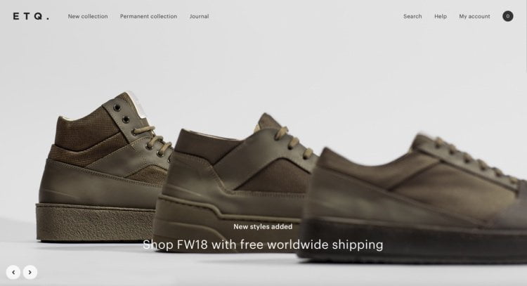
Your website navigation’s primary purpose is to let people find the right type of products they are searching for on your website. When looking for a specific product on your website, customers are conditioned to certain patterns. If you want most of the online sessions on your WoCommerce store to end up with a purchase, you should better follow the accepted norms in terms of your web store’s structure and your project’s overall structure. Instead of pushing customers out of their comfort zone, give your buyers what they are looking for. Take a look at how the main navigation panel is organized at ETQ Amsterdam. It’s clean and clear. It’s a great example of how you can manage the content in the navigation menu in a way that appeals to the needs of website visitors. A usable hover effect reveals images of featured items that people can find inside a specific group of items.
Top-Level Menu Items Should Be Clickable
One of the most common mistakes that WooCommerce websites make is lacking clickable top-label WooCommerce navigation patterns. People expect that all your website’s navigation panel elements are clickable and will take them to the respective category or page.
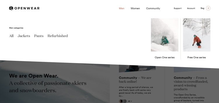
When you decide to list product categories in your menu, link the top-level item to the primary category page and feature subcategories in the drop-down menu. While hovering over the main product category, users will see more options that they will find out after browsing the entire category. Open Wear store does this job very well. The main navigation menu provides a list of the main categories of products that users can buy on the website. Hovering over any of them, people can see lists of more specific offers in the dropdown menu.
Stick to Standard Locations
There are many techniques that you may use to add a touch of creativity to your website. However, the main navigation menu is not the best place for experiments. To appeal to your prospective and returning buyers, it’s better to put the menu exactly where it should be.
As a rule, people expect to find the menu at the top of the web page. So, it’s always a good idea to locate the header’s primary navigation menu or put the most essential items there.
Besides the header of your site, people also expect to find links to the privacy policy, terms, FAQ, contacts, etc. in your site’s footer.
There is also a tricky thing about using hamburger menus. They are great for mobile menus but can be confusing for desktop computers and laptops. When viewed on large screen sizes, hamburger menus can look confusing to your customers. The three-line icon doesn’t reveal the main types of categories that are featured on your site. A user needs to take one more step before they find the products that they are looking for.
Add “On Sale” Items to the Navigation Structure
Many customers will first check the “On Sale” items when they land on your website. So, why don’t you make it easier for them to access the category of discounted items right from the main navigation menu? That way, you can save them time searching and invite them to complete an order whenever they see a slash cost on specific products.
Implement Dropdown Indicators
Adding dropdown indicators to menu icons is one of the proven techniques that can improve your website’s usability. The respective element can help your website visitors see where there are extra options available under different categories of products on your site.
Add Familiarity in Labeling
When you are looking for ways to boost conversions on your WooCommerce site, nothing helps better than your web store’s comprehensive structure. Top-level category labels should clearly describe what types of products you sell. Several top-level categories can have many sub-categories, which should help customers narrow down their search and find the right type of items they are looking for. Such a structure of the navigation menu structure adds some familiarity in users’ minds, so they won’t have any difficulty deciding where to click to find specific items.
Categorize with Attributes
When your customers look for the same category of products in different places on your website, you may opt for the technique of nesting the same sub-category under two different broader categories on your website. The approach lets your customers find certain products, which position may appear somewhat ambiguous in the classification scheme of your web store.
Ajax-Based Layered Navigation
The technique will be especially useful on websites offering a wide selection of products matching different attributes. For example, it will work well on websites selling clothes accessories, footwear, etc. Using the Ajax-based navigation menu, you customers can filter items based on color, size, shape, cost, etc. It provides them with a seamless shopping experience. What’s more, it adds an extra touch of interactivity while letting people switch between such elements as checkboxes, color swatches, size selectors, etc.
Work on Good Product Search Options
In addition to the well-structured main navigation menu, your website should include a good product search. There will likely be many customers who know what they want to find on your site and go through the layered navigation patterns to find what they need to be cumbersome for them. Instead, invest a little more in the advanced product search, which will help people find what they want as they tweak a few filters.
WooCommerce Live Search
Whatever topic your web store relates to, it’s essential to give customers a chance to run a live search. Ideally, your website’s live search should feature Ajax functionality. It’s very convenient when a user sees a list of suggested products while typing in the search request. The functionality reveals products with images and prices even before they enter the product name in the live search bar.
You can significantly improve customer experience and grow sales of your WooCommerce store as you integrate the respective feature into your WooCommerce project. You can also add Live Filter to your website, thus letting users run a live search based on products’ different attributes.
Product Recommendations
Optimizing the main navigation menu is vital, but that’s not all you can do to deliver a more usable site browsing experience to your customers and drive more sales. The success of your online store heavily depends on how much you know your audience. There are many ways to gain better insights into your customers’ preferences. Based on this knowledge, you can display recommendations of items for them to check out. As a rule, such lists of recommendations are revealed on product pages under the “You may also like” or “Customers who buy this item also enjoy…” subheadings.
Sometimes people reach a product by accident, without knowing that other items like this one also featured on your site. It’s when the lists of recommendations will also come in handy to them.
The default WooCommmerse settings let you define what items to reveal as recommendations for different products on your site. As a website administrator, you need to pick several items you’d like to display as upsells or cross-sells.
Run A/B Testing Before Changing Anything
Every time you implement any changes on your website, check how your customers feel about navigation innovations. Do not make any major changes without testing everything thoroughly. Track customers’ behavior using such popular tools as Activity Log or Simple History.
When you run A/B tests on your website, you can reveal different menu variations to your customers based on user roles and other aspects (like their geographical location). It’s vital to set up different variations at the same time. Revealing two variations at different periods won’t be helpful because other factors may come into play, and you can lose the experiment’s significance.
Mega Menus
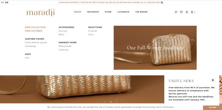
It’s a common practice for web stores to improve user experience with the help of mega menus. The technique lets you provide users with a broader set of options, and reveal images and videos in the menu field at the same time. Mega menus should feature parent categories, subcategories, and hierarchies, which let you group relevant products more effectively. For example, the Maradji shop masterful used the mega menu. It appears as you hover over the top-level categories. In addition to displaying narrower categories of products, the drop-down menu captures your attention with a bold banner that invites you to check a new collection of accessories.
The mega menu brings a sense of order to subcategories that are grouped below the parent category. In such a way, customers can easily navigate to the needed group of products while using the primary WooCommerce navigation patterns.
Footer Navigation
Footer navigation is an integral part of a website. It’s displayed on every page of your site, so you should carefully work on selecting links for the footer navigation area.
When it comes to working on your site’s footer structure, please do not make it massive and cluttered. Focus on the essential elements that you think will bring the most value to your audience. But what information is worth a mention in the footer menu? There are different approaches to different sites.
Some websites use to put links in the footer similar to the ones featured in the header menu. Using such an approach, you let visitors quickly access the necessary links without scrolling back to the page’s top.
Other websites use the footer menu to display additional pages and content that will be useful to customers. It may include:
- FAQ,
- Shipping information,
- Return and refund policies,
- Privacy policy,
- Terms and conditions,
- Contacts,
- Customer service details,
- Social media links, etc.
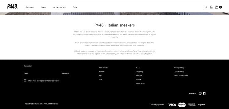
P448 web store is a great example of how you can effectively and clutter-free organize the footer of your website. It features a standard structure of the footer navigation. You can find quick links to the New arrivals and some essentials web store options like FAQ, Contacts, Returns, etc. Depending on your website’s size, you can feature more options in the footer, thus making it effortless for your audience to come across the necessary products or information on your site.
Breadcrumbs
Using breadcrumbs, you can show a user’s current location on your website. The title originated from Hansel and Gretel, who dropped breadcrumbs to find their route out of the forest. The technique will be especially useful for websites featuring many products and pages. Using breadcrumbs, users can get back to any post or category page with just one click, without the need to click the “back” button in their browser window a thousand times.
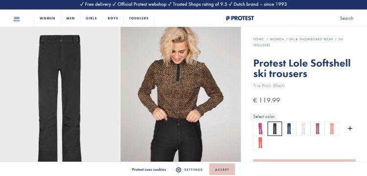
As a rule, a breadcrumb menu is placed right below the main navigation menu and above your website’s content. It makes it easier for your customers to navigate your website and go back to their starting point with ease. For example, take a look at how the technique is used at the Protest store. Thet use breadcrumbs to let people see how they reached the page they are currently viewing and give users a quick way to get back the previous pages and categories.
Breadcrumbs are useful for several reasons. First of all, the technique lets you improve your website’s usability. It keeps your customers away from getting lost on your website. With breadcrumbs, they always know how to navigate back to the previously opened pages.
Google also likes it when websites use breadcrumbs because they add more structure and hierarchy to web pages. You may even notice breadcrumbs being listed in search results, thus growing the chances that people will visit your web page and find the content they need.
How to Add Breadcrumbs to WooCommerce Navigation
In most cases, you can turn on breadcrumbs in the settings of your WooCommerce theme. If the respective functionality isn’t included out-of-the-box, you can add breadcrumbs using a plugin or while adding a piece of custom code to your site. Let’s see how each of these two approaches works.
If you decide to add breadcrumbs with a plugin, look through the WordPress plugin repository and you will find many options that match your search intentions. For example, you may use the Jetpack plugin, which lets you use breadcrumbs on your web store’s product and category pages.
To add breadcrumbs with a code, you can use <?php woocommerce_breadcrumb(); ?> snippet to control where your breadcrumbs output. Using filters and arguments, you can also manage the breadcrumb separator, the home text, and the link.
The following custom argument will change the way the breadcrumb separator is displayed before the breadcrumbs:
Change breadcrumbs separator
<?php

$args = array(
	'delimiter' => '/',
	'before' => '<span class="breadcrumb-title">' . __( 'This is where you are:', 'woothemes' ) . '</span>'
);

?>

<?php woocommerce_breadcrumb( $args ); ?>
By means of the following code, you can apply the filter that lets you change the default home text to whatever you choose:
Change Home Text in Breadcrumbs
add_filter( 'woocommerce_breadcrumb_defaults', 'mm_change_breadcrumb_home_text',20);

function mm_change_breadcrumb_home_text( $defaults ) {
	$defaults['home'] = 'Store';
	return $defaults;
}
To change the home link, use the following filter:
Replace the home link URL
add_filter( 'woocommerce_breadcrumb_home_url', 'woo_custom_breadrumb_home_url' );

function woo_custom_breadrumb_home_url() {
	return 'http://woocommerce.com';
}
Bottom Line
Navigation is an integral part of your website. Treat it with proper care and attention. The rupture success of your website depends on the ease of navigating your web pages. If users feel lost on your site, they will hardly apply extra effort to find the products or services they need. It’s more likely they will leave for a competitor’s website, which is more reusable and better organized.
To get started, figure out what elements of your website’s navigation are the most vital to your customers. In what ways can you make it easier for them to browse your content? What elements should be put front and center, and which ones are not very important?
Find answers to these and other questions related to making your web store more usable. The first-time visitor should quickly find what they are looking for. The simpler, the better. Using easy-to-follow navigation elements, you grow the chances that your customers will find what they need and keep coming back for more orders.
Use the techniques that we discussed in this guide. Choose the approaches that work best on your website, and may the number of sales grow by leaps and bounds.


Contact

Send a Project Brief
You are currently viewing a placeholder content from Facebook. To access the actual content, click the button below. Please note that doing so will share data with third-party providers.
More InformationYou are currently viewing a placeholder content from Instagram. To access the actual content, click the button below. Please note that doing so will share data with third-party providers.
More InformationYou are currently viewing a placeholder content from X. To access the actual content, click the button below. Please note that doing so will share data with third-party providers.
More Information