Best Fonts For Ecommerce Websites

Table of Contents

With over 650,000 different fonts available online today, choosing the best business font for your website can be daunting. The choice of typography especially matters when working on your ecommerce project. Fonts go beyond mere aesthetics; they shape the user experience, affect readability, and contribute significantly to a brand’s identity. In ecommerce, all elements should be masterfully chosen and combined to serve the primary goal of driving conversion. How to choose the best fonts for ecommerce website? This comprehensive guide describes the most popular fonts for ecommerce business and suggests the most effective font pairings for your project.
Why are Fonts Important?
One of the primary functions of fonts is to ensure that text is easy to read. Clear, legible fonts help users quickly absorb information, from product descriptions to terms of service. Visitors struggling to read your content are more likely to leave the site, resulting in lost sales. Readable fonts reduce eye strain and make it easier for users to navigate and interact with the website, leading to a more pleasant shopping experience.
Fonts play a crucial role in defining a brand’s identity. The right choice of fonts for ecommerce business website can convey your brand’s personality and values, whether modern, minimalist, elegant, luxurious, or playful and friendly. Consistent use of typography across your site reinforces brand recognition and trust. For instance, a luxury brand might choose sophisticated serif fonts to convey elegance and high quality. At the same time, a tech startup might opt for sleek sans-serif fonts to express innovation and simplicity.
Factors to Consider When Choosing a Font
Selecting good fonts for websites involves evaluating several critical factors to ensure the font meets your needs and enhances the overall user experience. Here are the key user-centered design methods to consider when looking for cool fonts for your website.
Readability
The primary purpose of text on a website is to convey information clearly and efficiently. The best font for reading on screen helps users quickly understand your content without straining their eyes. Poor readability can frustrate users, leading to higher bounce rates and lost sales.
Choose the best UI fonts with clear, distinct letterforms. Avoid overly decorative or complex fonts for body text. Sans-serif fonts like Arial, Helvetica, and Roboto are often recommended for their high screen legibility. Ensure adequate spacing between letters, words, and lines to enhance readability.
Brand Alignment
Fonts are a visual representation of your brand’s personality and values. The right font can effectively communicate your brand’s message, helping build a strong identity and connection with your audience.
Consider what your brand stands for and choose popular internet fonts that reflect these attributes. For example, a luxury brand might use elegant serif fonts like Playfair Display, while a modern tech company might prefer clean, sans-serif fonts like Montserrat. Consistency in font usage across all brand materials reinforces brand recognition.
Versatility
Your chosen fonts should look good and be readable across various devices and screen sizes, from desktops to smartphones. A font that performs well in different contexts ensures a consistent user experience.
Test fonts on multiple devices to see how they render. Building a web design mobile-first can help maintain font legibility on different screen sizes. Google Fonts and Adobe Fonts offer many versatile fonts for purchase and download, optimized for web use.
Performance
Web fonts can impact your website’s loading times. Fonts not optimized for web use can slow down your site, negatively affecting user experience and search engine rankings.
Use web-safe fonts or fonts hosted by reliable services like Google Fonts, optimized for performance. Limit the different fonts and font weights you use to enhance website page speed. Tools like Font Squirrel can help you find high-quality, web-optimized fonts.
Accessibility
Ensuring your fonts are accessible to all users, including those with visual impairments, is crucial for providing an inclusive user experience. Accessible fonts, used along with an accessibility plugin for a website, improve readability for everyone and help comply with legal standards.
Choose the best UI fonts with clear, distinguishable characters. Ensure sufficient contrast between text and background. Use text sizes that can be easily resized in different browsers. Consider fonts specifically designed for accessibility, such as OpenDyslexic.
Best Fonts for Ecommerce
Choosing the right fonts is one of the primary things that should be added to your ecommerce website checklist. What is the best font for a website that sells? Here is our curated list of the most popular fonts used by popular online stores. These fonts are chosen based on their readability, versatility, and ability to align with various brand identities. Check them out.
Montserrat
Montserrat is a clean and modern geometric sans-serif font. It is the best font for reading on screen. Its versatility makes it suitable for various uses, from headings to body text. Montserrat’s design is inspired by urban typography from the early 20th century, which gives it a contemporary yet timeless appeal.
Who might use it: Tech companies, fashion brands, lifestyle websites.
Examples: Montserrat is used by brands like Stripe and Asana for its clean and professional look.
Roboto
Roboto is a sans-serif font family designed for readability on screens. It features a friendly, open style while retaining the precision of a geometric sans-serif. Its wide variety of weights and styles makes it versatile for different types of content.
Who might use it: Tech startups, digital products, corporate websites.
Examples: Roboto is the default font for Android and is used extensively by Google, ensuring a familiar and comfortable reading experience.
Neue Helvetica
Neue Helvetica is a refined version of the classic Helvetica font, known for its clarity and neutrality. It is one of the most popular internet fonts, providing a clean, professional look suitable for various branding needs.
Who might use it: Corporate websites, finance, luxury brands.
Examples: Neue Helvetica is used by companies like Lufthansa and American Apparel to convey professionalism and reliability.
Lato
Lato is a sans-serif font that combines warmth and professionalism. Its semi-rounded details give it a friendly appearance, making it ideal for headings and body text.
Who might use it: Educational institutions, health websites, technology companies.
Examples: The Mozilla Foundation uses Lato for its readability and approachable style.
Oswald
Oswald reimagines the classic gothic typeface style, designed to be used freely across the web. It is a condensed sans-serif font that works well for headlines and short bursts of text, providing a strong visual impact.
Who might use it: Fashion brands, sports websites, entertainment platforms.
Examples: Oswald is often used in online magazines and news websites for its bold and engaging appearance.
Alegreya
Alegreya is a serif font for ecommerce business. It is designed with a dynamic and varied rhythm, which makes it highly readable and aesthetically pleasing for long-form text. Its elegant design works well for artistic and boutique brands.
Who might use it: Boutique shops, luxury brands, artistic websites.
Examples: Alegreya is frequently seen in literary publications and boutique stores for its sophisticated look.
Open Sans
Open Sans is a humanist sans-serif typeface designed for optimized readability on screens. Its neutral yet friendly appearance makes it highly versatile for various web applications.
Who might use it: Ecommerce, tech companies, service providers.
Examples: Open Sans is widely used by WordPress and FlatIcon for its readability and versatility.
Playfair Display
Playfair Display is a serif font with a high contrast that adds a sense of elegance and sophistication. It’s one of the best fonts for ecommerce businesses website, and it is perfect for making statements in headlines and larger text.
Who might use it: Luxury goods, fashion brands, editorial content.
Examples: Vogue and Elle frequently use Playfair Display for its elegant and stylish look.
Source Sans Pro
Source Sans Pro is Adobe‘s first open-source typeface family designed for user interfaces. It’s clean, readable, and highly functional, making it an excellent choice for various digital platforms.
Who might use it: Tech companies, digital agencies, corporate websites.
Examples: GitHub and Mailchimp use Source Sans Pro for its clarity and professional appearance.
Poppins
Poppins is a geometric sans-serif font that offers a clean and modern look. It’s visually appealing and easy to read, making it a popular choice for contemporary web design.
Who might use it: Modern brands, startups, minimalist websites.
Examples: Poppins is one of the most popular fonts for ecommerce business of startups and modern brands due to its fresh and sleek design.
Fonts Hierarchy
A clear font hierarchy is crucial for designing an effective and visually appealing ecommerce website. By categorizing fonts into three distinct classes—Primary, Secondary, and Accent—you can create a structured and cohesive look that guides users through the content smoothly.
Primary (Headings)
The primary font is used for headings and major titles. It grabs attention and highlights the most important information on the page. This font should be bold, distinctive, and easily recognizable to make headings stand out.
Characteristics: Bold, larger size, visually striking, often a different typeface from the body text to create contrast.
Example: Montserrat or Playfair Display, which are both attention-grabbing and elegant.
Secondary (Body Text)
The secondary font is used for body text, including paragraphs, product descriptions, and any other longer text passages. Its main function is to be easily readable over long periods, ensuring that users can comfortably read and understand the content.
Characteristics: Clear, simple, high legibility, medium size, often a sans-serif for its clean lines and screen readability.
Example: Open Sans or Lato, which are known for their readability and neutral design.
Accent Font (Buttons, Promotions, etc.)
The accent font is used for special elements such as buttons, promotional text, and calls to action. It must stand out but not overpower the primary and secondary fonts. Accent fonts add visual interest and can draw attention to specific actions or important information.
Characteristics: Unique, often a contrasting style or color, smaller text size, but still readable.
Example: Oswald or Poppins, which are distinctive and can highlight key actions effectively.
Different fonts for headings and body text help users differentiate between various sections and types of content, enhancing overall readability. A well-structured font hierarchy creates a visually pleasing and professional appearance, making the website look more organized and polished. Hierarchical fonts guide users through the content logically, ensuring they focus on the most important information first and navigate the site intuitively.
To create a font hierarchy, follow these steps:
- Choose Your Fonts: Select fonts that complement each other and align with your brand’s identity. Use a primary font for headings, a secondary font for body text, and an accent font for special elements.
- Define Sizes and Weights: Establish a consistent size and weight for each type of text. For example, headings might use a bold weight and larger size, while body text uses regular weight and medium size.
- Maintain Consistency: Apply the same rules consistently across all website pages. This includes sticking to the same font sizes, weights, and styles for similar elements.
- Use Contrast: Ensure there is enough contrast between different types of text to make them easily distinguishable. This can be achieved through size, weight, color, or spacing.
- Test Across Devices: Make sure your font hierarchy looks good and is readable on various devices and screen sizes. Responsive design is key to maintaining a consistent user experience.
Best Fonts Pairings for eCommerce
Choosing the right fonts for ecommerce business can enhance your website’s overall aesthetic and functionality. Here are three recommended font pairings, each designed to create a cohesive and engaging user experience.
1. Montserrat, Open Sans, and Oswald
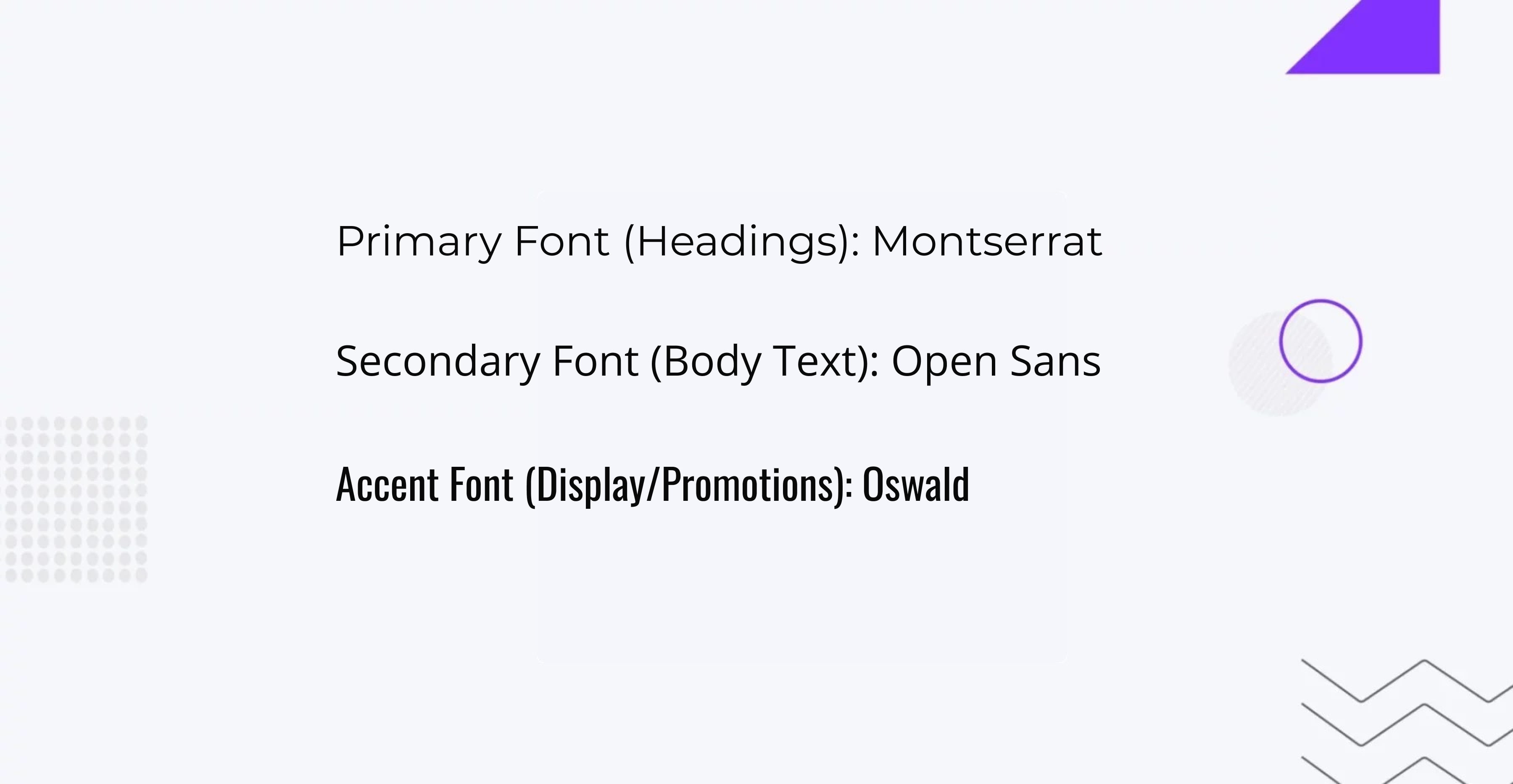
- Montserrat for headings offers a modern, clean, eye-catching, and professional look. Its geometric style ensures that headings are easily noticeable, helping users quickly identify key sections of your site.
- Open Sans for body text provides high readability and a friendly appearance. This humanist sans-serif font ensures that long text passages are easy to read on any device.
- Oswald as an accent font adds a touch of boldness for buttons, promotions, and other important elements. Its condensed style makes it perfect for drawing attention without overwhelming the page.
Ideal Use:
This combination works well for tech companies, fashion brands, and modern online stores looking to maintain a clean and professional appearance.
2. Playfair Display, Lato, and Poppins
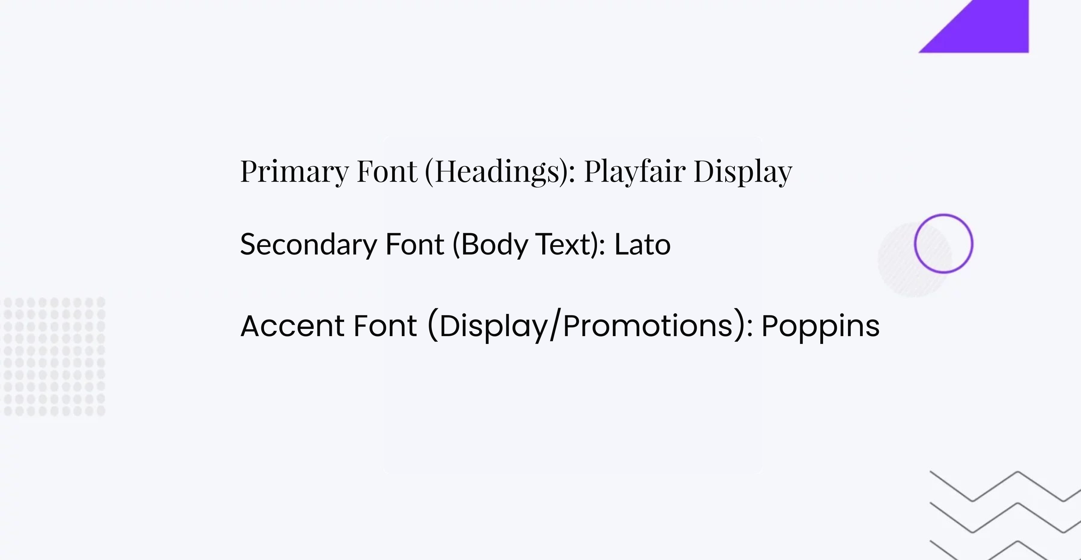
- Playfair Display is a serif font that adds elegance and sophistication to headings. Its high-contrast design makes it perfect for brands that want to convey luxury and refinement.
- Lato for body text offers a balance of professionalism and friendliness. Its semi-rounded details give it a warm feel, ensuring readability across all content.
- Poppins as an accent font brings a modern touch with its geometric sans-serif style. It is perfect for highlighting key actions and promotional content with a fresh, contemporary look.
Ideal Use:
This pairing is ideal for luxury goods, fashion retailers, and editorial websites aiming to project an elegant yet approachable image.
3. Neue Helvetica, Source Sans Pro, and Alegreya
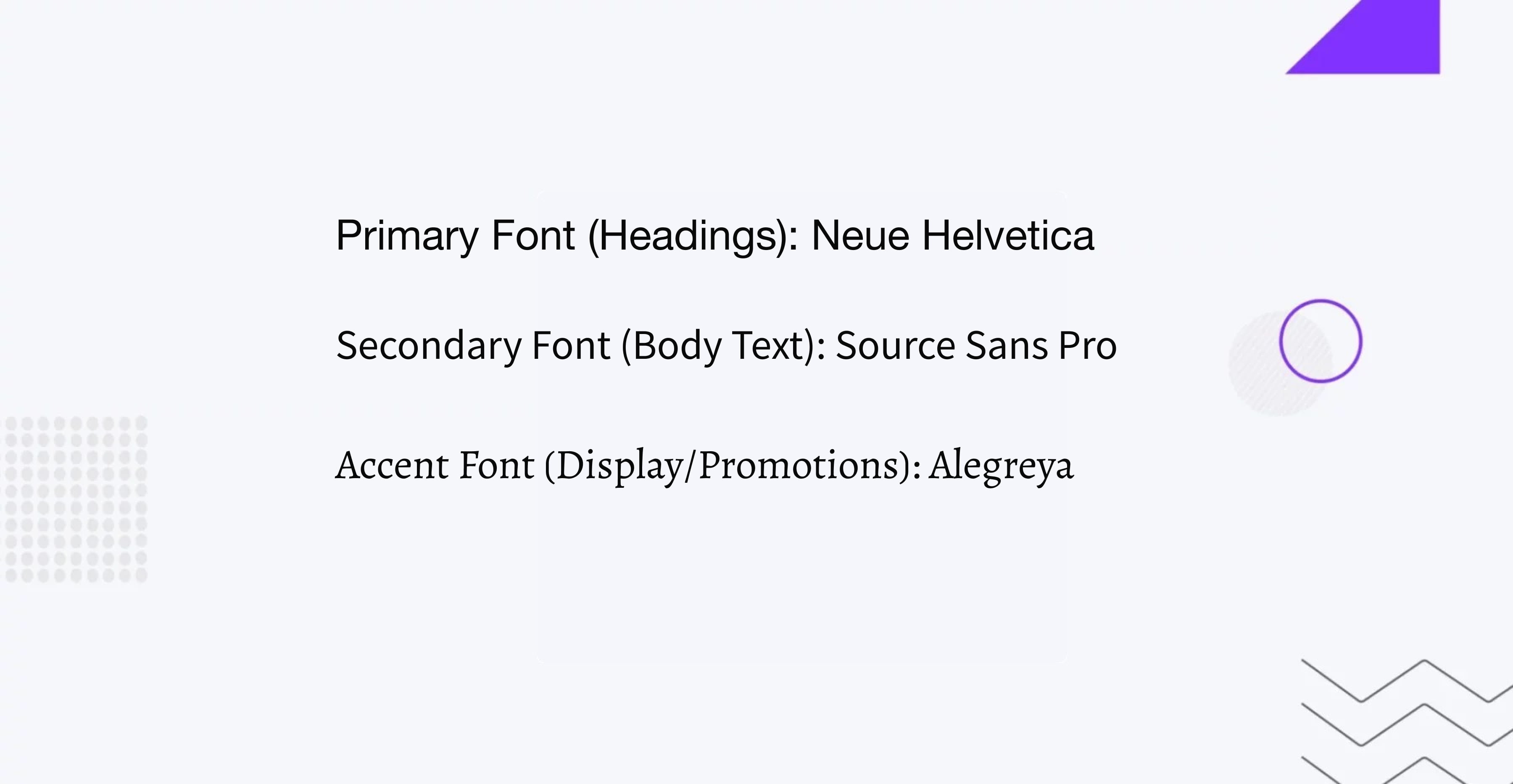
- Neue Helvetica provides a timeless, clean look for headings. Its neutral and professional appearance ensures that it does not distract from the content while still providing clear hierarchy.
- Source Sans Pro is a highly readable sans-serif font that excels in body text. Its design is optimized for user interfaces, making it perfect for comprehensive product descriptions and long-form content.
- Alegreya adds a unique and sophisticated touch as an accent font. Its dynamic rhythm and varied letterforms are ideal for engagingly highlighting promotions and special offers.
Ideal Use:
This combination is best suited for corporate websites, finance sectors, and artistic brands that require a professional yet distinctive look.
Tools and Resources for Font Selection
Selecting the right fonts for your ecommerce website is made easier with a variety of tools and resources. Here are some popular ones that can help you find and pair fonts effectively:
Google Fonts
Google Fonts is a free and widely-used resource that offers a vast library of web-optimized fonts. You can preview and compare different fonts, and Google Fonts also provides recommendations for font pairings.
Adobe Fonts
Adobe Fonts (formerly Typekit) is a subscription-based service that offers a comprehensive collection of high-quality fonts. Integrated with Adobe Creative Cloud, it is ideal for designers looking for professional typefaces.
Font Squirrel
Font Squirrel is a free resource that offers a selection of high-quality, hand-picked fonts that are free for commercial use. It also features a Webfont Generator tool for converting fonts into web-friendly formats.
WhatFont
WhatFont is a browser extension that allows you to identify the fonts used on any webpage easily. This tool is useful for exploring font combinations used by other successful websites.
Canva Font Combinations
Canva’s Font Combinations tool helps you discover great-looking font pairings. It’s a quick way to find complementary fonts that work well together, ideal for those without extensive design experience.
Typewolf
Typewolf is a valuable resource for designers looking for font inspiration. It showcases real-world examples of font usage, provides pairing suggestions, and keeps you updated on trending fonts.
Google Material Design
Google’s Material Design guidelines offer recommendations on typography, including font pairings and usage best practices for various digital interfaces. This resource is particularly useful for creating consistent and user-friendly designs.
Conclusion
By implementing a well-thought-out font strategy, you can significantly enhance the readability, user experience, and overall appeal of your ecommerce site, ultimately driving engagement and sales. With the right fonts for ecommerce website and pairings, your online store can stand out in the competitive ecommerce landscape.
If you are unsure about choosing the right fonts for your ecommerce website, consider seeking expert assistance. The IT Monks team is always ready to help you with professional UI/UX design solutions and expert ecommerce development services.


Contact
Don't like forms?
Shoot us an email at [email protected]

Send a Project Brief
You are currently viewing a placeholder content from Facebook. To access the actual content, click the button below. Please note that doing so will share data with third-party providers.
More InformationYou are currently viewing a placeholder content from Instagram. To access the actual content, click the button below. Please note that doing so will share data with third-party providers.
More InformationYou are currently viewing a placeholder content from X. To access the actual content, click the button below. Please note that doing so will share data with third-party providers.
More Information