Explore our specialized services, tailored solutions, and industry expertise to elevate your digital presence. From custom WordPress development to seamless integrations, we build high-performing websites that deliver impact.
Your team publishes on schedule. The articles are solid. Yet every month the report shows fewer people arriving from search, and sooner or later someone in leadership asks whether the blog is still worth the effort.
It is a fair question, but the traffic report cannot answer it. In most cases, the writing did not get worse. Google now answers many questions on its own results page, so fewer searchers need to open an article. The report does not show whether the people who stopped coming would ever have become customers.
So the right response isn’t to stop blogging, and it isn’t to publish more of the same.
Do three things instead: find out why the visits fell, improve the pages where visitors become leads, and stop relying on search alone to bring readers to your content. This article covers each one in that order.
AI answers can remove the need for a website visit
Imagine someone types “what is a modular website” into Google. Before any link appears, they see a short explanation written by AI. They read it, get what they need, and close the tab. Your article on the same topic may rank well and still never receive the visit.
That explanation is an AI Overview: a summary Google generates and places above the regular results. Pew Research Center studied what people do when one appears, using the browsing activity of 900 U.S. adults in March 2025. Pew calls the feature an “AI summary,” and found three things:
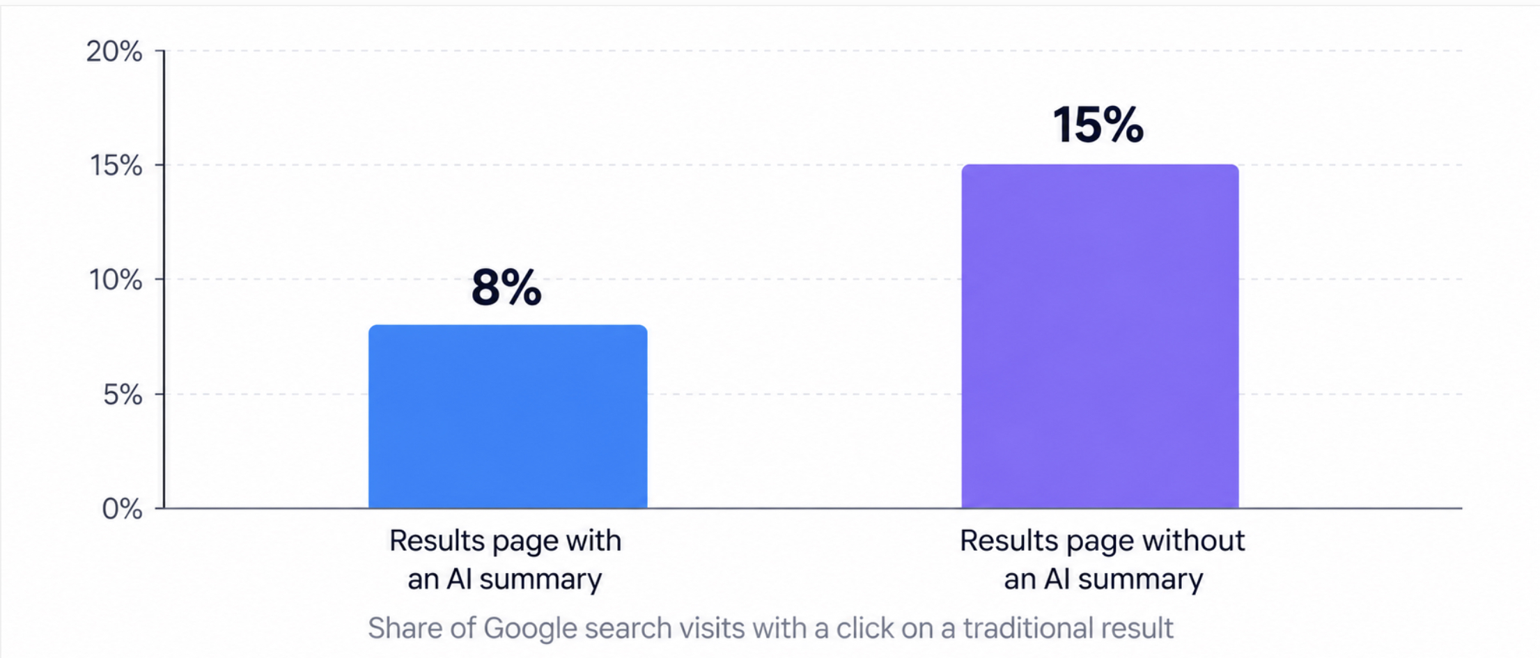
People clicked a traditional search result on 8% of visits to a results page with an AI summary, compared with 15% of visits to a page without one.
They clicked a link inside the summary itself on only 1% of visits.
Summaries appeared for 60% of searches that began with a question word such as “who,” “what,” or “why,” compared with 18% of searches overall.
Clicks on traditional search results, with and without an AI summary. Browsing activity of 900 U.S. adults, March 2025. Source: Pew Research Center.
Put the three numbers together and the picture is clear. When a summary appears, the chance of a click on a regular result falls by almost half. Summaries appear most often on question searches. And question searches are exactly what most blog articles were written to win: “what is,” “how to,” “why does.”
That is why explainers and how-to articles lose traffic first, while service and product pages hold up better. If your decline sits mostly in informational articles, AI answers are the reason.
AI summaries also continue an older trend. Answer boxes, “People also ask” questions, videos, and shopping results were already keeping searchers on Google. The AI summary is the strongest of these features, because it answers the question in full.
This changes how you should read the loss. A person who wanted a quick definition and got it from Google was never going to request a quote that day. So before you count every lost click as a lost customer, ask what that searcher was trying to do.
Separate learning, comparing, and buying intent
People search for different reasons. Some want to understand a topic. Some are weighing their options. Some are ready to choose a supplier.
Reader’s task
Example search
Useful website content
Learn
“What is a modular website?”
Explanation with practical examples
Compare options (middle of funnel)
“Custom WordPress vs a page builder for a marketing team”
Comparison, tradeoffs, implementation details
Choose a provider (bottom of funnel)
“WordPress development agency for marketing teams”
Service page, relevant work, process, inquiry route
Now compare the first row with the last. A two-sentence AI answer can satisfy the person who wants a definition. It cannot satisfy the person choosing an agency. That person needs to see relevant work, understand the process, and find a way to get in touch. In a lead-generation program, this is why content for comparing and choosing deserves priority: those readers are the closest to sending an inquiry.
Andy Crestodina, co-founder and CMO of Orbit Media, makes a similar case in his article on zero-click marketing, using his own agency’s website as the example. He recommends looking at informational visits and supplier-evaluation visits separately, and improving service pages before writing another search-focused article. The logic applies well beyond one agency: AI can replace a definition, but it cannot replace the decision about whom to hire.
None of this makes educational content worthless. An explainer can introduce a problem the reader has not yet named. It can show that your team knows the subject. And it can give the reader a reason to come back when the purchase becomes real.
It is also a mistake to assume that “blog” means “low intent.” A comparison or a detailed case study can help a buying decision. So when you audit your content, do not simply split pages into “blog” and “not blog.” Sort them by such questions: is the reader learning, comparing, or choosing, and how close is the topic to what you sell?
Keep the blog, and give each article a clear job
The audit shows which pages you have for each type of reader. The next step is to plan new articles the same way. For years, many blog articles had one job: rank in Google and bring traffic. AI answers now take part of that traffic, so each article needs a job that does not depend on the click alone. Before you commission an article, decide what it should help the reader do:
Understand a problem relevant to your services.
Compare approaches.
Evaluate evidence from a real project.
Prepare for a sales conversation.
Use a tutorial, checklist, or original dataset.
A clear job also makes internal links easier to plan, because each link should answer the reader’s next question. Suppose someone has just read how quote requests that lose product details influence a drop in conversion rate. Their next question is probably “How do we fix it?”, so the article links to a comparison of the options. After the comparison, they may want proof, so that page links to a case study. From the case study, the service page explains who can do the work.
This is not the same as adding a sales pitch to every paragraph. An educational article should stay educational. The links only make the next step available to the readers who want it.
Finally, keep the complete, maintained version of each resource on your own website. Crestodina’s advice in the same article form Orbit Media is to publish there first and treat versions on other platforms as copies. LinkedIn, email, and video help people find the resource. Keep the full version, updated, on your website.
Build distribution into content production
If fewer people find your articles through search, the articles have to reach them another way. In many teams, distribution (getting the article in front of people) is still one social post on publication day. Survey data suggests that is not enough.
In a new study, 1,042 content marketers were surveyed, and only about 14% reported strong marketing results. The useful question is what that 14% does differently, and two findings stand out:
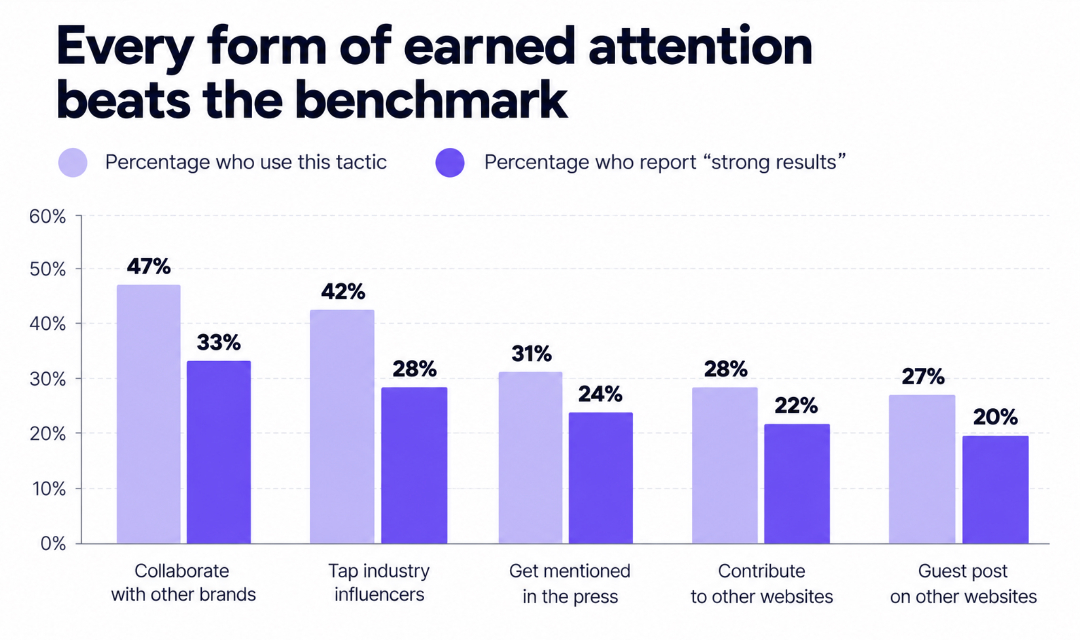
Marketers who collaborate with influencers reported strong results at 2.6 times the overall benchmark.
Marketers who publish original research were 50% more likely to report strong results.
Both findings make sense once you remember what AI answers do. An AI summary can restate a generic how-to in seconds, because the same information exists on a hundred websites. It cannot restate your own data, or an expert opinion that exists only in your article. And a collaborator brings an audience that does not depend on Google at all.
Chart: Orbit Media, Blogging Statistics 2026. Survey of 1,042 content marketers; results are self-reported.
The same survey shows the rest of the pattern. The marketers with strong results use visuals, promote each article on purpose, and check the numbers regularly.
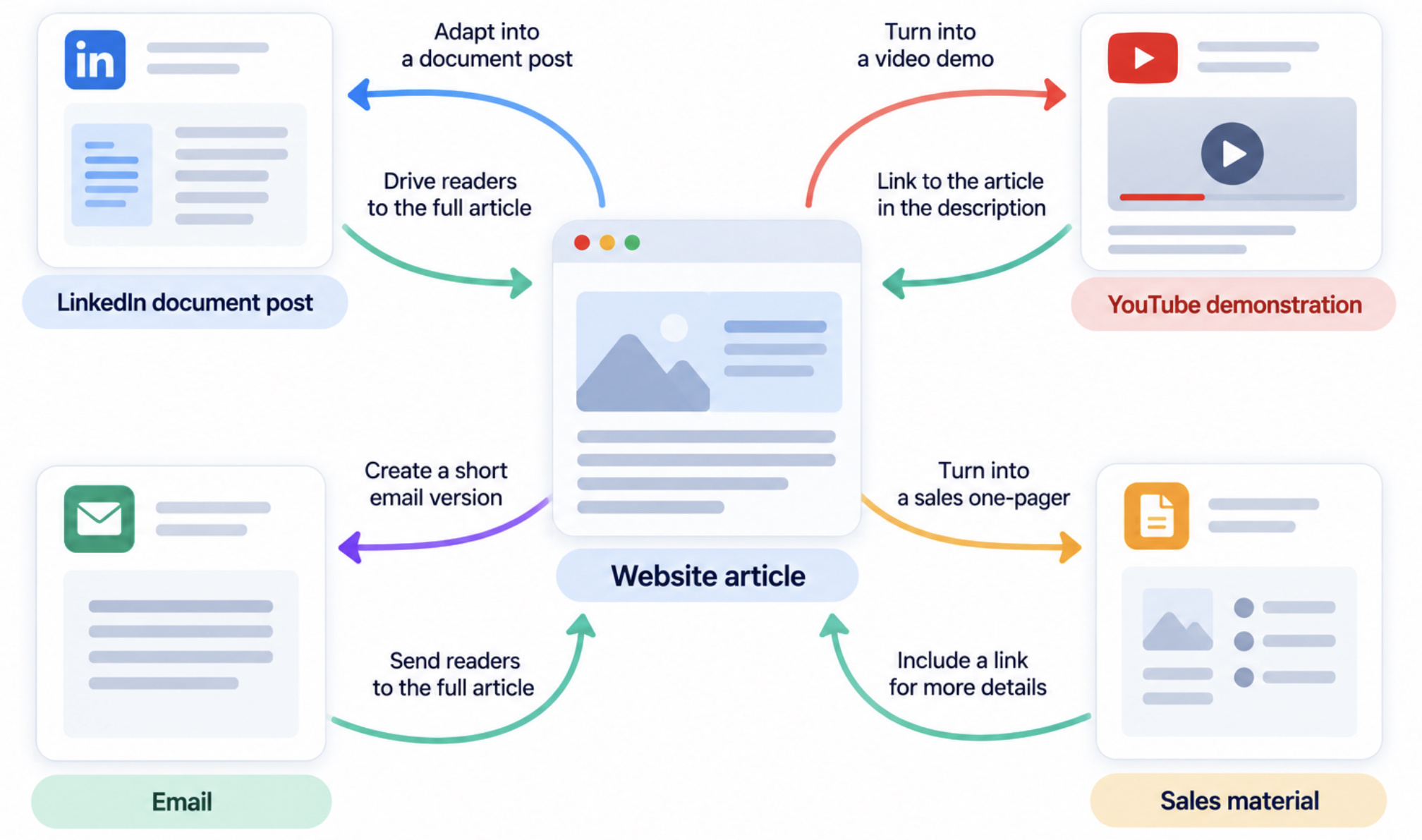
The practical lesson is to choose formats and collaborators while you plan the article, not after it is published. Take one topic as an example: buyers losing product details when they request a quote.
Channel or asset
Distinct contribution
Website article
Evidence, explanation, examples, and improvement checklist
LinkedIn document post
A short visual walkthrough of the broken journey
YouTube demonstration
Show how a request can retain the selected product
Email
One diagnostic question and a relevant resource
Sales material
A concise example addressing a prospect’s concern
You do not need all five on day one. Start with the website and two channels your team can maintain. Add a third channel only when the first two bring comments, subscribers, or inquiries, and your team has time.
Illustrative example: one website resource adapted into channel-specific assets, each with a relevant next step back to the website.
This takes more work: research, expert input, demonstrations, editing, and rewriting the idea for each format. But more work doesn’t guarantee better content, and being on more platforms doesn’t guarantee better results. Each version has to be useful on its own, in the place where people see it. A LinkedIn walkthrough that helps a buyer recognize their problem has done its job, even if nobody clicks through to your website.
Make it easier for interested visitors to take the next step
Reaching the right people is half the work. The other half happens on your website, when an interested visitor decides whether to get in touch. With fewer visits arriving from search, you cannot afford to lose the visitors who do arrive.
Start with the pages where people decide whether to contact you: service, product, comparison, and case-study pages. Check five things on each:
A clear offer. The visitor can tell what they will get and what happens after they ask.
Relevant proof. A case study or result sits next to the claim it supports.
A usable mobile layout. The page loads quickly, and buttons and forms work on a phone.
An understandable call to action. “Request a quote for this product” says more than “Submit.”
A form that keeps relevant information. The visitor does not retype what the page already knows.
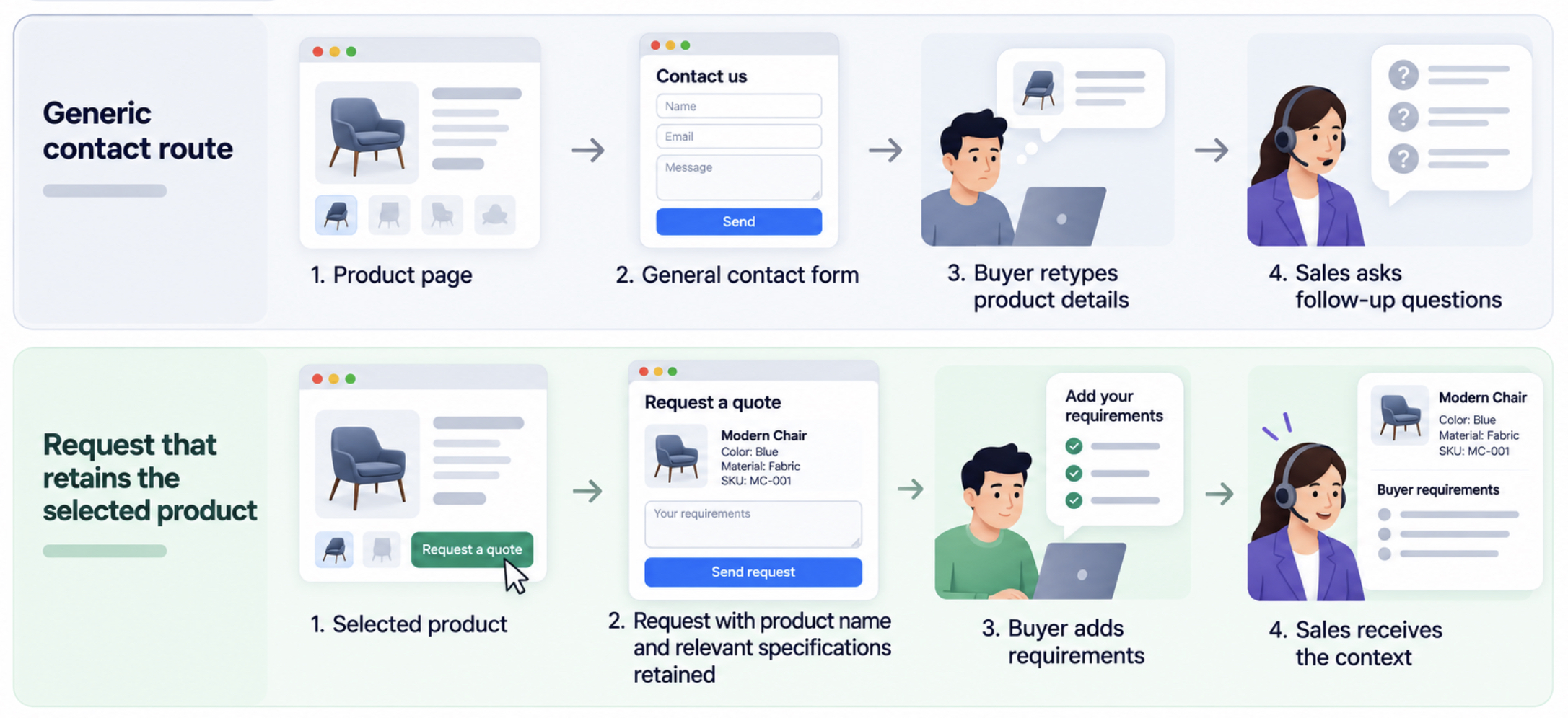
The last point is easy to overlook, and our own research shows how common the gap is. In IT Monks’ review of 79 U.S. manufacturer websites, only 16 offered a quote route that carried the product into the request. The remaining 63 of 79, approximately 80%, lacked that route. On those websites, a buyer who clicks “Request a quote” on a product page has to explain again which product they mean. Some will not bother. The ones who do send a vague message, and sales has to start the conversation with a question instead of a quote.
Here is the design we recommend instead:
Selected product → request with product name and relevant specifications retained → buyer adds requirements → sales receives the context.
Illustrative design: a generic contact route compared with a quote request that retains the selected product. A recommendation from IT Monks, not an outcome tested in the research.
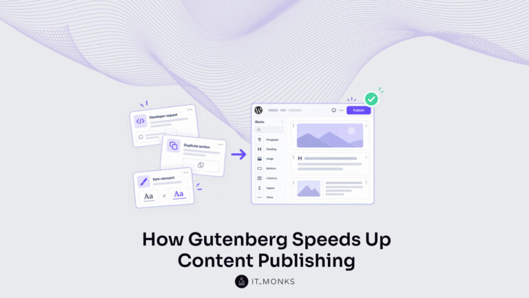
Offers, proof, and calls to action change with every campaign, so it helps when marketers can edit them without a developer. On a WordPress website, reusable Gutenberg components (Gutenberg is the WordPress block editor) can let your team update proof, page sections, and calls to action without commissioning each routine layout change. That is part of what custom WordPress development provides. Custom integrations, such as sending form data to a sales system, still need a developer.
Measure outcomes, and check that tracking works
By now you have changed what you publish, where you share it, and how visitors send inquiries. Traffic alone will not tell you whether those changes worked. A useful report answers three questions: how do people find you, what do they do on the website, and which inquiries become customers?
Question
What to examine
Has search visibility or clicking changed?
Impressions, clicks, click-through rate, and position by relevant page/query group
Are potential buyers reaching decision pages?
Visits to service, comparison, product, and case-study pages
Where does the inquiry journey break?
CTA use, form starts, errors, and confirmed submissions
Are inquiries useful to the business?
Qualified leads, opportunities, and revenue in the CRM
Is distributed content reaching the intended audience?
Relevant engagement, subscriptions, conversations, and attributable visits
The first row is how you find out why visits fell. Google Search Console reports all four numbers for free. Impressions show how often a page appeared in search, and position shows how high it ranked. If both hold steady while clicks fall, people are getting their answer on the results page. If position drops, you have lost rankings. If impressions fall while position holds, fewer people are searching for the topic.
These numbers are only useful if the tracking behind them works. Check the setup before you trust the report:
Agree on what counts as a lead and a qualified lead.
Record successful submissions, rather than treating every button click as a conversion.
Test the journey from the website form through to the CRM.
Use consistent campaign labels for links you share on other channels.
Review results by page purpose, source, and device.
Whenever you report a conversion rate, say what it is a share of: all visits, or only visits to service pages.
One warning. Conversion rate can rise simply because fewer low-intent visitors arrive. If visits fall from 10,000 to 6,000 and qualified leads stay at 60, the rate climbs from 0.6% to 1.0%, but the website has not improved. Look at the absolute number of qualified leads alongside the rate before you claim progress.
Finally, accept that no report shows everything. Someone may watch your video or read your LinkedIn post, then visit your website weeks later by typing the address. The report will not connect that visit to the video or the post.
Start with one manageable step
You do not need to rebuild your content strategy this quarter. Work through the steps in order:
List the pages that lost visits, and check whether leads fell too.
Check rankings, search demand, tracking, and changes on the results page before you decide on a cause.
Fix one important service or product page and its inquiry form.
Publish one article built on your own data or project, with a plan for where you will share it.
Review qualified leads alongside traffic and conversion rates.
The first two steps need only the reports you already have. The last three need a website your team can edit and test without waiting on a developer for every routine update.
If your website makes those changes slow, talk to IT Monks about a WordPress website that makes campaign updates, conversion improvements, and measurement easier for your team.




 ChatGPT
  Claude
  Grok
Grok  Gemini