Enterprise Website Design: 9 Best Practices

Table of Contents
An enterprise website design is a system architecture built for enterprise-scale interaction, operational stability, and tool integration. It governs cross-department workflows and binds interface logic directly to backend processes. Each component structures modular behavior through semantic hierarchies and mapped content roles.
An enterprise website design supports real-time data throughput, scalable UX systems, and integrates directly with CRMs, ERPs, and content repositories. These functions help ensure a strong performance, reliable uptime, and overall system continuity. Within this architecture, accessibility and security are enforced system attributes, defined by compliance logic and validated through structured testing protocols.
Interface modules follow role-based rules controlling content behavior and interaction load. This behavioral logic influences layout structures, which respond to performance metrics over aesthetic variables. Navigation, sitemap, and dashboards operate within fixed entity roles and hierarchy maps.
Where general design favors aesthetics, enterprise design prioritizes resilience, interoperability, and structural consistency. It responds to CI/CD workflows, versioning, and design-to-dev parity, as every element is architected for operational continuity.
Enterprise website design choices function as structured transformations that trigger measurable outcomes, each improving usability, accessibility, and conversion.
What is Enterprise Web Design?
Enterprise web design governs the structural, functional, and semantic architecture of websites operating within a large-scale, governance-bound business environment. It structures multi-system environments through modular components, version control, and centralized UI frameworks, ensuring system interoperability and visual uniformity. Unlike SMB-focused design, it emphasizes structural resilience, integration depth, and compliance scalability.
Enterprise web design resolves complex UX demands by integrating internal systems like ERP, CRM, and HRMS to sustain workflow continuity and interface logic. Design scales across departments and regions, maintaining performance through load balancing and data redundancy under regulatory constraints.
Enterprise web design facilitates secure access, validates UI behavior, and orchestrates information via stakeholder-driven logic mapped to operational flows. Each structural layer aligns with business objectives, user roles, and governance protocols.
Unlike general web design, enterprise systems demand version control for structural continuity, standardize APIs for interoperability, and sustain resilience through load-tested architecture.
Enterprise website design includes CI/CD pipelines and component-based frameworks to handle versioning and deployment across multi-environment systems. It ensures parity across all user roles and team structures.
Design decisions in the enterprise context govern internal integration through defined interfaces and structured user flows, supporting high-load operations with clarity and fault tolerance. Design serves infrastructure, translating organizational needs into system-ready interfaces.
This framework can be observed clearly in enterprise website examples such as Salesforce, IBM, Microsoft, and Tesla, each exemplifying modular scalability, secure integrations, and governance-aware UIs across regions and departments.
Such a systemic structure demands usability as the first operational requirement, where interface logic adapts to complex user roles, workflows, and load conditions across the enterprise environment.
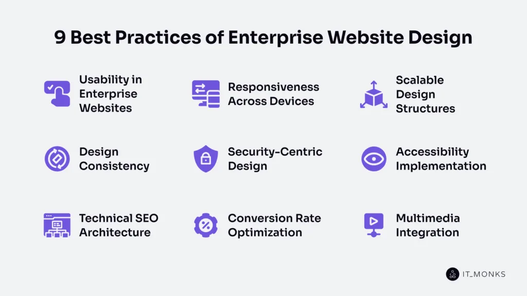
1. Usability in Enterprise Websites
Usability in enterprise websites governs interaction clarity across complex, multi-role task environments. High-load systems demand frictionless workflows in CRM dashboards, ERP modules, and intranet portals, where session continuity and error containment are critical.
Role-based access structures simplify navigation across fragmented business logic. Every UI node must prioritize task-flow clarity to reduce completion time and eliminate ambiguity. System feedback, such as confirmations or error states, becomes crucial for aligning cross-departmental tasks.
Usability in enterprise websites structures decision logic to reduce latency and lower reattempt rates in time-sensitive operations. Redundant fields and unclear CTAs elevate failure rates and drive internal support load. Interfaces must adapt across user agents to resolve fragmentation and ensure operational continuity.
By reducing complexity and guiding predictable interactions, usability lowers onboarding friction, training costs, and support bottlenecks. It governs ERP front-ends, HRIS dashboards, and admin panels, forming the backbone of enterprise design logic.
Usability governs access pathways and feedback loops. When inconsistent across form factors, responsiveness collapses. Without it, device adaptation fails, making usability the prerequisite for scalable, responsive enterprise systems.
2. Responsiveness Across Devices
Responsiveness across devices ensures the ability of enterprise websites to maintain task flow and data integrity across varied hardware environments. It functions as a behavioral guarantee, not a visual enhancement. From smartphones to widescreens, the enterprise website preserves access control logic, interaction consistency, and semantic layout stability.
This multi-device UX ensures operational commands remain recognizable across interface contexts. Role-based access patterns, such as sales on mobile, analysts on desktops, and executives on tablets, require consistent functionality across device types.
Enterprise websites stabilize availability through device-class adaptation: component reflow, breakpoint logic, and input method compatibility. These behaviors adjust layouts for touch, stylus, keyboard, and voice input. Input compatibility prevents degraded task performance across interaction surfaces.
Each device transition imposes structural tests: a broken collapsible menu delays navigation, misaligned charts introduce decision latency, and touchscreen input failures compromise data accuracy. These issues increase errors, delay actions, and escalate support needs.
Responsiveness preserves enterprise system trust by retaining session logic, form state, and user path synchronization during device switching. It supports session continuity across disrupted access events. Enterprise tasks, such as approvals, reports, and configurations, must remain intact across input environments.
Enterprise websites maintain screen-agnostic design to reduce layout shift and stabilize TTI and FID across device groups. This directly improves task fidelity, error reduction, and decision speed. Enterprise website stabilizes TTI and FID values to preserve task performance across platforms. Accessibility depends on responsiveness to ensure inclusive interaction across all devices.
Responsiveness also underpins system scalability. Adaptive component logic across device classes enables modular growth, localization, and custom workflows without regression. Responsiveness connects usability, accessibility, and scalable system behavior into a unified architectural baseline.
3. Scalable Design Structures
Scalable design structures enable enterprise websites to retain clarity, coherence, and performance as systems and demands grow. Governed by modular layout architecture, UI elements function as reusable segments orchestrated within a framework built for inheritance and branching complexity.
Modularity drives expansion tolerance. Each module follows atomic design principles, decoupled from logic and data layers to prevent entanglement. The enterprise website maintains layout inheritance through template-based architecture, adapting grids and navigation to brand and content hierarchy shifts.
The enterprise website propagates resilience through component abstraction, referencing centralized patterns instead of replicating design across departments. This allows redesigns and updates to cascade cleanly across multi-brand environments. Scalable systems support modular delivery across distributed site structures.
At the system level, scalability orchestrates interface continuity using micro frontends and API-federated architecture. Components are decoupled by design, enabling safe, independent deployment and rollback. The enterprise website decouples visual layers from back-end logic to support governance and parallel development.
Scalable design structures ensure collaboration readiness by enabling role-based orchestration. As teams grow, new user roles expand taxonomy without disrupting layout logic. Growth-ready UI frameworks reduce build time while maintaining high reusability rates and consistent interface logic.
Scalability governs sustainability under increasing feature demands and growing content ecosystems. Layout choices, from grid elasticity to template use, must scale without compromising render speed or clarity. These systems absorb traffic spikes and user expansion without degrading the structure.
Scalable design structures maintain enterprise website continuity by abstracting interface complexity into modular, governance-ready systems. They support consistent delivery, rapid iteration, and seamless growth across the digital architecture.
4. Design Consistency
Design consistency structures the uniformity of interface behaviors, visual patterns, and layout structures across an enterprise website. As enterprise systems scale across brands and regions, consistency stabilizes workflows, aligns team outputs, and reinforces system trust.
It propagates visual parity through standardized tokens, defined spacing units, typographic rhythm, and grid alignment. Each element reflects fixed alignment logic within the design system. Behavioral consistency emerges through shared components, predictable interactions, and uniform feedback. This reduces cognitive load and accelerates task performance. Users adapt faster, make fewer errors, and navigate with greater accuracy.
The enterprise website maintains cohesion through atomic UI systems and governance protocols. Component libraries enforce structural rules and prevent arbitrary deviation. Every element traces back to a managed schema. This ensures component-level consistency, grounded in token control and pattern enforcement. Design governance replaces visual styling with semantic clarity, enabling predictable user experiences.
Design consistency structures navigation across menus, pages, and platforms. Multiregional parity requires replicated hierarchies and coherent link logic. Disjointed structures increase confusion, break workflows, and weaken brand continuity. Vertical and horizontal consistency uphold interaction stability throughout the system.
An enterprise website enforces consistency as a usability prerequisite: stable patterns preserve trust, identical behaviors reduce friction, and clear layout grammar improves accessibility precision.
Consistency supports responsiveness, scalability, and accessibility by grounding the interface in rule-based uniformity.
5. Security-Centric Design
Security-centric design governs access constraints and protective behaviors across enterprise website interfaces. It structures interaction as a permission-bound system, where each component enforces visibility and data exposure through role-driven logic. Trust signals are embedded directly into the layout to regulate actions and reduce exploit risk.
Navigation, forms, and modals operate as threat surfaces. Layout states respond to session conditions, while navigation adapts to authenticated roles. Permission-based structures prevent interface elements from appearing outside their scoped visibility. Verified context chains dictate component exposure, transforming user roles into structural access gates.
Security-centric UI patterns apply input restrictions, real-time validation, and isolated error handling: login expirations reset layouts, session timers trigger interface shifts, and inline validation blocks injection attempts and confirms input legitimacy. Each interaction generates a verifiable state, reinforcing a hardened UI framework.
Enterprise websites deploy feedback-governed security flows. Authentication acts as a conditional layout trigger, not a redirect. Secure UX constructs include 2FA prompts, password meters, and expiration alerts. These features validate user legitimacy as part of the interface grammar.
Enterprise security logic must scale with layout contexts. Access rules persist across devices and breakpoints. Encrypted components adapt to screen size without exposing logic. Anti-phishing defenses emerge through deterministic flows and visible trust cues, turning design predictability into containment.
Security-centric design aligns with accessibility and layout consistency. Enterprise websites ensure safe and predictable interaction through a visual structure. Accessibility ensures inclusive access; security enforces protective constraints. Together, they establish trust as a design-level outcome.
6. Accessibility Implementation
Accessibility implementation ensures enterprise websites structure interfaces for equitable interaction across diverse user capabilities and assistive technologies. It governs interface behavior as a semantic design layer, embedding accessibility as a systemic logic.
Components such as form fields and modals expose controlled attributes for visibility, input clarity, and assistive parsing.
Accessibility implementation ensures label associations, constraint messaging, and validation patterns to maintain screen reader compatibility. It structures tab order and focus traps with deterministic logic to support keyboard navigation and real-time orientation.
Enterprise websites align heading levels, skip links, and ARIA roles to define predictable navigation for assistive systems. Multimodal logic, such as alt text, captions, and adaptive themes, is integrated as functional behavior, not decorative add-ons.
It shares enforcement patterns with security and responsiveness, regulating error visibility, input signaling, and layout continuity. In data-dense or role-specific interfaces, accessibility governs content exposure, interaction flow, and semantic mapping under varied cognitive and sensory contexts.
Semantic HTML and role alignment expose underlying logic to assistive technologies, ensuring interaction clarity beyond visual structure.
Accessibility implementation structures trust through readable feedback, error clarity, and constraint signals, reinforcing interface credibility. It adapts layouts to preserve interpretive flow across devices and input modes. Accessible elements reduce friction, enhance usability, and increase retention as part of a sustainable enterprise design system.
7. Technical SEO Architecture
Technical enterprise SEO architecture structures how enterprise website content becomes accessible, interpretable, and indexable by search engines. It defines a governed system where crawl behavior, semantic tagging, and content exposure operate under strict logic.
Robots.txt files restrict or permit entry points, while sitemap.xml sequences the priority of indexation across large domains. These files form the crawlability hierarchy that controls content flow and index scope.
Semantic HTML tags delineate content structure. Elements like `<main>`, `<article>`, and heading levels formalize page segments for machine parsing and indexing. Schema markup using structured data types clarifies content intent by labeling objects, such as organizations, products, and navigation trails, with a defined meaning.
Canonical paths enforce index clarity across duplicative templates, preserving authority and preventing signal fragmentation. Hreflang tags direct language and region-specific versions, maintaining linguistic intent and avoiding misalignment in multilingual indexing.
Performance metrics such as LCP, CLS, and TTFB determine whether content renders fast enough to qualify for crawling and indexing. Rendering logic, such as server-side, static, or hydrated, shapes what the crawler sees, not just when but how.
Structured metadata binds semantic meaning to content components. Internal linking systems govern crawl paths and preserve semantic continuity across deep or broad site architectures. Orphaned pages, broken hierarchies, or misaligned structures waste crawl budget and weaken index presence.
Every indexed asset must be correctly rendered, semantically tagged, and crawl-path validated before it can convert. SEO architecture is not an optimization layer; it is the core framework of the content delivery system.
8. CRO(Conversion Rate Optimization)
Conversion Rate Optimization (CRO) governs the behavioral flow of enterprise website users by aligning interface design with business goals across multi-stage interactions. As a system-level logic, CRO orchestrates how value is prioritized across layout layers to trigger measurable user actions such as form submissions, demo bookings, or quote requests.
Each conversion outcome emerges from coordinated design predicates. CRO sequences behaviors through 5 core levers: value hierarchy clarity, CTA visibility, cognitive-ease-driven layout composition, feedback accessibility, and performance-validated variant testing. These levers reduce interaction ambiguity and shape decision progression across extended enterprise funnels.
CRO applies architectural logic to eliminate scroll friction, simplify form tasks, and embed trust signals, such as certifications, testimonials, and partner logos, within layout flows. CTA placement follows urgency logic: task relevance, expectation alignment, and structural priority over visual preference. Microcopy and interface consistency act as cognitive anchors that align user interpretation with enterprise messaging.
CTA hierarchy directly reduces drop-off risk by guiding users through resolution thresholds with minimal friction. Design choices are validated through structured variant testing, where interaction hypotheses are proven or dismissed via analytics feedback. Session replays, funnel diagnostics, and path segmentation refine future design iterations.
CRO activates only after SEO architecture delivers qualified visibility. Without findability, conversion doesn’t begin; without CRO logic, visibility has no value. Accessibility layers, such as screen reader flow, contrast options, and keyboard readiness, expand behavioral reach and reinforce compliance.
In the enterprise context, conversion rate optimization transforms web interfaces into performance systems that guide, validate, and adapt user behavior through structured design-state interactions.
9. Multimedia Integration
Multimedia integration governs how enterprise websites deploy structured content assets to enhance clarity, support behavior, and reinforce message architecture. Video, audio, and visual elements follow placement logic defined by hierarchy, user pathways, and module visibility thresholds. Each asset is positioned within semantic zones to fulfill specific communicative roles.
Enterprise websites embed captioned videos to improve accessibility and retention. Audio assets are governed by transcript inclusion, caption layering, and screen reader compatibility. Infographics decode complex data through scannable layouts and visual hierarchy, especially on operational or product-dense pages.
Media deployment conforms to responsive behavior rules. Formats like MP4, WebP, GIF, and embedded iframes undergo scalability validation across breakpoints. Interaction elements, such as play toggles, hotspots, scroll-to-play, signal user intent, and align media use with session flow.
Performance is maintained through lazy loading, file compression, and CDN routing. Priority hints manage above-the-fold loading without excess bandwidth. Weight thresholds ensure fast render velocity, with oversized assets trimmed. Schema.org markup and semantic tagging enhance discoverability through structured metadata.
Media assets validate decisions when placed near CTAs or pricing sections. Explainer videos and visual comparisons support claims and guide conversion behavior.
Multimedia enterprise integration aligns with SEO structure, CRO design, accessibility enforcement, and visual consistency. Each asset is embedded with purpose, mapped to context, and optimized for functional delivery across the enterprise website.
Popular Types of Enterprise Web Design
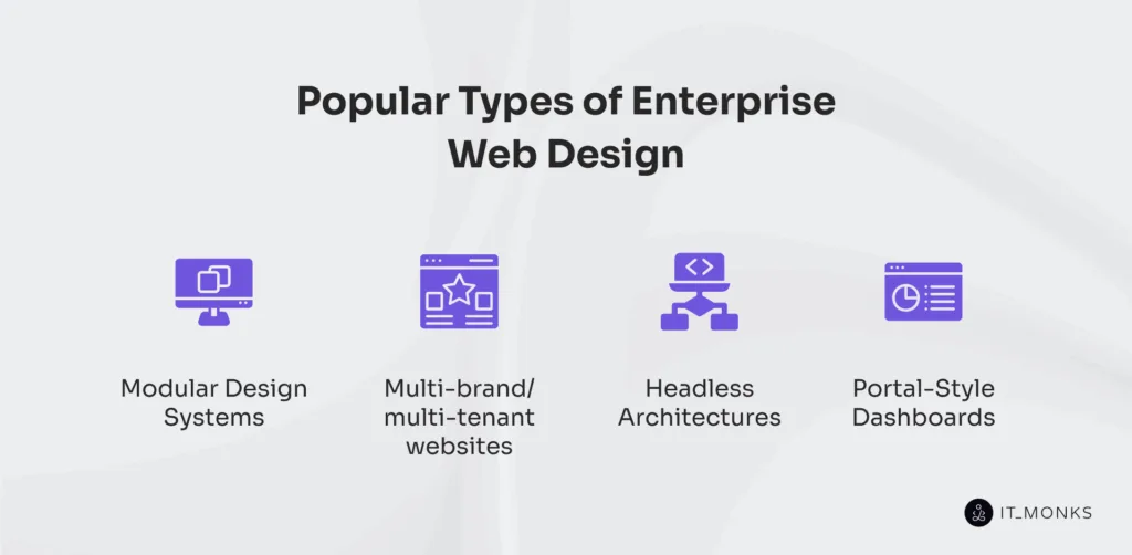
Popular types of enterprise web design are structurally defined systems that shape how enterprise websites manage content delivery, layout behavior, and scalable interaction.
Modular design systems govern component reuse and layout control. The enterprise website structures content into autonomous blocks governed by shared design logic. It enables rapid updates, localized overrides, and task-based UX through consistent module behavior.
Multi-tenant architectures enforce brand separation within shared infrastructure. The enterprise website maps common components to tenant-specific logic and content. It structures governance workflows, enforces publishing control, and isolates layout behavior across segments.
Headless architectures decouple interface logic from content workflows. The enterprise website delivers structured content via APIs across channels and devices. It adapts rendering by role or platform while preserving centralized schema control.
Portal-based dashboards support role-specific interaction through dense, governed UIs. The enterprise website aligns navigation, module layout, and access rules with operational tasks. It structures content visibility, secures workflows, and prioritizes render behavior by context.
Modular systems provide the most scalable, composable foundation for controlling layout behavior and enterprise-level content orchestration. They frame the next stage of structural control.
Is Modular Website Design a Good Solution?
Modular website design is a structurally viable solution for enterprise websites that require scalable layout governance, repeatable design systems, and consistent cross-team implementation. It organizes enterprise websites using reusable, styled components governed by shared design logic. Each unit applies atomic layout rules, abstract presentation and behavior, and inherits controlled design tokens for consistent structure.
Modular architecture scales layout logic via component orchestration and template-driven inheritance. Enterprise websites enable multi-team contribution without design drift or excess technical debt.
Component governance consolidates UI asset reuse and update control within isolated modules. Token-controlled styling propagates changes without disrupting layout coherence or brand rules.
Performance improves through contextual component rendering. Modular systems isolate resource loads and preserve stability across high-volume content environments.
Access control is structured through component-level logic, separating content delivery by roles. This supports authoring independence while enforcing visual and behavioral standards.
Accessibility is embedded at the atomic level. Components carry ARIA roles, contrast logic, and labeling for consistent compliance across reused UI elements.
Cross-brand systems segment visual identity into modular wrappers. Component governance aligns design logic while preserving contextual differentiation.
Constraints may appear when layout demands exceed schema limits. Still, when governance, consistency, and scalability matter, modular design becomes structurally preferable in enterprise systems.

Contact
Don't like forms?
Shoot us an email at [email protected]