Above the Fold

Table of Contents
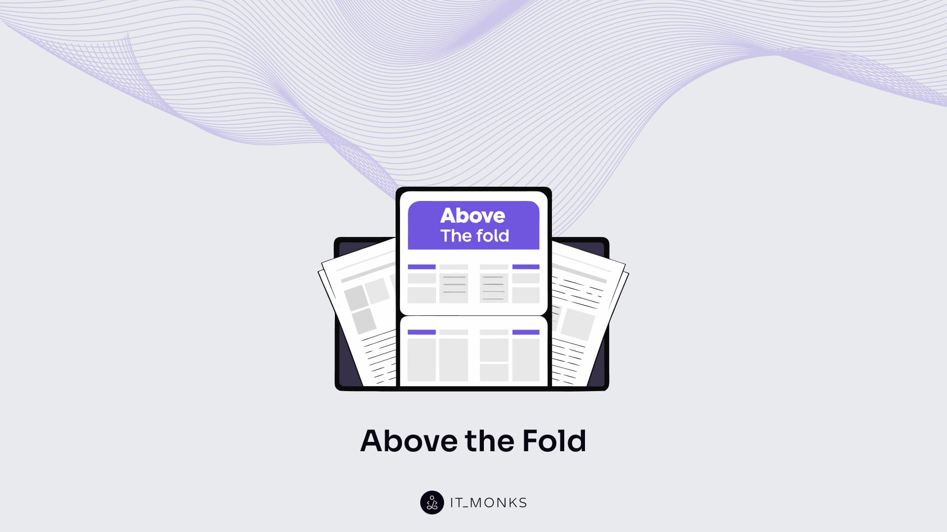
Above the fold is the part of a web page visible in the initial viewport before scrolling.
In WordPress website development, the above the fold content is determined by theme layout, template structure, responsive breakpoints, performance constraints, and content prioritization. Because this first viewport must load quickly, adapt across devices, and convey intent immediately, it directly shapes user attention, comprehension, and readiness to interact.
Structurally, the above the fold content typically contains the primary headline, a supporting value proposition, the primary call to action, brand identifiers such as the logo and navigation, and visible trust signals. Failures in this part of a web page usually stem from unclear messaging, weak visual hierarchy, poor content prioritization, or missing credibility cues, all of which affect first-screen usability.
Above-the-fold quality is assessed through observable attributes, including message clarity, visual hierarchy, responsiveness, load speed, and interaction readiness. Unlike the below the fold content, which supports deeper exploration and task completion, the above the fold part establishes expectations and direction, enabling effective engagement throughout the rest of the page.
What is Above the Fold?
Above the fold is the part of a web page that appears in users’ viewports on the first screen, before they scroll down. Above the fold is the visible viewport in digital interfaces, where the “fold” marks the limit of immediately visible content on page load.
Above the fold depends on screen size, device type, browser interface, and responsive breakpoint, which means the boundary varies across desktops, tablets, and mobile devices rather than aligning to a fixed pixel height (px) or a viewport percentage (vh).
In WordPress website development, above the fold content is constrained by template structure, header or hero placement, responsive layout behavior, and performance budgets, because these implementation decisions determine what is rendered first and how quickly it becomes visible in milliseconds (ms) or seconds (s), especially in mobile-first and modern front-end environments.
Above the fold includes only high-priority content at the category level, such as the primary message, essential navigation cues, visible trust signals, and an initial action prompt, establishing visual hierarchy and orientation without overloading the page.
Why Above the Fold Matters?
Above the fold governs the first screen users encounter the moment a page loads, shaping how they immediately classify the page as relevant or irrelevant. It influences first-screen comprehension by determining whether the page’s message is clear, hierarchically organized, and aligned with user intent within the visible viewport.
Because users make an early relevance decision in this part of a web page, above the fold signals credibility and reduces uncertainty through immediately visible cues such as orientation, navigation paths, and trust indicators.
Above the fold supports interaction readiness by prioritizing visible navigation and a clear action prompt, connecting early comprehension to measurable outcomes, like engagement and conversion rate.
Above the fold matters only if its content is actually perceivable on real devices, meaning its impact depends on viewport size, responsive layout behavior, and rendering performance rather than on abstract design intent.
Key Above the Fold Elements
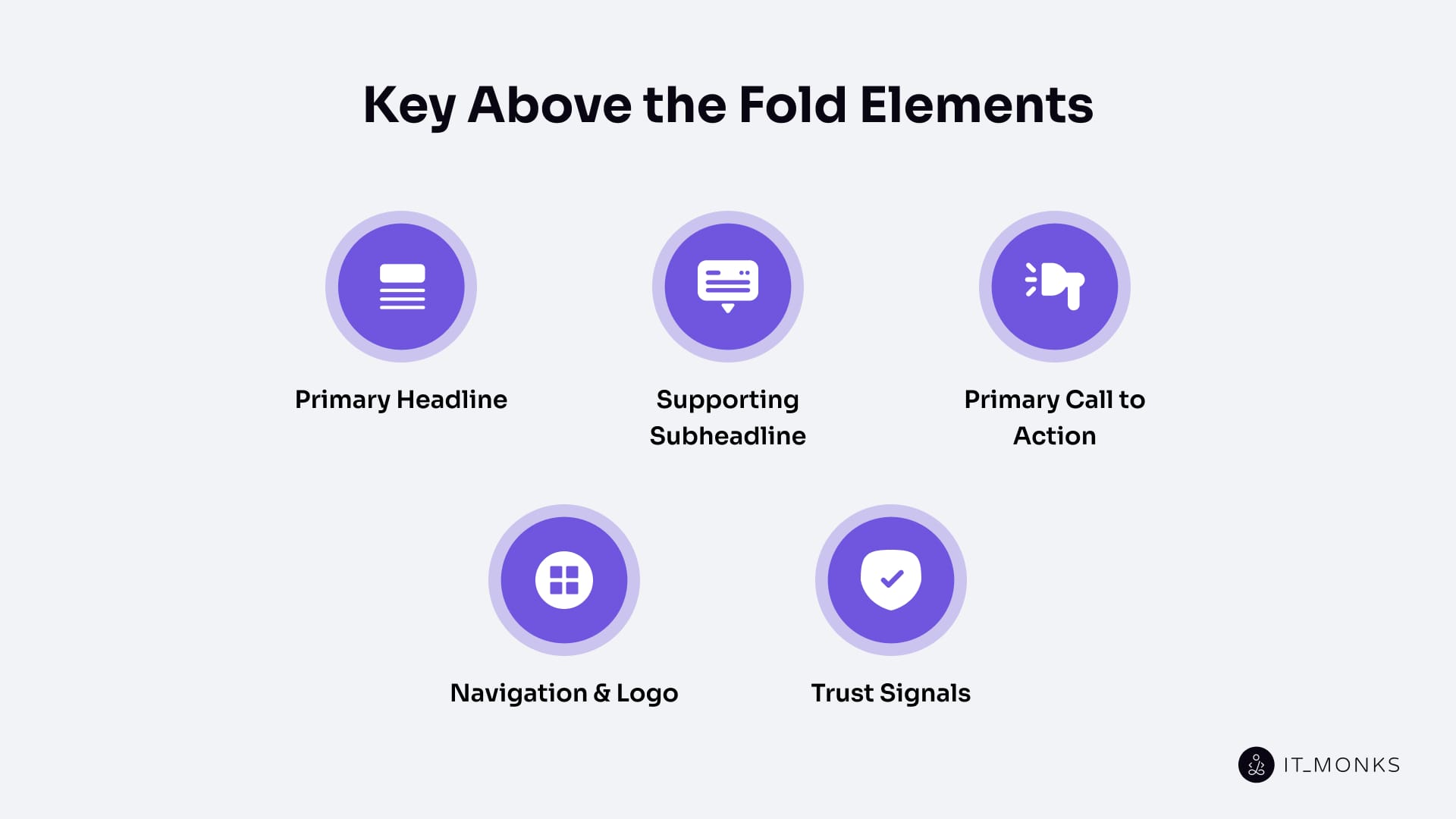
Primary Headline
Primary headline is an element that states the page topic as the first interpretable text node on the first screen. It anchors intent by naming the topic with high specificity and low ambiguity, thereby establishing visual hierarchy and framing relevance within the viewport.
Primary headline also constrains the supporting subheadline/value proposition and the primary CTA that follow, because those elements depend on the headline’s topic meaning to remain consistent and interpretable.
The primary headline depends on first-screen visibility and must maintain the same meaning across devices and responsive breakpoints, since the fold boundary is viewport-dependent.
Supporting Subheadline or Value Proposition
A supporting subheadline or value proposition clarifies and narrows the primary headline by adding the minimum attributes needed to understand what the page offers and who it is for.
Supporting subheadline/value proposition specifies the offer by exposing key attributes such as scope, benefit, audience, constraint, or outcome, which improves message clarity and perceived relevance without introducing new topics. It aligns with the primary headline to disambiguate intent and enables the primary CTA by grounding the next step in the offer rather than making it arbitrary.
Supporting subheadlines/value propositions depend on first-screen readability and must remain semantically stable across viewport sizes and responsive breakpoints.
Primary Call to Action (CTA)
A primary call to action (CTA) is an above the fold element that distills the page’s meaning into a single intended user action on the first screen. It guides action selection by operationalizing the intent expressed in the primary headline and specified in the supporting subheadline/value proposition, preventing the first screen from being merely descriptive.
Primary CTA aligns its action predicate with upstream meaning, keeping the verb and object low-ambiguity and intent-consistent, and it reduces uncertainty by clarifying what happens next.
The primary CTA depends on first-screen visibility across devices and is supported by navigation and logo, plus trust signals, because orientation and credibility cues make the action interpretable and safe within the same viewport.
Navigation and Logo
Navigation and logo are above the fold elements that provide orientation and identity confirmation on the first screen. Navigation guides user paths by exposing primary routes to key sections or pages, while the logo confirms site identity at a glance, reducing disorientation and stabilizing context in the viewport before scrolling.
Navigation and logo support interpretation of the primary headline and supporting subheadline/value proposition by answering “where am I?” and “how do I move?”, and they reduce friction around the primary CTA by making the page feel predictable and navigable.
Navigation and logo depend on consistent first-screen presence across responsive layouts and template variations in WordPress website development, because the above the fold boundary shifts with viewport size and breakpoint behavior.
Trust Signals
Trust signals are the elements that reduce perceived risk and increase credibility at first glance within the viewport before scrolling. They validate the value proposition by providing immediately readable evidence cues that address credibility questions early, reducing uncertainty and increasing confidence in the Primary CTA.
Trust Signals support the headline → value proposition → CTA chain by substantiating the offer rather than redefining it, keeping first-screen meaning coherent and believable. They depend on first-screen visibility and legibility across viewport sizes and responsive breakpoints, because credibility cues lose function when they are delayed, hidden, or unclear.
Common Above the Fold Mistakes
Common above the fold mistakes describe the recurring ways the first viewport fails to communicate meaning, credibility, or direction, breaking the dependency chain that should guide users before they scroll.
Meaning-related failures often appear first. When the primary headline lacks clarity or contains high polysemy, the page topic becomes ambiguous, weakening intent recognition and reducing first-screen comprehension. Similar breakdowns occur when the supporting subheadline or value proposition introduces intent mismatch (either by adding unrelated claims or by failing to specify scope, benefit, or audience), diluting relevance and destabilizing the headline’s meaning.
Action clarity is commonly disrupted at the primary CTA level. Multiple competing CTAs or vague action verbs overload attention, distract from the intended next step, and reduce interaction readiness. Even a visible CTA becomes ineffective when it is semantically misaligned with the headline and value proposition, because the meaning-to-action link no longer holds.
Orientation and trust failures further weaken the first viewport. Poorly emphasized or missing navigation and logo elements increase friction by obscuring wayfinding and identity cues, making the page feel less predictable. In the same way, absent or unclear trust signals raise perceived risk, reducing confidence in the offer and weakening acceptance of both the value proposition and the CTA.
Delivery and visibility issues often compound these problems. Responsive breakpoint errors can hide, compress, or reorder critical elements, breaking visual hierarchy within the viewport. Slow render times or layout instability (measured in milliseconds or seconds, or observed as shifts in px and vh) delay perception, distract attention, and reduce scroll continuation.
How to Evaluate Above the Fold Quality?
Evaluating above the fold quality means determining whether the first viewport delivers clear meaning, credible context, and a coherent next action, and whether that experience is reliably perceived across devices. Quality exists only when the first screen communicates effectively and remains visible, stable, and responsive, because users decide whether to continue based on what they can understand and trust without scrolling.
Topic clarity forms the foundation of first-screen quality. The primary headline should anchor meaning with low ambiguity and minimal polysemy, enabling immediate recognition of relevance within the viewport. When the topic is unclear at this stage, the entire first screen lacks a stable semantic reference, weakening every downstream element.
Specificity determines whether that initial meaning becomes actionable. The supporting subheadline or value proposition should expose the essential attributes (such as scope, benefit, audience, or outcome) that give the headline substance. If these attributes are vague or missing, intent match deteriorates, and the first screen feels non-committal, even when the topic itself is identifiable.
Direction emerges only when a clear next step is present. The primary CTA should express one dominant, low-ambiguity action that aligns with the meaning established above it. When the CTA is generic, misaligned, or competing with other actions, interaction readiness breaks and understanding fail to translate into movement.
Context stability reinforces confidence at this stage. Navigation and logo should immediately establish identity and orientation, while trust signals should reduce perceived risk by validating credibility at a glance. Weak orientation or insufficient trust cues increase uncertainty, making even a clear message and CTA feel unsafe to act on.
Delivery ultimately determines whether any of this semantic work is perceived. The first viewport must remain visible, stable, and responsive across real devices and responsive breakpoints. Performance and layout behavior gate quality, which is why real-user Core Web Vitals at the 75th percentile (such as LCP ≤ 2.5 s, INP ≤ 200 ms, and CLS ≤ 0.1) are critical indicators of whether the first screen can be reliably processed.
Behavioral signals provide confirmation rather than definition. Engagement rate, primary CTA key events, scroll continuation, and bounce rate reflect whether users understood and acted on what they saw first, but these outcomes must be interpreted by device and traffic source because they are multi-causal. When semantic clarity and delivery stability align, these signals tend to corroborate quality, establishing a clear boundary between what must succeed above the fold and what can meaningfully extend the experience below it.
Above the Fold vs Below the Fold
Above the fold is the part of a web page visible in the viewport on the first screen, without scrolling or any further user action. Below the fold is the part that is not visible on initial load and requires scrolling to become visible.
Above the fold is viewable without scrolling, making it the lowest-interaction-cost part of a web page and the first zone users consider when deciding whether a page is relevant, trustworthy, and worth engaging with. Below the fold is hidden initially and becomes visible only after scrolling, which introduces an extra action and therefore depends on the first screen providing enough value cues, often described as information scent, to justify that effort.
Thus, above the fold functions as the first interpretation and decision zone, while below the fold functions as the continuation and expansion zone where details, depth, and supporting content can unfold.
The position of the fold varies by device size, viewport dimensions, browser UI, and responsive breakpoints, which means a single page can effectively have multiple folds across mobile, tablet, and desktop layouts. In WordPress website development, this variability is shaped by themes, templates, and responsive layout behavior, but it does not change the underlying roles: above the fold must motivate scrolling or action, and below the fold fulfills and extends the promise introduced in the first screen rather than compensating for a weak one.


Contact
Don't like forms?
Shoot us an email at [email protected]