Media Query Complete Guide

Table of Contents
Media queries are the conditional CSS logic that adapts a WordPress website’s layout and styling based on viewport width, resolution, orientation, and user preferences.
Integrated through WordPress theme stylesheets or exposed in page-builder responsive controls, media queries determine how CSS rules react to breakpoints and configure adaptive behavior for navigation, typography, spacing, and component visibility.
CSS layout systems, including Flexbox, CSS Grid, and container-based layouts, use responsive conditions to determine styling outcomes, and media queries provide the device-targeting layer that aligns layout rules with responsive requirements within WordPress themes, custom CSS panels, and visual builders.
What Is a Media Query in Web Design?
A media query is a conditional CSS rule that checks a device’s properties, such as width, height, orientation, and resolution, to decide which style rules a webpage should apply. It creates a conditional layer in the CSS cascade where the browser evaluates these media properties and activates the matching styles.
A CSS rule wrapped in a media query enables targeted styling and controls how layouts adapt to changes in viewport size or device characteristics. This ensures that style declarations activate only when the device environment meets the specified criteria.
Within a WordPress theme, a media query determines how the theme’s CSS architecture applies layout adjustments at defined breakpoints. Theme stylesheets and page-builder frameworks generate these conditional rules to control typography scaling, navigation behavior, grid structure, and overall layout rendering.
Because these breakpoints are encoded directly in the stylesheet, they form the structural map that dictates how the interface transitions across display environments.
Media queries, therefore, establish the link between device evaluation and CSS rule activation, forming a core mechanism for consistent layout behavior, visual stability, and mobile adaptation in WordPress-based designs.
How Do Media Queries Work?
A media query evaluates the rendering environment and applies CSS only when its condition resolves to true. The browser parses the @media rule, filters by media type, evaluates media features, applies logical operators, and injects the matched declarations into the cascade.
Inside an @media block, the syntax container and rule body execute only when the query matches. Media types establish the initial filter, logical operators combine constraints, and range syntax defines comparative boundaries.
Each media feature, such as width, height, aspect-ratio, orientation, resolution, pointer accuracy, or user-preference settings, acts as a measurable property. When the Boolean expression evaluates to true, the applied ruleset controls layout behavior in Grid and Flexbox, fluid typography, and functions such as clamp().
In a WordPress theme, this cycle is identical: theme stylesheets and page builders resolve breakpoints, adapt components, and inject inline rules through wp_add_inline_style() under the same matching logic. Container queries evaluate container dimensions rather than the viewport, but follow the same parse-evaluate-apply model, supporting more modular responsive web design in block-based layouts.
Media Query Syntax
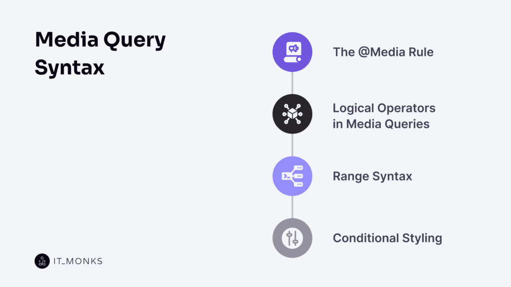
Media query syntax is the rule structure that governs how CSS applies styles conditionally based on device or user context. It contains a rule condition that targets specific media features and a conditional style block that applies declarations when the condition evaluates as true.
The @media at-rule serves as the wrapper for both the condition and the declaration block. Logical operators connect or negate feature expressions, allowing multiple requirements to be evaluated as a single statement.
Range syntax defines threshold comparisons, including minimum, maximum, or interval values, that control when layout adjustments activate across widths, heights, resolutions, or other measurable attributes. When these comparisons match the current device context, the corresponding declarations are applied in the cascade.
As a structured system, media query syntax combines the @media rule, logical operators, range expressions, and the declaration block to define the grammar that drives responsive rendering across WordPress themes, page builders, and custom CSS workflows.
What Is the @media Rule?
The @media rule is a CSS at-rule that defines the conditional block used to control when a group of styles becomes active. It wraps the media query condition, including the media type and media feature tests, and the rule set that contains the declarations. This structure forms the media query block and establishes the boundary between static styling and condition-based rendering logic.
The browser evaluates this media query block whenever relevant environment factors change and checks whether its media type and media feature requirements match the current state. These conditions may include viewport size, orientation, resolution, or user preference settings. When the condition is true, the associated CSS declarations become active.
As the primary responsive styling container, the @media rule provides the outer scope for logical operators, range syntax, and conditional styling.
In WordPress stylesheets, whether theme-based, plugin-generated, or inserted via inline CSS, the @media rule functions as the required syntax wrapper that initiates and governs responsive behavior across different display contexts.
What Are Logical Operators in Media Queries?
Logical operators define how media types and media features interact within a media query, creating the conditional chain that controls when a CSS rule activates. The operator performs feature conjunction, so all conditions must be true.
It does not apply type negation by excluding a specific media type or inverting a condition. The operator only enforces restrictive targeting, so a query applies solely to the defined media type.
These operators establish the Boolean logic of the @media rule, determining whether a responsive rule triggers under single, combined, or excluded states.
In WordPress theme CSS, builder rules, and custom blocks, they govern breakpoint evaluation and rule activation.
What Is Range Syntax?
Range syntax is the threshold values inside a @media rule that determine when its CSS block activates. It uses dimension expressions such as min-width, max-width, min-height, and resolution checks, each tied to a media feature and a numeric unit expression that the browser continuously evaluates.
The browser tests the current feature value against the declared threshold. Expressions create a viewport range that governs breakpoints, producing a condition match when the device state satisfies the requirement. A rule like min-width: 768px activates only when the viewport width meets or exceeds that threshold; max-width restricts activation to values below that limit.
These threshold expressions structure breakpoint logic across responsive layouts. WordPress themes and page builders use the same model, relying on values like max-width: 767px for mobile and min-width: 1024px for desktop, mapped directly to viewport width.
Once the range is satisfied, style activation occurs, and the media query applies its conditional styling block.
What Is Conditional Styling?
Conditional styling is the output layer where the browser applies visual changes after evaluating media type, features, logical operators, and range syntax.
It executes the CSS rule block inside a media query when its condition is true.
When the query matches, the browser activates the selector block, injects its declarations, and overrides or extends base styles. This style execution adapts grids, flex behavior, spacing, and typography based on breakpoint conditions. The CSS is context-triggered, not a secondary style set.
Conditional design logic ensures layout changes occur only after a successful rule match. The final CSS block applies when all conditions are satisfied.
In WordPress, conditional styling controls responsive adjustments in theme CSS, block editor output, and page-builder styles. A matched media query modifies components, performing a rendering override, resizing text, reorganizing columns, toggling visibility, and adapting container spacing, producing the visible media query effect.
What Are Media Features in Media Queries?
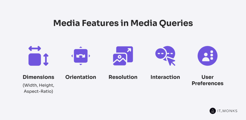
A media feature is the core device-specific condition that a media query targets and evaluates. It exposes a measurable device attribute, such as viewport width, orientation, resolution, pointer type, or user color-scheme preference, that the browser measures at render time.
The browser then compares that measurement to the feature’s declared value or range, using defined measurement units and display thresholds to determine whether a feature match occurs. When the condition is met, the media query applies the associated CSS as part of condition-based styling.
Media features function as the test variables inside a media query. They enable the browser to detect, filter, and trigger styles based on responsive criteria, allowing layout, typography, interactions, and accessibility rules to adapt to the rendering context. This evaluation process is essential in modern CSS and WordPress theme development, where breakpoints and responsive adjustments depend on accurate feature measurements.
Media features fall into 5 categories:
- Viewport dimensions control layout scaling and breakpoint logic
- Orientation selects directional layout variants
- Resolution adjusts asset density and visual fidelity
- Interaction features respond to pointer type and hover capability
- User preferences activate reduced-motion or color-scheme adaptations
Dimensions: width, height, aspect-ratio
Width, height, and aspect-ratio are core media features that a media query evaluates to determine the viewport size in CSS pixels. They expose the dimensional conditions used to trigger responsive layout changes.
Width defines the horizontal viewport size and is the primary CSS breakpoint threshold, controlling when styles activate via min-width and max-width.
Height defines the vertical viewport size and supports height-based adjustments on layouts with limited vertical space.
Aspect-ratio compares width and height as an aspect condition, enabling layout decisions based on screen proportions rather than raw size.
These features operate through range syntax (min-width, max-height, min-aspect-ratio) to establish responsive thresholds. In WordPress, such thresholds map directly to layout breakpoints for mobile, tablet, and desktop views.
The browser continuously evaluates these values and applies conditional logic that governs responsive containers, content reflow, and overall WordPress layout structure.
Orientation
Orientation is a media feature that detects viewport direction and evaluates whether the screen is in portrait (height > width) or landscape (width > height). As a binary state, it triggers layout changes on a viewport flip without relying on numeric ranges.
Used alongside width or aspect-ratio, orientation refines responsive logic by adding a directional input. It adapts styles immediately when the screen changes direction and must not be confused with aspect-ratio, which is proportional rather than state-based.
In WordPress themes and page builders, orientation queries allow layout overrides even when the width stays constant, enabling components to shift, navigation to reposition, and interface behavior to adapt to the viewport direction.
Resolution
Resolution is a media feature that evaluates the pixel density of a device screen, measured in dpi or dpcm. A query such as @media (min-resolution: 192dpi) triggers when the device’s density meets that threshold, while @media (max-resolution: 150dpi) targets lower-density displays. Resolution checks density only, so it does not affect layout; it controls how sharply images, icons, and fine UI elements render on HiDPI and Retina screens.
When the resolution condition matches, the browser can swap image assets, improve icon clarity, or adjust borders and line weights to maintain visual accuracy across density levels. This enables precise pixel-density matching and efficient asset optimization.
In WordPress themes and plugins, resolution queries support conditional asset loading, allowing high-density variants to be delivered to compatible devices. They are often combined with width or orientation queries to maintain both screen clarity and responsive layout behavior.
Interaction
Interaction media features detect user input capability by evaluating hover ability and pointer precision, allowing CSS to adapt UI behavior based on the input device condition rather than viewport size.
The hover feature identifies whether the primary device can maintain a hover state: hover: hover detects hover-capable devices, while hover: none differentiates touch systems where hover is unavailable. The pointer feature measures targeting accuracy: pointer: fine identifies high-precision input, pointer: coarse responds to finger-based input, and pointer: none enables non-pointer adaptation when no pointing mechanism exists.
Together, these features establish conditional UI logic that adjusts hover behaviors, target sizes, and precision-dependent interactions across device types.
In WordPress themes and builders, interaction queries apply device-specific menu behavior, hover handling, and responsive controls by mapping styles to input capability and device-type behavior, ensuring consistent interaction across mouse, touch, and hybrid environments.
User Preferences
User-preference media features expose a user’s accessibility and appearance settings to CSS through browser-reported system preferences. They allow style rules to respond to motion sensitivity, color-scheme selection, and contrast requirements without JavaScript or manual toggles.
prefers-reduced-motion reports a request for minimized animation, enabling CSS to limit transitions or motion effects. prefers-color-scheme indicates whether to use dark or light mode and applies the corresponding palette. prefers-contrast signals a high-contrast preference, allowing CSS to increase contrast ratios or adjust spacing and boundaries. Additional features, such as prefers-reduced-transparency or inverted-colors (when supported), provide further adaptation paths.
These features reflect user-defined accessibility preferences. Modern WordPress themes and design systems integrate them so animation, color schemes, and contrast values automatically align with the user’s environment.
Which Media Types Can Be Targeted?
CSS media queries can target the following media types: all, screen, print, and speech, with legacy media types such as tty, tv, and braille rarely used. A media type is a high-level device context that determines whether the browser should evaluate any further conditions. If the media type does not match the active render medium, the media query is ignored.
all matches every output context and defaults when no type is specified.
screen targets devices with a visual display, including phones, tablets, laptops, and monitors.
print applies during print or PDF rendering and is used for print stylesheets that adjust layout or hide interface elements in WordPress templates.
speech targets audio-based rendering systems that vocalize page content.
Media types serve as the first content-filtering layer, while modern responsive design primarily depends on media features such as width, orientation, and resolution.
Most queries omit a type because all is implicit, but explicit types remain necessary for tasks like print-specific styling or audio-oriented output.
Common Breakpoints for WordPress Media Queries
Breakpoints are layout thresholds defined by specific viewport-width conditions that trigger a style transition. When the viewport crosses this threshold, the layout reflows, components resize, and the WordPress layout enters a new responsive state.
In a mobile-first workflow, breakpoints commonly use min-width for upward scaling and max-width to constrain narrower screens.
A breakpoint maps to a trigger condition whose value is a CSS-pixel width; the media query provides the control logic that activates rules at that rendering breakpoint. These thresholds appear in the theme CSS, WordPress builder controls (Elementor, Gutenberg, Divi), and custom CSS panels.
Common WordPress ranges include:
- ≤ 480–600px: mobile layout with stacked structure and reduced component width.
- ≥ 768px: tablet layout enabling two-column or widened grid/flex configurations.
- ≥ 1024px: desktop layout with expanded content areas and persistent sidebars.
- ≥ 1440px: large-screen layout with extended container widths and increased spacing.
These values are widely used but not fixed standards. A breakpoint is a style transition point determined by how content scales as space changes. Layouts may require additional or earlier breakpoints if elements compress, overflow, or stretch outside expected ranges.
Modern CSS methods, such as CSS grid, flexbox, fluid typography, and especially container queries, enable responsive behavior based on component size, allowing breakpoints to match actual content requirements rather than global screen widths.
What Other CSS Tools Work With Media Queries?
Container Queries
Container queries apply a responsive condition based on container size. They evaluate a parent element’s width or height and apply styles when that local threshold is met, enabling element-level logic that decouples components from global breakpoints. Unlike media queries, they scope responsiveness to the component’s layout context.
This lets WordPress blocks adapt consistently across sidebars, columns, and nested grids, supporting modular styling and parent-aware adjustments in block themes and page builders. In practice, a container query determines how a block behaves across different layout scopes.
@container rule
The @container rule is a conditional CSS block that applies styles when a parent container satisfies a specified size condition. It mirrors the @media rule but evaluates container dimensions instead of the viewport. Here is an example:
@container (min-width: 400px) {
  .component {
    font-size: 1.2rem;
  }
}
The rule wraps conditional styles, checks the parent container’s size, and activates the enclosed declarations when the size threshold is met. This produces local responsive logic, enabling element-level style changes tied to the component’s layout context.
The @container block governs container queries and activates only when a container-enabled parent (using container-type) crosses the defined size. This supports component-level responsiveness in WordPress themes, allowing blocks to adapt based on the container they occupy rather than global breakpoints.
CSS custom Properties
CSS custom properties define reusable style variables (–name) accessed with var(–name). They participate in the cascade, resolve at computed-value time, and can be inherited or overridden in any scope, including inside media or container queries.
When redefined in a query, the property functions as a responsive token: the query supplies the override, and any declaration using var(–name) updates automatically. This centralizes responsive logic, reduces duplication, and preserves a consistent value cascade.
Custom properties manage spacing, typography scales, and color modes across breakpoints while allowing components to reference unified values. Each rule treats the property as its value source and inherits or overrides it as required by context.
In WordPress theme development, custom properties operate as shared layout tokens for gaps, font scales, and color sets. Redefining them per breakpoint lets the WordPress style system, including theme.json, maintain unified, query-responsive values across blocks and templates with minimal repeated CSS.
CSS grid
CSS grid is a two-dimensional layout system that controls rows, columns, and named grid areas, providing a responsive foundation for WordPress layouts. Through track definitions and area mapping, Grid adapts to viewport changes without relying on legacy float techniques.
Inside a media query, grid updates track sizes, reflows multi-column structures, and remaps template areas as breakpoints change. The media query determines when these track or area adjustments activate.
In WordPress section layouts, grid maps block regions to structured areas and maintain consistent alignment. Developers modify grid rules within media queries to adjust track density, column flow, and area allocation across device sizes.
Flexbox
Flexbox is a one-dimensional layout model that controls directional layout and alignment inside a flex container. In responsive design, media queries modify Flexbox behavior by switching flex-direction for directional layout shifts, updating justify-content and align-items for responsive alignment, and enabling flex-wrap for content wrap during layout reflow.
In WordPress, Flexbox governs the flow of menus, button groups, block rows, and form elements, allowing each WordPress layout element to adapt, stack, or reflow at defined breakpoints. While Grid manages two-dimensional layouts, Flexbox specializes in single-axis, breakpoint-driven alignment conditions essential for responsive component behavior.
Fluid Typography
Fluid typography is a responsive sizing method in which font sizes scale with the viewport width, using units like vw or calculated expressions like clamp(). It produces smooth size transitions, maintains proportional text hierarchy, and reduces the number of media-query font-size overrides while still allowing controlled min/max limits.
In WordPress themes, block templates, and page builders, fluid typography integrates with the theme’s responsive CSS, works alongside media queries when boundaries are defined, and keeps component text consistent and readable across different screen sizes.
Clamp()
Clamp() is a CSS function that sets a responsive value bounded by a minimum, a viewport-relative preferred value, and a maximum. With the clamp(min, preferred, max) structure, the preferred value scales fluidly while the min–max values enforce size limits.
It provides precise control over fluid typography, spacing, and layout dimensions, maintaining readable scaling boundaries without additional media queries.
In WordPress themes, block styles, and builder interfaces, clamp() applies bounded responsive values to text, buttons, and container elements, reducing breakpoint overrides and preserving consistent proportions across devices.
What’s the Best Way to Add Media Queries in WordPress?
The best way to add media queries in WordPress is to place them in the theme’s main CSS file. This centralizes responsive rules inside the core stylesheet and ensures consistent loading order, caching behavior, and integration with grid, flexbox, and custom-property systems.
Theme-level queries align with component breakpoints and maintain stable responsive behavior across layouts.
wp_add_inline_style() allows PHP-generated conditional CSS, injected at runtime as targeted overrides.
Page builders expose their own responsive controls, generating device-based styles that act as builder-level overrides for component-specific adjustments.
All methods are valid, but the theme stylesheet provides the most scalable and maintainable integration point for responsive rules.
Add Media Queries in theme CSS Files
Placing media queries in the theme’s main CSS file, usually style.css or an enqueued stylesheet, is the preferred WordPress method because it loads with core layout rules, preserves the cascade order, and aligns responsive logic with established CSS breakpoints, custom properties, and layout systems like Grid, Flexbox, and fluid typography.
Centralizing queries here keeps global and component-level breakpoints consistent, maintains unified style architecture, and provides reliable versioning and caching.
This approach ensures design consistency, predictable viewport behavior, and a single authoritative location for all responsive rules.
Add Inline Styles Using wp_add_inline_style()
wp_add_inline_style() attaches and appends inline CSS to an enqueued stylesheet, enabling PHP-generated rules and runtime media queries based on user settings, theme-customizer values, plugin options, or page-specific conditions.
The function scopes the injected CSS to the target handle, ensuring the output follows normal cascade behavior while supporting conditional rule injection, plugin-generated CSS, and user-defined responsiveness such as custom breakpoints or layout adjustments.
Because the inline CSS loads after the main stylesheet, it can override earlier declarations but should be limited to dynamic or context-driven styling, as it is not ideal for long-term maintainability. wp_add_inline_style() is therefore best used for runtime styling logic, dynamic layout conditions, and responsive rules that cannot be predefined in theme files.
Use Page Builders with Responsive Controls
Page builders with responsive controls provide a visual layout control interface that maps device-specific settings to CSS media queries. Each responsive setting in the visual editor outputs builder CSS that applies layout conditions at defined device breakpoints, abstracting the underlying media query logic while still producing standard CSS in the builder stylesheet or inline.
Each breakpoint maps to an auto-generated style rule, and adjusting a WordPress block for desktop, tablet, or mobile outputs a scoped media query rule. These block-level declarations can override theme CSS, so coordinating builder and theme styles avoids layout conflicts.
In WordPress workflows, this media query abstraction controls block-level responsiveness. Visual inputs still generate conditional styling that responds to active breakpoints, supporting modular layouts while relying on standard CSS behavior for consistent rendering.
How to Test Media Queries in Your WordPress Site?
Media query testing verifies that each CSS condition triggers at the correct breakpoint and that the expected responsive layout is applied in the WordPress environment. It confirms layout reflow accuracy and verifies that spacing, typography, and fluid values scale according to the defined rules.
Testing also checks for conflicts between CSS sources, such as theme stylesheets, PHP-generated inline rules, and builder output, by inspecting which declaration becomes active at each breakpoint to detect overrides or duplicated conditions.
Through device simulation, responsive previews, and real-time viewport resizing, browser developer tools reveal when media queries activate and which stylesheet supplies the effective rule. Manual resizing helps surface subtle alignment, flow, or scaling issues.
WordPress block editor previews and builder responsive modes expose inconsistencies caused by conditional visibility settings or device-specific wrappers.
Effective testing ensures stable, responsive behavior and prevents layout overlaps, grid breakage, interaction issues, or inaccessible elements across devices.
Contact
Don't like forms?
Shoot us an email at [email protected]