Responsive Images in WordPress Web Development

Table of Contents
A WordPress website uses a responsive image to adapt visual assets to screen resolution, pixel density, and layout width. This adaptation supports responsive web design by improving page speed, bandwidth efficiency, device compatibility, and visual rendering.
A responsive image is stored in the WordPress media library as multiple size-specific variants. A WordPress site exposes these variants through template-based render logic, allowing the theme to embed and deliver the correct file. A website relies on the browser to detect viewport constraints and interpret srcset and sizes.
Responsive images define their screen-specific attributes using these values, which WordPress processes within its media-handling model.
A WordPress website depends on this adaptive delivery to reduce load time, maintain accurate rendering across devices, and strengthen performance-related SEO signals.
What Are Responsive Images in WordPress?
Responsive images in a WordPress website are screen-specific visual assets that adapt to viewport width, screen resolution, pixel density, and device type. WordPress generates multiple image size variants through the media library, producing auto-generated sizes that support device-specific rendering within a fluid layout and across compatible file formats.
These behaviors align directly with the principles of responsive web design, in which assets adapt to layout constraints and device capabilities.
During template output, a WordPress theme inserts an <img> tag with srcset and sizes attributes. The browser reads this markup, detects device constraints, evaluates breakpoints and available variants, and chooses the file that fits the visual context. This source selection logic directs how images are served, scaled, and delivered to maintain image quality while reducing bandwidth.
The media library supplies the variant set, and the theme exposes it through structured markup. The <img> element functions as the responsive layer, while the media library and the theme form WordPress’s native system for rendering, optimizing, and aligning images with mobile responsiveness and visual scaling requirements.
This WordPress-native rendering process establishes the basis for the HTML elements, responsive attributes, and theme-level image controls.
Which HTML Elements Support Responsive Images?
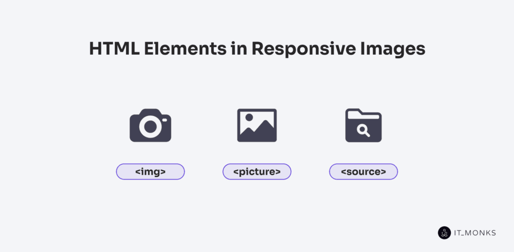
Responsive images in HTML are supported by 3 core HTML elements: <img>, <picture>, and <source>. Each element enables responsive image behavior via tag-level attributes that guide the browser’s selection based on device conditions. In WordPress, theme rendering logic outputs these elements and applies the responsive attributes that the browser consumes.
The <img> tag provides intrinsic responsiveness through srcset and sizes. The <picture> element wraps <img> to enable format-driven and layout-based switching. Within it, <source> tags define conditional, breakpoint-controlled rules that determine which file is rendered.
What Attributes Make the <img> Element Responsive?
Responsive behavior in the <img> tag is enabled by 2 attributes: srcset and sizes. The srcset attribute defines a list of candidate image files at different widths or resolutions, allowing the browser to select the file that best matches the device’s pixel density before applying layout conditions.
The sizes attribute determines the expected display width based on viewport rules, enabling the browser to interpret the srcset list correctly and select the smallest file that meets the visual requirement.
When WordPress renders images, these attributes are applied automatically through functions such as wp_get_attachment_image() and the_post_thumbnail(), ensuring each <img> tag adapts to viewport conditions and improves file-resolution matching and performance.
When Should You Use the <picture> Element?
The <picture> element should be used when an image must switch formats or compositions based on browser capability or viewport context, and when the <img> tag cannot express these conditions. Typical cases include format switching, such as preferring AVIF or WebP with fallback to JPEG or PNG, and art direction, where the visual composition changes across breakpoints rather than scaling a single asset.
In these scenarios, <picture> provides the required conditional rendering logic by wrapping multiple <source> elements and evaluating media or type conditions before falling back to the embedded <img> element.
Within WordPress development, <picture> is applied in custom templates, Gutenberg blocks, and theme overrides when image output must target breakpoints, apply format-compatibility rules, or deliver layout-specific variants beyond what standard srcset resolution switching supports. WordPress srcset handles resolution switching only, not format or composition changes.
How Do <source> Tags Define Breakpoints or Formats?
The <source> tags define breakpoints and formats by applying conditional rules inside a <picture> element. The media attribute targets screen characteristics, such as min-width or resolution, while the type attribute specifies a preferred image format, such as WebP or AVIF.
The browser evaluates each <source> in order and selects the first candidate whose media query matches the current device context and whose format is supported; otherwise, it falls back to the <img> element. Because this evaluation sequence controls which image is ultimately rendered, WordPress developers use it in custom blocks, theme overrides, or manual <picture> markup where they define explicit media queries and modern formats not handled by default thumbnail output. This gives precise control over format compatibility and resolution targeting across devices.
How Are Image Sizes Controlled in WordPress Themes?
Image sizes in WordPress themes are controlled by a declarative pipeline that defines, registers, and renders size variants through the theme’s codebase. Themes register custom image sizes in functions.php using add_image_size(), expose these sizes to WordPress during setup, and reference them at render time via template tags such as the_post_thumbnail().
This functional flow defines how the theme governs the available sizes, each size acts as a declared attribute of the image output, and the rendering call selects the appropriate value.
How Do Themes Register Custom Image Sizes?
Themes register custom image sizes by declaring them during the theme setup process in the theme’s functions.php file, where the theme initializes its functional environment and registers new size definitions with WordPress. Each declared size is added to the WordPress media system and becomes part of the platform’s internal image-size inventory.
Once stored, a custom image size is available to template logic and can be loaded by rendering functions such as the_post_thumbnail() or wp_get_attachment_image(), which reference the registered dimensions to output the correct file for a given layout context.
This operational use of the registered sizes depends entirely on the initial declaration step.
This registration step integrates theme-specific dimensions into WordPress’s media handling workflow.
What is the Purpose of add_image_size()?
The purpose of add_image_size() is to define additional image size variants that WordPress automatically generates when an image is uploaded. The function registers a name, assigns width and height, and sets the crop rule, adding a new entry to the media system’s image-generation rules.
The add_image_size() attribute prepares the size so theme templates can request it. Once registered, the size becomes an addressable token that renders functions, such as the_post_thumbnail(), that can be resolved and selected based on layout requirements.
How Does the_post_thumbnail() Choose Image Sizes?
the_post_thumbnail() selects an image size based on the size name passed to the function, which must match a registered size in the WordPress media system. WordPress resolves the size token to the core default or custom value added with add_image_size(), and retrieves the file whose stored dimensions match the registration rule. If no size is provided, the function falls back to the default defined by the theme or media settings.
After resolving the size, WordPress outputs the matched file in the template and, when responsive variants exist, includes a srcset so the browser can choose the most suitable file for the layout and device.
What Is the Difference Between Intrinsic and Extrinsic Image Sizing?
The difference between intrinsic and extrinsic image sizing lies in how the image’s final dimensions are determined during rendering. Intrinsic sizing comes from the image file itself: the natural width, height, and aspect ratio embedded in the asset, which the browser uses as its initial rendering logic before layout rules apply.
Extrinsic sizing comes from outside the image file. It is defined by the theme’s layout, CSS container rules, parent container widths, and any registered image size variants generated by WordPress. These external rules override or scale the intrinsic dimensions when the layout imposes a different width or height.
In practical WordPress layouts, including block-based themes, an image often inherits its extrinsic size from the parent container or block style, allowing the layout to override the image’s natural size when the template structure imposes constraints.
As a result, when a WordPress theme renders an image, intrinsic dimensions provide the initial reference, but extrinsic rules determine the actual displayed size. This separation allows responsive images to adapt fluidly across devices while maintaining predictable aspect ratios and layout stability.
How Do Image Formats Affect Responsiveness?
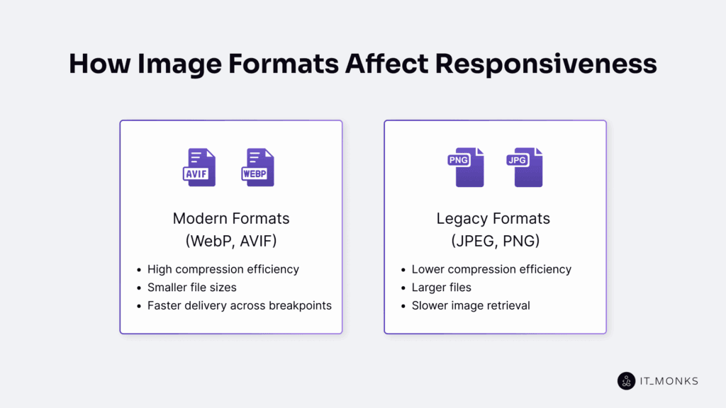
Image formats affect responsiveness by influencing how efficiently images are delivered across devices and screen sizes. Each format modifies file size, compression efficiency, quality retention, and browser support, which directly shape load time and determine how reliably an image adapts through srcset or density descriptors.
Because modern formats such as WebP and AVIF compress more effectively and reduce transfer cost, they support faster delivery than legacy formats like JPEG and PNG, which generate larger files and slower retrieval.
In WordPress themes, this format behavior ties directly into the rendering workflow. The theme can output multiple formats through <picture> and <source>, allowing the browser to select the smallest compatible asset based on its capabilities. This conditional delivery optimizes performance and preserves consistent asset selection across breakpoints.
WebP
WebP improves responsive image performance by delivering smaller file sizes without significant quality loss. Compared to JPEG and PNG, WebP achieves this reduction through more efficient lossy and lossless compression.
As a modern format that supports both compression types, WebP reduces the data footprint of responsive image sets while maintaining visual clarity across density-based outputs. Its broad browser support enables responsive delivery, allowing the browser to request WebP through <picture> or srcset when supported.
In WordPress themes, WebP is often the preferred format for responsive image logic because it optimizes load time, reduces bandwidth usage, and scales efficiently on high-resolution displays. When the browser cannot render WebP, the theme’s conditional structure falls back to JPEG or PNG, ensuring consistent image rendering without disrupting responsiveness.
AVIF
AVIF supports responsive images with high compression and low file sizes, improving load speed in WordPress themes. It maintains quality at low bitrates, benefiting mobile and low-bandwidth conditions where responsive delivery requires small assets. Because browser support is still partial, AVIF must be delivered conditionally with fallback formats to ensure compatibility.
To accommodate this constraint, WordPress themes typically serve AVIF via <picture> and <source> elements, allowing supported browsers to load AVIF and others to automatically fallback. This format-switching logic integrates AVIF as a performance optimization without limiting delivery.
JPEG
JPEG remains a core format in responsive image delivery because it is universally supported by browsers and provides predictable lossy compression. WordPress generates multiple JPEG sizes by default on upload, and these outputs flow directly into srcset as reliable baseline sources for responsive rendering.
In <picture> elements, JPEG functions as the fallback when formats like WebP or AVIF are unsupported, ensuring a compatible asset is always available. While JPEG lacks transparency and advanced compression, its broad compatibility maintains consistent rendering across devices. As a result, WordPress themes embed JPEG as the compatibility layer while using modern formats conditionally.
PNG
PNG contributes to responsive image delivery when transparency or lossless detail is required, despite its larger file size. It supports alpha channels and preserves crisp edges, making it suitable for logos, icons, and UI graphics in WordPress themes that require accurate blending and pixel-stable rendering. PNG is not intended for photographic content, but it remains necessary in responsive layouts where exact color integrity or overlay behavior must be maintained.
Because of these requirements, WordPress themes may include PNG files in srcset definitions or opt to fallback to PNG when transparency is mandatory, and other formats cannot provide equivalent alpha support.
How to Optimize Responsive Images for Faster Load Times?
To optimize responsive images for faster load times, you must control file size, format selection, and conditional rendering so the browser receives only the resolution and format required for each viewport. Optimization occurs when file weight is minimized while preserving the structural cues the browser uses to select the correct variant.
Building on this selection logic, modern formats such as AVIF and WebP reduce transfer size through efficient compression, while legacy formats remain fallbacks. WordPress themes and core image handling support this by registering exact image sizes with add_image_size(), generating scaled variants that prevent resolution over-delivery. These variants populate the srcset attribute, enabling the browser to choose the smallest file that meets layout requirements.
With these size variants in place, markup finalizes delivery logic. <picture> with format-specific <source> elements enables conditional format selection, while srcset inside <img> exposes size-based candidates. The browser evaluates these options autonomously, matching both resolution and format to its capabilities to reduce unnecessary network transfer.
Within WordPress, theme-defined sizes, media-generated variants, and responsive markup operate as a unified system. They reduce file size, limit resolution waste, optimize file delivery, and ensure responsive rendering without degrading visual fidelity across frond end wordpress implementations.
How Does the WordPress Media Library Manage Image Sizes?
The WordPress Media Library manages image sizes by generating multiple versions of each uploaded image. During upload, WordPress creates default sizes, such as thumbnail, medium, large, and full, plus the intermediate medium_large, and any theme-registered custom dimensions. Each variant is saved as a separate file in the uploads directory. This makes the media library an active, responsive asset generator.
After the files are created, WordPress records all variants in the attachment metadata. This metadata stores filenames, dimensions, and crop data, linking each derivative to the original file and defining the complete size set available for rendering.
Rendering functions then use this indexed structure to resolve the correct image source. the_post_thumbnail() retrieves the requested size, while wp_get_attachment_image() exposes all available variants. When WordPress outputs an <img> element, it generates srcset and sizes attributes from the metadata so the browser selects the most efficient file.
How Do Responsive Images Affect SEO?
Responsive images improve SEO by reducing load times, reducing bandwidth usage, and improving mobile performance. WordPress themes that deliver size-appropriate assets via srcset, sizes, an optional <picture> element, and registered image sizes reduce over-delivery and lower transfer costs, which directly improve page speed and support Core Web Vitals.
Because lighter assets reach the viewport faster, LCP improves, and defined intrinsic dimensions reduce layout shift and lower CLS. These optimizations create a more stable render path and strengthen the performance signals used by search engines in page-experience evaluations.
As mobile-first indexing prioritizes device responsiveness, optimized image delivery further reduces user friction and supports page-experience ranking signals. By matching each request to an optimized variant, a WordPress theme maintains responsive delivery and consistent image optimization across viewports.
How to Test If WordPress Images Are Responsive?
To test if WordPress images are responsive, inspect the HTML output and verify that each image exposes a srcset attribute, a <picture> element, or <source> tags. These structures confirm that the browser receives multiple image candidates and selects the appropriate file based on viewport width or device pixel ratio.
Open developer tools, inspect the image element, and confirm that it contains responsive markup. WordPress functions such as the_post_thumbnail() and wp_get_attachment_image() typically output this markup automatically, so verification confirms that the theme’s template is delivering responsive HTML as intended. Then confirm that the browser is choosing among multiple candidates, not rendering a static file.
Resize the browser window to observe image switching, and use the Network panel to check which file is loaded at each width. Smaller assets should load on narrow screens; larger or higher-resolution assets should load on wide or high-DPR displays. If the same file loads across breakpoints, the image is not responsive.
When issues appear, for custom themes or hard-coded images, verify that the HTML includes responsive attributes and that the browser switches image files when conditions change. This verification confirms that the WordPress theme is delivering a responsive image rather than a fixed asset.

Contact
Don't like forms?
Shoot us an email at [email protected]