Responsive Web Design Best Practices for a WordPress Website

Table of Contents
A WordPress website requires responsive web design so its layouts, Gutenberg blocks, navigation elements, and media assets adapt correctly to desktop, tablet, and mobile viewports. Responsive behavior depends on structured HTML containers, CSS breakpoints, media queries, and accurate mobile viewport settings, ensuring stable rendering and performance aligned with CLS, LCP, and INP.
In WordPress, responsiveness is achieved through deliberate configuration. The theme system, CSS layers, Gutenberg blocks, plugin layout integration, and JavaScript behavior must align with flexible grid systems and device-specific rules, so components integrate, adjust, and render predictably across screens.
Key elements include layout responsiveness, responsive navigation patterns and adaptive mobile menus, theme responsiveness, responsive frameworks, responsive images and video (WebP, SVG, fluid containers), mobile interaction considerations, and plugin compatibility, all contributing to consistent cross-device behavior and reliable Core Web Vitals performance.
What is Responsive Web Design?
Responsive web design (RWD) is a web development approach that adapts a website’s layout, media, and the layout conditions surrounding interactive components to the dimensions, screen size, pixel density, and orientation of any device. It reflows UI structures, adjusts containers, and stacks or shifts elements so each HTML component renders with consistent readability, usability, and accessibility across phones, tablets, and desktops.
RWD operates through CSS media queries, the viewport meta tag, fluid grid systems, and relative units (%, em, rem, vw, vh). Media queries evaluate viewport width, and can also target resolution or pixel density when explicitly defined, triggering CSS breakpoints that modify grid or flexbox structures, resize containers, and change element placement. Fluid units support continuous layout reflow, ensuring that containers, typography, and media scale with the viewport.
This approach is essential because the way layout structures, components, and media adapt to different viewports directly affects usability, accessibility, and Core Web Vitals, which are metrics that evaluate rendering speed (LCP), layout stability (CLS), and interaction responsiveness(INP). WordPress themes, plugins, and frameworks rely on consistent responsive CSS logic so the same HTML structure renders correctly across all device types.
Layout Responsiveness
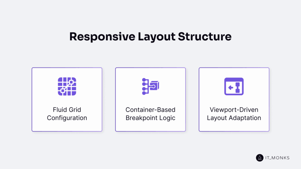
Layout responsiveness is the first structural layer of responsive web design. It defines how a WordPress website adapts, reflows, and collapses its layout containers, rows, columns, and Gutenberg blocks as the viewport changes. As one of the key components of WordPress web design, a stable responsive structure ensures that navigation patterns, media rendering, plugin components, and performance-critical rendering paths can adapt reliably to different devices.
WordPress achieves layout responsiveness through CSS grid and flexbox, fluid units (%, vw, em, rem), and media queries that trigger layout changes at common breakpoints such as 1200px, 992px, 768px, and 480px. While WordPress core does not enforce a grid system, many themes apply container classes (e.g., .container, .row, or column utilities) or use block-based layout primitives to create fluid or hybrid container models.
Gutenberg’s layout settings, such as content width, block-level width controls, nested group blocks, and percentage-based layouts, allow blocks to stretch, wrap, or stack when the screen width decreases. Hybrid layout models combine max-width constraints with fluid columns to maintain structure across devices.
Responsive layouts rely on media queries to detect viewport changes and adjust structure accordingly. Multi-column layouts typically collapse into a single column on small screens, while fluid units preserve readable text and prevent overflow.
All layout containers, rows, and columns inherit these responsive rules, ensuring Gutenberg blocks and page-builder sections remain aligned, scalable, and readable across device classes.
Reliable layout responsiveness prevents horizontal scrolling, overflow, and layout instability. This directly reduces CLS (Cumulative Layout Shift) and avoids reflows that can delay LCP (Largest Contentful Paint). Rigid plugin components, fixed-width elements, or outdated template structures often break responsive behavior and degrade mobile usability.
Responsive Navigation Patterns
Responsive WordPress navigation must adjust structure, visibility, and interaction patterns as the viewport narrows. It collapses menus, reorganizes items, and shifts interaction behavior through toggle actions, off-canvas or sliding panels, stacked layouts, wrapped items, and screen-reader-friendly labels to preserve accessibility.
On desktop, most themes render a horizontal navigation bar within the header container, using hover-based dropdowns and multi-level menus. At smaller screen widths, the navigation switches to a mobile pattern, typically a hamburger toggle, drawer panel, or slide-in menu, with submenus converted to tap-triggered expand/collapse interactions arranged vertically.
Responsiveness is controlled by the theme’s navigation system, CSS breakpoints, and optional JavaScript toggles. Some themes rely solely on CSS for collapse, while others use JavaScript to animate transitions and manage interaction states.
For example, breakpoints (≈768–992px) trigger the mobile toggle button. JavaScript handles toggle events or touch inputs, updates aria-expanded, manages focus order, and controls the visibility of nested lists. Because this interaction changes how users access the menu, accessibility rules must apply to the responsive state.
Proper tap-target sizing, keyboard navigation, and semantic ARIA attributes ensure that the mobile navigation remains usable and compliant. Menu items must remain in the DOM so search engines can crawl them, even if hidden behind a collapsed or off-canvas pattern.
Adaptive Menu Structures
Adaptive menu structures define how a WordPress menu’s visual layout changes across viewport sizes while preserving the same underlying HTML. On desktop, the navigation container typically renders as a horizontal flex or grid layout. At mobile breakpoints, CSS media queries restructure it into a vertical stack, responsive wrapper, or off-canvas pattern to maintain hierarchy when the menu collapses.
Media queries switch the navigation list from display: flex to display: block (or equivalent layout rules), supported by theme-defined conditional classes such as .mobile-nav or .collapsed. These classes adjust presentation only and do not alter the menu’s HTML structure.
WordPress themes, the Gutenberg navigation block, and wp_nav_menu() with custom walkers all output stable markup that can be transformed into horizontal, stacked, or off-canvas layouts through CSS and optional JavaScript without modifying menu items themselves.
If these structural transitions fail due to rigid CSS, incorrect breakpoints, or incompatible plugin styles, the menu hierarchy becomes inconsistent, harming usability, accessibility, and SEO crawlability because crawlers may not reliably interpret hidden or misaligned navigation items.
Responsive Behavior for Navigation Components
Responsive navigation behavior defines how a navigation component toggles, activates, expands, and collapses based on viewport size and input mode. It describes interaction patterns, click, touch, keyboard navigation, rather than structural layout changes.
The menu toggle button controls visibility through theme or navigation block JavaScript, updating aria-expanded and switching the navigation container between collapsed and expanded states. On touch devices, dropdowns open on tap, and off-canvas menus render sliding panels when the mobile toggle event fires.
WordPress themes and the navigation block implement these behaviors through event listeners bound to click and touch events. These listeners update visibility classes such as .active or .open, manage nested submenu expansion, and also enable sticky header behavior and keyboard navigation support.
Because these interactions change how users reach and navigate menu items, the responsive state must also satisfy accessibility requirements.
Accessibility requires semantic navigation elements, consistent labeling, synchronized ARIA states, and controlled focus movement to avoid focus traps. Skip links and predictable aria-label usage ensure reliable screen reader output. Correct responsive navigation behavior improves usability, accessibility compliance, and interaction-focused performance metrics such as INP.
The example below shows how a WordPress theme or custom navigation script can manage ARIA attributes during menu toggling.
html
<button class="menu-toggle" aria-expanded="false" aria-label="Open menu">☰</button>
<nav class="main-menu" hidden>
  <ul>
    <li><a href="/">Home</a></li>
    <li><a href="/about">About</a></li>
  </ul>
</nav>
js
toggleBtn.addEventListener('click', () => {
const expanded = toggleBtn.getAttribute('aria-expanded') === 'true';
toggleBtn.setAttribute('aria-expanded', !expanded);
menu.classList.toggle('active');
});Theme Responsiveness in WordPress
Theme responsiveness in WordPress refers to a theme’s control over layout containers, breakpoints, and CSS rules that determine how blocks, menus, and template parts render across device sizes. Because the theme owns these structural rules, it effectively defines the mobile, tablet, and desktop behavior for the entire site..
Classic themes implement responsiveness through style.css, functions.php, media queries, and container utilities (e.g., .container, .row, column classes) built with flexbox or grid. Block themes use WordPress theme.json, global style settings, and block templates to configure content width, spacing, and mobile-first layout behavior, for example:
"settings": {
  "layout": { "contentSize": "800px", "wideSize": "1200px" },
  "spacing": { "blockGap": "1.5rem" }
}
Many themes integrate frameworks such as Bootstrap or Tailwind to supply responsive class utilities, grid reflow logic, and mobile menu collapse patterns. Registered menu locations, header and footer template parts, and navigation toggles rely on the theme’s breakpoint rules and its CSS/JS layer. A typical container structure:
.container {
  width: 100%;
  max-width: 1200px;
  margin: 0 auto;
}
Responsiveness breaks when themes use fixed-width layouts, outdated media queries, or CSS overrides that conflict with block output, leading to overflow, horizontal scroll, or unstable mobile layouts.
All responsive behavior, navigation adaptation, layout reflow, and media handling ultimately depend on the theme’s container system, breakpoint configuration, and global responsive rules.
Responsive Frameworks in WordPress
Responsive frameworks in WordPress integrate predefined layout grids, CSS utility classes, and breakpoint logic to support mobile-first design without replacing the theme. Frameworks such as Bootstrap, Tailwind CSS, Foundation, and native CSS grid engines define container rules, grid columns, flex behaviors, and responsive utility classes (e.g., col-md-6, md:grid-cols-2).
Using these frameworks reduces implementation time, standardizes responsive behavior, and ensures consistent spacing, alignment, and scaling across templates. They provide reliable cross-browser patterns and minimize the need for custom CSS, making responsive layouts easier to maintain and extend.
In a WordPress environment, frameworks are added through theme bundling or enqueued via functions.php. Page builders and block plugins may also integrate these systems by injecting grid components and utility classes directly into Gutenberg or FSE workflows. Each framework defines its own breakpoint hierarchy, which must align with the theme’s responsive rules to avoid layout inconsistencies.
Because frameworks include resets, spacing utilities, and opinionated layout defaults, they can override WordPress block styles or theme.json declarations. These conflicts are typically handled through CSS scoping, namespacing, or adjustments in theme.json to preserve block editor compatibility.
When configured correctly, a responsive framework strengthens a WordPress theme by providing consistent grid behavior, predictable breakpoint sequencing, and efficient class-based layout control.
Bootstrap example:
<div class="container">
  <div class="row">
    <div class="col-md-6">Left</div>
    <div class="col-md-6">Right</div>
  </div>
</div>
Tailwind example:
<div class="grid grid-cols-1 md:grid-cols-2 gap-4">
  <div>Left</div>
  <div>Right</div>
</div>
Media Handling in Responsive Design
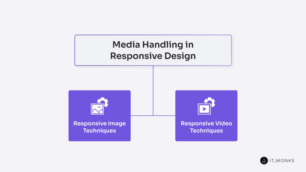
Responsive media in WordPress ensures that images and videos scale with their content container and the viewport, preventing overflow, layout shifts, and rendering instability. Because media participates directly in the layout structure, its behavior depends on container width, theme responsiveness, and browser rendering rules.
WordPress automates responsive images via srcset and sizes, generating multiple image sources so the browser selects the optimal file for each device. Video embeds are wrapped in a responsive container (e.g., .wp-embed-responsive in classic themes or block-level wrappers in FSE) to maintain aspect ratio and prevent overflow. Containers such as figure.wp-block-image applies width constraints that keep media aligned with the layout and avoid horizontal scrolling.
CSS rules enforce scalable behavior: images use max-width: 100% and height: auto, while videos rely on aspect-ratio boxes, the aspect-ratio property, or object-fit to preserve proportions within fluid layouts.
The loading=”lazy” attribute optimizes rendering performance by deferring offscreen media, improving mobile loading, and reducing unnecessary network usage.
Responsive Image Techniques
Responsive images ensure that each <img> element renders, scales, and adapts to device resolution and its layout container. WordPress provides this automatically by generating multiple image sizes and applying srcset, sizes, and loading=”lazy”, enabling the browser to choose the optimal image source based on viewport width and pixel density.
The block editor (wp-block-image) outputs this responsive markup by default. Developers can refine behavior through custom sizes definitions (e.g., sizes=”100vw” for full-width layouts), custom cropping, or CSS rules such as max-width: 100% and height: auto. Properties like object-fit: cover and controlled aspect ratios ensure consistent image presentation, functioning as layout-level breakpoints without requiring additional media queries.
Modern formats such as WebP and AVIF reduce file weight, while the <picture> element allows format switching with fallbacks for older browsers. Optimization plugins (e.g., ShortPixel, Smush) compress images while preserving WordPress’s responsive image pipeline. Retina displays are handled through high-density (2x) image sources defined in the srcset attribute.
Stable aspect ratios, accurate alt attributes, and correctly sized assets reduce CLS and improve LCP, ensuring predictable and efficient responsive image rendering across all device classes.
<img
  src="image-800.jpg"
  srcset="image-400.jpg 400w, image-800.jpg 800w, image-1200.jpg 1200w"
  sizes="(max-width: 600px) 100vw, 50vw"
  alt="Sample image description"
  loading="lazy"
/>
img { max-width: 100%; height: auto; display: block; }Responsive Video Techniques
A responsive video scales fluidly, maintains its aspect ratio, and stays within its container to prevent overflow on smaller screens. WordPress renders video using the video block (<video>) and the embed block (.wp-block-embed, which wraps an <iframe>). External embeds do not resize automatically, so responsiveness must be enforced by the container.
To preserve aspect ratio, wrap the <iframe> or <video> in a responsive container using the padding-box technique:
.embed-container{
  position:relative;
  padding-bottom:56.25%;
  height:0;
  overflow:hidden;
}
.embed-container iframe,
.embed-container video{
  position:absolute;
  top:0;left:0;
  width:100%;height:100%;
}
Or apply the modern aspect-ratio property:
.responsive-video{
  aspect-ratio:16/9;
  width:100%;
}
Extend .wp-block-embed and .wp-block-video with these rules to ensure consistent responsive behavior across breakpoints and theme container widths.
Use loading=”lazy” on iframes and videos, avoid autoplay on mobile, and maintain accessible controls and semantic markup. Responsive video behavior depends on the embed method, container structure, and CSS logic, not on the video platform itself.
Mobile Interaction Considerations
Mobile interaction is a required responsive attribute of a WordPress website. The interface must respond correctly to touch input, gesture events, mobile focus states, virtual keyboards, and viewport constraints as part of its touch-first layout.
When mobile interaction logic is missing, tap targets fall below accessible size, hover-based menus fail to open, input fields slide under the virtual keyboard, and fixed headers cause content loss without scroll-blocking or safe-area handling.
WordPress themes rely on the navigation toggle and .wp-block-navigation__responsive-container, which must trigger on tap, expand to fullscreen or an off-canvas overlay, block background scrolling, and support gesture handlers for tap and swipe interactions. Block templates, custom navigation patterns, and plugin-rendered menus must follow the same mobile-safe breakpoints to ensure consistent behavior.
Mobile interaction also requires correct input handling. Form fields must stay visible on focus, avoid keyboard overlap, and invoke the appropriate on-screen keyboard types (email, tel, number). An interaction-safe container ensures that focused elements remain visible without causing layout jumps or forced reflow.
Viewport configuration enforces proper scaling and prevents fixed-width layouts from overriding mobile responsiveness. The required setting is:
<meta name="viewport" content="width=device-width, initial-scale=1">Plugin Compatibility with Responsive Behavior
WordPress plugins directly influence responsive rendering because their HTML output, injected CSS, and JavaScript behavior interact with the theme’s container system and breakpoint logic. A plugin must inherit container widths, align with the theme or framework grid, and avoid fixed-width elements or unscoped CSS that causes class collisions or layout overrides.
Plugins that heavily impact responsiveness include sliders, popups, form builders, and page builders, as they often introduce fixed dimensions, independent grid systems, or global utility classes that break fluid scaling. Their rendering logic must adapt to viewport changes, and interactive components must recalculate dimensions, resize containers, and update event handlers across breakpoints.
Developers should audit plugin DOM output, media queries, inline styles, and responsive states using DevTools, device emulators, and performance tools such as Lighthouse. Responsive issues are resolved through scoped overrides in a child theme, plugin configuration changes, or replacing plugins that cannot conform to the site’s responsive architecture.
A plugin must demonstrate fluid container behavior, safe and scoped class usage, valid component nesting, and viewport-aware JavaScript to function as a reliable responsive component within the WordPress layout system.
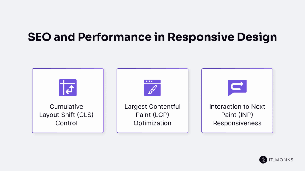
SEO and Performance in Responsive Design
A responsive WordPress website directly affects SEO ranking and mobile performance because search engines evaluate viewport adaptation, layout stability, and primary content load speed through Core Web Vitals. In this model, SEO and performance act as output attributes of responsive rendering rather than separate optimization tasks.
Correct responsive behavior, such as fluid layouts, stable media scaling, predictable container flow, and scripts that avoid layout thrashing, reduces CLS, improves LCP, and lowers interaction latency (INP).
These improvements support mobile-first indexing, increase crawl efficiency, and prevent responsiveness-related penalties. Conversely, broken responsive logic triggers layout shifts, increases INP delays, and degrades key SEO metrics.
Google’s Core Web Vitals validate responsive performance by measuring CLS (Cumulative Layout Shift), LCP (Largest Contentful Paint), and INP (Interaction to Next Paint).
Cumulative Layout Shift (CLS) Control
Cumulative Layout Shift is a Core Web Vitals metric that measures unexpected layout movement during page load and interaction. A high CLS score on a responsive WordPress site indicates that images, text blocks, ads, or navigation elements shift after initial rendering, reducing visual stability across breakpoints and negatively affecting SEO evaluations.
In WordPress, CLS commonly originates from missing image dimensions, late-injected plugin markup, theme components that load sliders or banners without reserved space, and font rendering delays that swap fallback fonts during paint. These behaviors trigger DOM reflow, viewport movement, and structural shifts that accumulate into higher CLS values.
CLS control requires reserving layout space before elements load. Developers should set explicit width and height attributes on <img> elements or apply aspect-ratio to guarantee predictable container dimensions:
<img src="image.jpg" width="600" height="400" alt="Example" />

img {
  aspect-ratio: 3 / 2;
  width: 100%;
}
Because WordPress lazy-loads images by default, all lazy-loaded images must maintain their container size to prevent late content jumps. Embedded videos, ads, and dynamic plugin components should use aspect-ratio wrappers to maintain layout stability as external content initializes. Proper dimensioning, minimized DOM adjustments, and consistent responsive behavior reduce CLS and improve rendering stability for users and search engines.
Largest Contentful Paint (LCP) Optimization
Largest Contentful Paint is a Core Web Vital that measures how quickly the largest visible element, typically a hero image, featured image, or primary heading, renders within the viewport. It is a responsive rendering metric influenced by DOM order, media delivery, and render-blocking resources.
On WordPress sites, the LCP element must appear early in the DOM tree and avoid deep nesting or unnecessary lazy loading, both of which frequently push LCP beyond the recommended 2.5-second threshold. Using responsive formats such as WebP or AVIF, applying defined dimensions or an aspect-ratio, and assigning fetchpriority=”high” help the browser load the LCP element immediately.
For consistent rendering, the LCP image should include a responsive srcset, and a minimal critical CSS subset should be inlined to prevent blocking. Non-essential CSS and JavaScript should be deferred. Headline fonts must be self-hosted and loaded without FOIT or excessive delays, since text-based LCP elements must paint as soon as layout data and font files are available.
An aligned theme structure, predictable responsive media rules, and well-scoped critical CSS ensure that the LCP element renders consistently across breakpoints, improving both responsive performance and search visibility.
Interaction to Next Paint (INP) Responsiveness
The Interaction to Next Paint metric measures the time from a user interaction event to the next visual paint. As a Core Web Vitals metric, it reflects input latency and indicates how quickly a WordPress interface responds to clicks, taps, or gestures across responsive layouts, DOM structures, CSS rules, and plugin scripts.
High INP on WordPress sites commonly results from plugin JavaScript that blocks or queues tasks on the main thread, deeply nested layout containers that increase click-to-render delay, and event listeners or CSS operations that trigger layout recalculations. These conditions reduce tap responsiveness and delay visual feedback.
To improve INP, reduce main-thread blocking, use passive listeners for scroll and touch events, debounce non-critical handlers, and simplify DOM structure around interactive elements. GPU-accelerated CSS properties (transform, opacity) should be used for responsive animations and transitions to avoid layout thrashing.
These optimizations help meet INP thresholds and maintain fast interaction performance across devices.
Contact
Don't like forms?
Shoot us an email at [email protected]