WordPress Hero Image – Best Practices for Elementor
Table of Contents
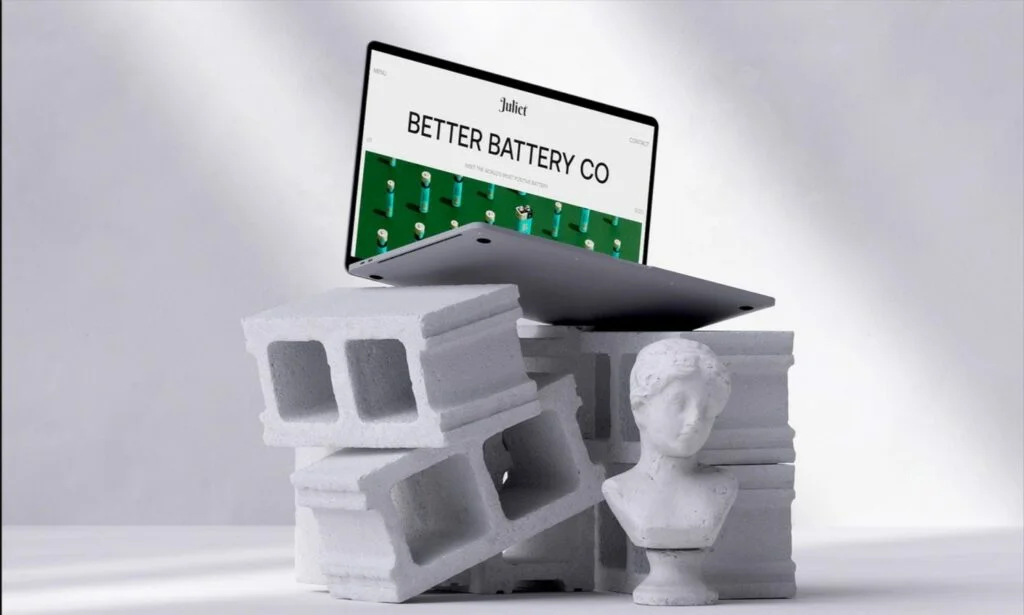
A stunning hero image is one of those elements of your website that should engage your audience and increase conversion rates. A hero banner image can bring many advantages to websites related to different topics and targeting different groups of customers. You might be wondering where to start when you decide to add a WordPress hero image with Elementor. This guide highlights the best tactics to update your website with an impressive hero banner design. You can also check out several great examples of websites that have wisely implemented the best practices of hero images. Excited? Let’s get started!
What is a hero banner image?
A hero banner image is one of the inevitable elements of every modern website. The area between the main navigation bar and the section where your content starts. Simply put, a WordPress hero image can be defined as the first large section of the homepage or a landing page.
A hero banner image commonly features such elements as a powerful heading, an image, some content, and a CTA that can motivate customers to take a certain action after seeing the hero image. The first impression always matters. It’s especially true when we work on the hero banner design. That’s why businesses shouldn’t apply extra effort to creating bold and catching hero images that would impress every website visitor.
A hero banner image shouldn’t necessarily feature a picture (though it’s one of the most common choices). The dedicated area of your website can feature an engaging video that doesn’t slow down your website’s loading speed, an image slider, animated or static illustrations, headings next to the visual content, etc. WordPress hero image area can be styled in multiple ways. You may opt for fixed or sticky positioning and add hover effects or contrasting elements to differentiate the hero banner image from other content. You may also use background videos in the hero image area.
The choices of styling options and effects are endless. You must decide which stylish options work best for your website and appeal most to your target audience.
Types of hero images
Before we discuss how to create interactive WordPress hero image banner-wide signs with Elementor, let’s consider the types of hero images so that you can easily pick the best option for your website.
Product hero image
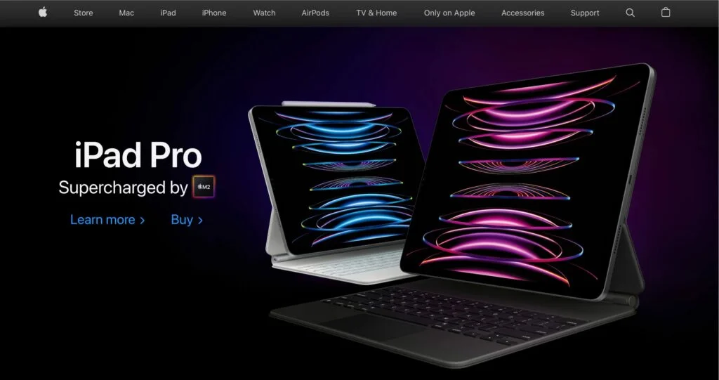
A product hero image commonly features a high-quality image or video representing the company’s product. Some of the most popular ways of presenting a product hero image on a website are by adding an example of an individual product in the respected area or a screenshot of a digital product’s interface (e.g., a dashboard).
It’s a common practice for eCommerce websites to use product hero image banners on their front pages. For example, Apple uses this technique masterfully. The brand commonly features images of its new releases, thus fostering its customers’ informed decision-making.
Pro tips:
- Whether you decide to use an image or a video file, invest in high-quality files that would be as lightweight as possible.
- Mind the contrast if you decide to add some text in front of your hero image banner. Ensure that your message is visible. Use filters if you need to increase the contrast.
Customer hero image
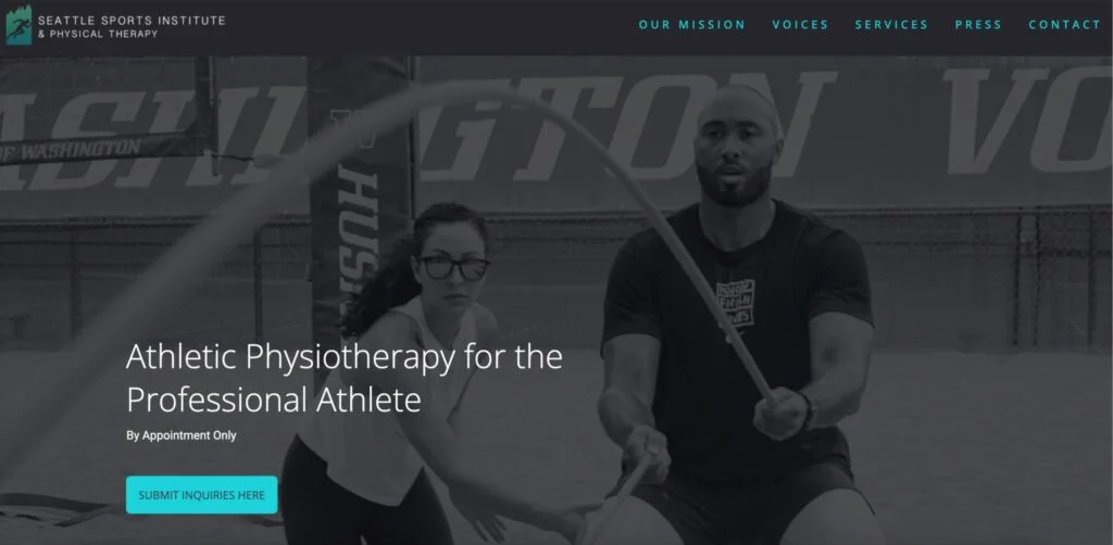
Another way businesses can use the impact of hero images is by showing their customers trying their products in action. This approach lets companies emphasize that they understand their clients’ pain points and demonstrate how a specific item can be used.
Seattle Sports Institute’s website is a vivid example of a website using a customer hero image. They chose a customer hero image demonstrating one of their sports programs in action.
Pro tips:
- When choosing this hero image banner, emphasize your product’s strongest points and the points setting your business apart.
- Also, ensure you appeal to your target audience while featuring the type of person demonstrated in the hero image.
Founder hero image
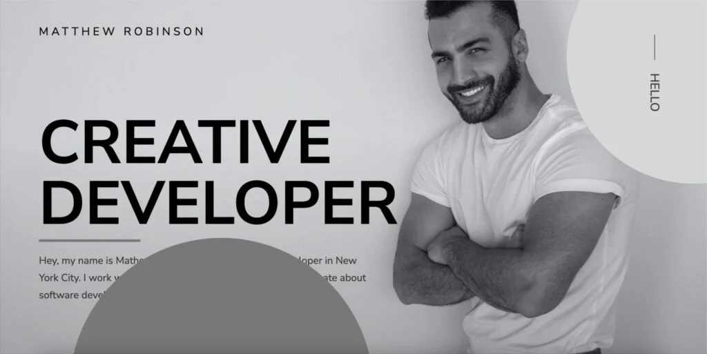
As the name suggests, this hero image banner features the photo of the person who founded the business or provided the promoted services. Using the founder’s hero image is the greatest virtue that puts a face to a name. It lets companies better connect with the audience by showing pictures of real individuals standing behind the brand.
Mathew Robinson’s website shows that founder hero images are commonly used in independent portfolios.
Pro tips:
- Choose a properly cropped image that shows your visitors the exact details you want them to see.
- The hero image should emphasize the person standing behind the brand.
Non-contextual hero image
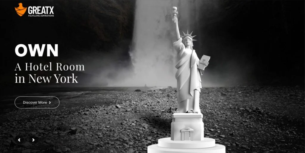
Non-contextual hero image banners display something unrelated to the product or the brand owner. Such hero image banners aim to indirectly show your audience what the product or brand is all about.
The GREATX website uses a non-contextual hero image banner accompanied by hero text that welcomes users to buy digital assets to own and earn from hotel rooms in different states in the USA. The hero image banners feature the main iconic symbols of the states, where users can earn from hotels through digital assets.
Pro tips:
- Ensure everyone understands why this image is relevant to your business and products/services. Although you do not display the product directly in the hero banner, you need to ensure that every visitor understands the connection of the non-contextual hero image with your brand.
- The hero text you place on the hero image should be related.
- It’s important to stay consistent with the visual language on your website. The CTA buttons and other design elements you add to your website should coordinate well with the overall hero image and website design.
How to design an interactive WordPress hero banner image?
After you decide what type of hero image banner you wish to add to your website, you can learn the most effective recommendations on creating an effective WordPress hero image design in Elementor or any other website. Check them out.
Your clients should feel welcome at the beginning of their journey. The hero image design should tell users what they want to know in a creative yet easy-to-follow manner.
- Besides featuring static images in the hero area, add some actions and animations to the subheadings, content, or buttons. You can easily fulfill your desired goals and make users act right after seeing your content. Be clear and concise about the hero banner.
- Think beyond the design limits. Research your target audiences to learn what else you can feature in the hero banner and what elements should never be featured there. Feel free to experiment with different types of hero banners and hero texts you put on them.
If you have added a hero image to your website, get the most out of each element it contains.
How to design a WordPress hero image with Elementor
Here comes the focal point of this article. How can you design a WordPress hero image by yourself in Elementor? Check out how to make the hero section of your website or landing page appeal to your target audience.
There are a few more things that should be added at this point.
While working on the WordPress hero image banner in Elementor, ensure the image size design is correct and the design is responsive. A landscape layout should have at least a 1920px x 1080px image size. Fit the image in the right place, adjust the background color, and configure other options to make your hero banner look striking on all devices.
Next, optimize your WordPress hero banner image for speed. Use lightweight yet quality pictures or videos that ensure the fastest speeds of your website’s content.
SEO is the last but not the least important factor to consider. Put the right keywords in an enticing headline that would grab your audience’s attention when they land on your web page.
How to test your hero image design
Testing is always the best way to understand which version of the hero image design will appeal to your customers the most. Here are several proven methods that should provide you with a clear understanding that the approach you use on your website works best for your business and appeals the most to your audience.
- A/B testing. This approach requires the designer to create several versions of the hero banner designs with layouts, visuals, font sizing, color choice, and other slightly or completely different elements. When A/B testing the hero section of your website, consider testing at least two CTA buttons to identify which option appeals the most to your customers. Moreover, testing the color of the CTA button should help you understand which option attracts your customers the most.
- Heatmap tools should help you discover where users click on your website and how actively they navigate your content. Using heatmaps, website owners can discover what elements distract users’ attention and which engage them the most. You can also understand what color and size of CTA buttons
Final words
A hero section is one of the essential elements of any website, directly impacting the customers’ decision-making. A hero area works as an opening act that welcomes your website visitors. Mind the WordPress hero image tips and go-go methods described above to create a competing and engaging hero banner image in Elementor, which should appeal to your clients.
WordPress hero image FAQ
- What is the best size for a WordPress hero image in Elementor?
u003cdiv id=u0022faq-question-1666877357903u0022 class=u0022schema-faq-sectionu0022u003ernu003cp class=u0022schema-faq-answeru0022u003eThe optimal size is between 1200px and 1600px. The WordPress hero image’s height depends on the hero section’s chosen type. If you decide to add a hero banner image, 500px should be enough.u003c/pu003ernrnu003c/divu003e
- How important is it to make WordPress hero image mobile-friendly?
u003cdiv id=u0022faq-question-1666877657246u0022 class=u0022schema-faq-sectionu0022u003ernu003cp class=u0022schema-faq-answeru0022u003eMore than 70% of customers use mobile devices for website browsing. That is why making all elements of your website smoothly adjust to all screen sizes is important.u003c/pu003ernrnu003c/divu003e
- How to design an effective WordPress hero banner design?
u003cdiv class=u0022schema-faq wp-block-yoast-faq-blocku0022u003ernu003cdiv id=u0022faq-question-1666877737762u0022 class=u0022schema-faq-sectionu0022u003ernu003cp class=u0022schema-faq-answeru0022u003eIt’s not only the design elements that play major importance. A compelling WordPress hero image should be responsive, SEO-friendly, lightweight yet high-quality, perfectly meet your objective and appeal to users’ pain points.u003c/pu003ernrnu003c/divu003ernu003c/divu003e
Contact
Don't like forms?
Shoot us an email at [email protected]

