Ways to Convert WooCommerce Store Visitors into Buyers
Table of Contents
What’s the primary purpose of running a WooCommerce website? You will probably suggest driving sales, engaging more users, and driving them into customers. You will be correct. The primary goal of running an eCommerce project is driving conversions and increasing sales. How to get the maximum from your web store and convert visitors into buyers? Let’s see.
What Is Conversion Rate?
The conversion rate is measured in the percentage of the total visits to your website that resulted in the desired eCommerce action. Conversion rates are not only about sales. It includes many other things like an email subscription, product ratings, and reviews, social shares, adding items to the shopping carts, and placing an order. All of the factors mentioned above are crucial for the success of your eCommerce project. In this guide, we are going to focus solely on how to convert visitors into actual buyers.
How to Convert Visitors into Buyers
Make Your Products & Services Easy to Find
Every person who reaches your WooCommerce store can potentially convert into a loyal customer. That is why it’s essential to take care of your site’s usability. Making your web store’s items easy to find is the key to success. A customer shouldn’t spend too much time and effort, trying to locate the necessary products and services and making things easier on your website, you will always win.
To make it easier for customers to find the offers they need, make sure that your WooCommerce site matches the following requirements.
- It’s easy to navigate your web pages. Adding layered product navigation, you let people find the necessary items based on the product category, type, color (or other characteristics), price range, etc.
- Integrate the Ajax search. The respective functionality lets you reveal suggestions as users type in their search requests.
- Let users compare the items they enjoy. This is an essential element that allows customers to pick two or more things from the same category and compare the features they have in common and the functionality that differs one item from another.
- Add live chat. Providing support in real-time, you can assist users with making the right choice on your site and complete their online browsing sessions with conversions.
Use High-Quality Product Images
A picture can say a thousand words. Even the most professional and well-written product description cannot compare with the image of the item that you sell. When buying online, people cannot physically touch items, so online stores should look for ways to compensate for the lack of physical contact. The best way to do it is by using high-quality product images that meet the following requirements.
- Online stores offering high-resolution product images are three times more likely to convert than those that provide low-resolution photos or no photos. From the online customers’ perspective, low-resolution images do not let buyers examine the preferred items in minor details, making your company look untrustworthy.
- Featuring photo galleries, you allow your customers to check your products from different sides. It’s also a good idea to show your offers in action. This can be a photo of a model wearing the clothes that you sell or a gadget serving its primary function.
- By means of the Zoom feature, people can examine their preferred products’ photos in more detail.
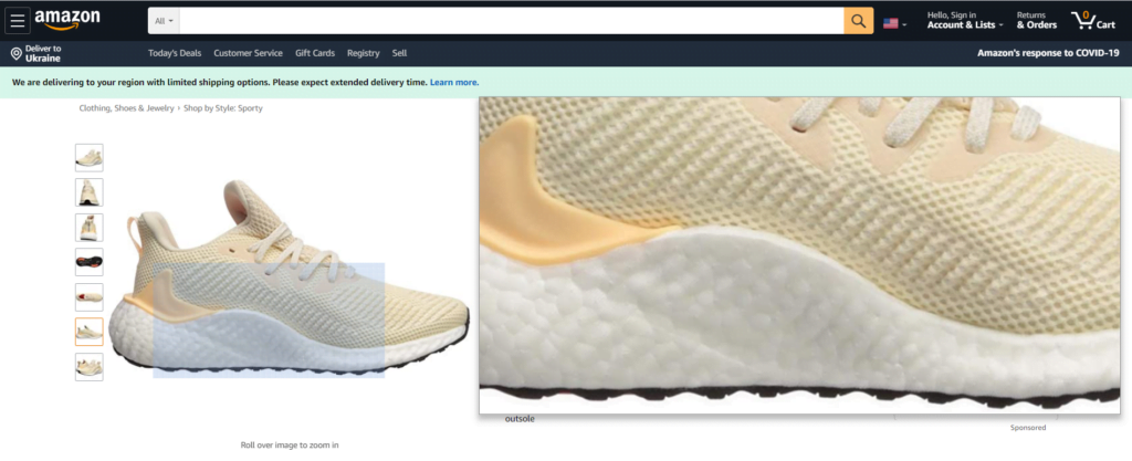
- A 360-angle product view lets you reveal your online store’s offers from different angles, perspectives, and dimensions. This is one more trick making customers better examine your products, resulting in the online sales boost.
Write Detailed Product Descriptions
The more details you write in the product description, the more people will learn about your offers, and the more likely they will trust your web store. Detailed product descriptions can potentially increase the credibility of your eCommerce site. Keep in mind that you are the one who knows your products better than anyone else. This is you responsible for a compelling demonstration of your items and how engaging your solutions will be presented to online buyers.
When publishing product descriptions, make sure there are no mistakes in the text. Delivering items that lack the functionality mentioned on the product page may make your buyers leave negative product reviews. This can have a negative effect on your online store’s reputation.
Keep CTAs Front and Center
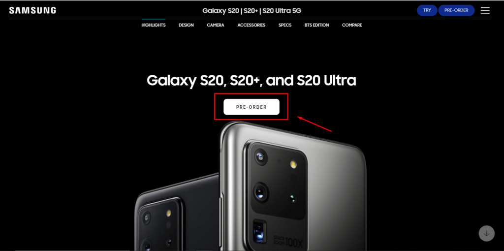
The call-to-action that you put on your website is one of the main factors that significantly impact your web store’s conversion rates. The CTA buttons are the area where you want to drive online buyers’ maximum attention and click when they land on your website.
- The CTAs should be highlighted from the rest of the pieces of data that you share on your web page. To make CTAs more engaging and visually striking, eCommerce website owners need to match the following criteria:
- The CTA buttons should be placed at the top of the page so that you’ll be able to attract the customers’ attention when they land on your site.
- The text written on the CTA buttons should be simple and clear. Avoid using aggressive verbs as much as you can.
- The color of CTAs is also essential. The CTA should stand from the rest of your data. It should be bold and vibrant, using bright colors that differentiate it from other elements of the product page.
Make the Checkout Simple
The shorter and more straightforward is the checkout process, the more likely your website visitor will end up the browsing session with a purchase. The practice shows that forcing customers to create an account on your web store can harm the overall conversion rate. Instead, you can make it optional for your customers to register on your website or place an order as a guest.
Another trick to increase conversion rates on your website it keeping the minimum number of fields in the checkout. Ask your customers only about the things that are necessary for completing an order. Do not force them to share many personal details with you.
Arrange Cart Abandonment Email Sequences
More than two-thirds of shopping carts are abandoned on WooCommerce stores. Many factors distract customers from finalizing their order on your web store. To decrease the dropdown percentage, it’s always good to launch a series of abandoned cart emails that will notify your customers about the items they left in the shopping cart. It’s also a good idea to offer some rewards to shopping cart abandoners. This can be a discount on the order or the shipping cost. You can let your customers know that you care about them and value their choice.
Conclusion
The conversion rate is a crucial factor of a WooCommerce store. You can optimize the conversion rate by optimizing your web store’s product pages, sharing high-quality images and professional product descriptions, optimizing the color and location of CTAs, and keeping the checkout process simple and intuitive.
With the practices described above, you can optimize your WooCommerce website, make it more usable, and convert visitors into buyers. Start implementing them into your website and watch the conversion rates boost.
Are there any other useful tips that should be mentioned on this list? Please share your recommendations with us in the comments section.
Contact
Don't like forms?
Shoot us an email at [email protected]

