Best 404 Page Design

Table of Contents
A 404 page is the system-generated response a website returns when no matching content exists for a requested URL. In WordPress, this behavior is handled through the template hierarchy, typically via the 404.php file, which acts as the fallback template when a post, page, or archive cannot be resolved.
Because the 404 template is fully editable, WordPress allows developers to transform this system response into a controlled user-experience element. Through direct theme editing or plugin-based customization, the page can include structured navigation, contextual guidance, and clear paths back into the site’s architecture.
Ignoring the design of this page often results in user drop-off, interrupted navigation paths, and weak recovery signals within the site’s UX flow. A well-implemented 404 page does the opposite: it maintains orientation, offers actionable next steps, and supports continuity by directing visitors toward valid sections of the site.
In WordPress environments, effective 404 page design relies on a clear template structure, consistent branding elements, and functional navigation options. Instead of delivering only an error notice, an optimized 404 page provides concise messaging, links to primary sections, and design cues that align with the rest of the site, enabling users to return to the intended navigation path with minimal friction.
What is a 404 Error Page?
A 404 error page is a client-side HTTP status code returned by the server when a user attempts to access a non-existent resource, typically due to a broken link, a dead URL, or a mistyped address. It indicates that the requested path could not be resolved within the current site’s URL resolution framework.
As part of the broader error-handling protocol, the 404 status code belongs to the 4xx class of HTTP codes, specifically indicating “page not found” conditions. This response does not signify a server malfunction but instead serves as a structured signal that the target content is unavailable, either because it was removed or never existed. The server-client interaction completes with a status notification confirming that the referenced location lacks a valid resource mapping.
Within WordPress websites, this condition is addressed through the platform’s template hierarchy. When no content match is found for a request, WordPress loads the 404.php file from the active theme’s directory. If this file is absent, fallback behavior defers to core template logic or may be overridden by plugins that deliver predefined or dynamically generated 404 templates into the response pipeline.
Why You Should Care About 404 Page Design?
A well-designed 404 page is important because it determines how a WordPress site responds when a user reaches a missing URL. The template guides visitors back to valid sections of the site, reduces unnecessary exits, and helps maintain a stable navigation flow. When the design is unclear or incomplete, users are more likely to abandon the session, resulting in higher bounce rates and disrupted browsing paths.
From a structural perspective, the 404 layout affects how routing and discovery behave inside WordPress. If the template provides no useful links or orientation cues, both users and crawlers reach a dead end with no recovery options. Customizing 404.php or extending it with plugins creates a predictable fallback page that offers navigation options and ensures that unresolved requests are handled consistently.
Treating the 404 page as part of the site architecture strengthens usability and supports SEO by keeping users within the site’s reachable areas. A clear layout, functional links, and consistent branding make the page a practical point of re-entry rather than a termination point. Caring about 404 design means ensuring that missing URLs are handled in a controlled, user-focused way that supports the website’s overall structure.
1. Shopify Summer ’24 Edition: 404 Page
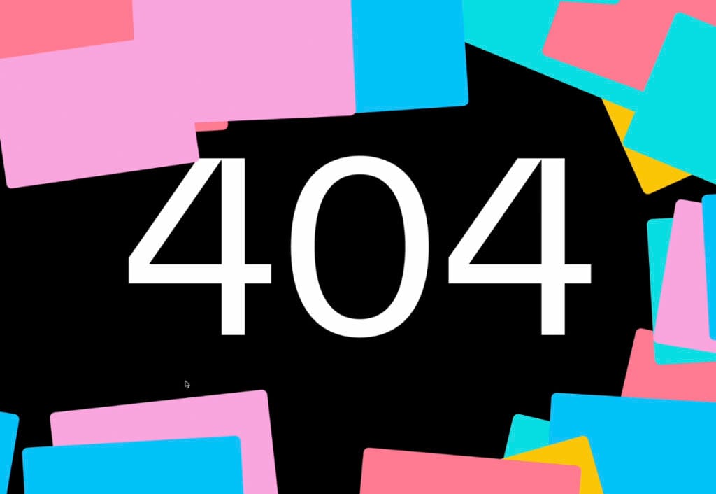
An oversized “404” paired with bright color tiles makes this page instantly readable while staying true to Shopify’s playful seasonal style. The visual rhythm does most of the communication work, turning the error state into a branded moment. Although navigation is minimal, its clarity and strong identity make the design effective even without additional messaging.
2. Büro website – 404 Page
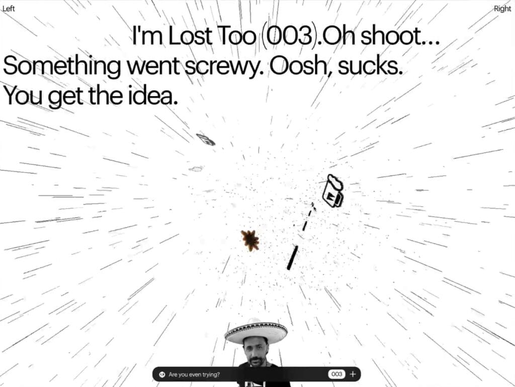
Büro’s 404 leans heavily on tone, using irreverent, conversational copy to soften the error and reinforce the studio’s personality. The chaotic starburst illustration adds humor and movement, matching the experimental brand feel. A small numerical navigation element offers a subtle way back into the site, keeping the experience quirky but functional.
3. SAAPRO 404 page
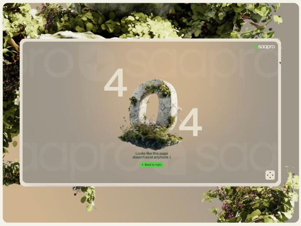
SAAPRO’s page excels through brand cohesion: a nature-inspired stone “0” blends seamlessly into their organic visual language. The soft message and single green return button keep the experience calm and intuitive. This design is about atmosphere and trust: an error page that feels consistent with the brand’s quiet, earthy identity.
4. 404 Letters Animation from Stas Bondar ’25
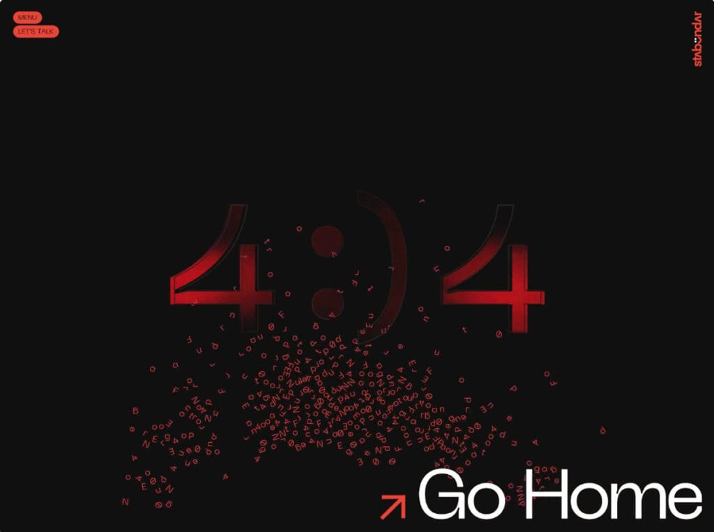
This 404 page design stands out for its motion-first approach. Animated red letters swirl beneath the stylized “4:)4,” turning the error into a dynamic visual artifact. The high-contrast palette and bold CTA ensure the page still functions smoothly. It’s a technical, expressive take that makes the fallback feel intentional and crafted.
5. Creative 404 from Intrapan
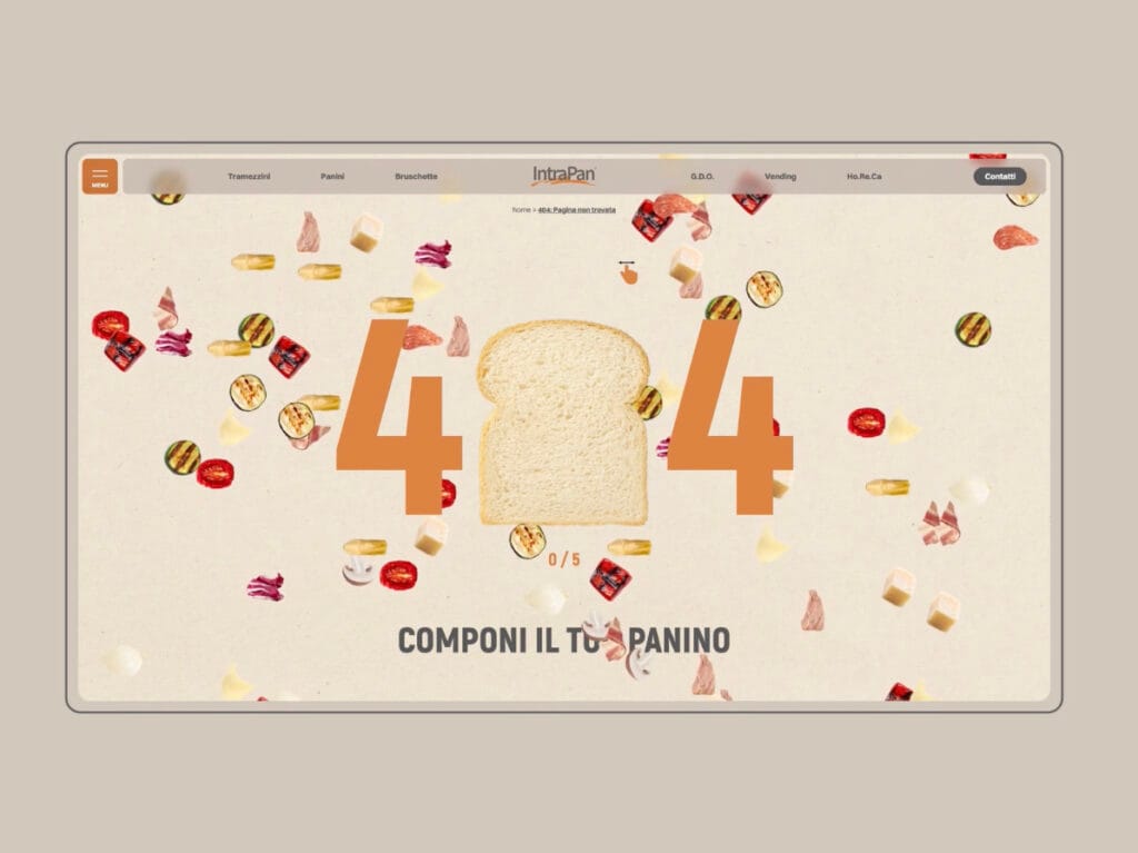
Intrapan transforms the 404 into a playful food moment: ingredients float across the screen, and a slice of bread becomes the “0.” The concept ties directly into the brand’s culinary world. With global navigation still accessible, the page stays practical while delivering a fun, thematic interruption.
6. 404 Page with WebGL Mouse Flow from Dave Holloway

This design uses mood and interactivity to define the experience. A dramatic portrait background paired with a reactive WebGL effect creates an immersive “lost” feeling. The straightforward navigation links provide a clean way out. The result is dark, cinematic, and perfectly aligned with a portfolio rooted in visual craft.
7. Error page with interactive grid of shapes from L’Étude
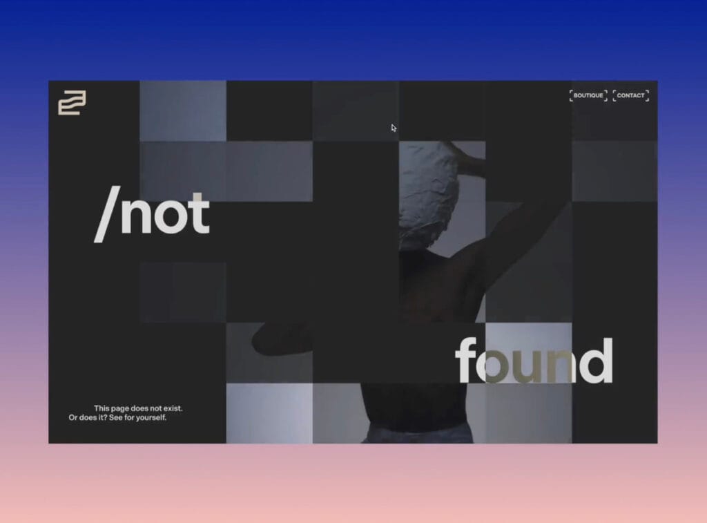
This 404 design subverts expectations with a conceptual twist: the phrase “/not found” overlays a fractured, grayscale grid that partially conceals a figure, inviting user interaction. The design flirts with ambiguity, blending navigation uncertainty with artistic expression. Minimal yet engaging, it transforms the 404 experience into a spatial puzzle.
8. What you’re looking for doesn’t exist. From Portfolio – Adrian Wilhelm
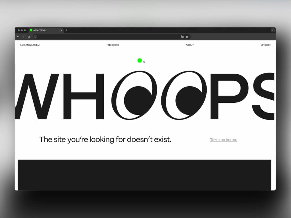
Bold typography does the heavy lifting in Adrian Wilhelm’s portfolio 404 page. The oversized “WHOOPS” with animated googly-eye “O”s delivers both visual delight and clarity. A minimalist layout reinforces usability with a clear path back to the homepage. The tone is casual, the brand voice confident, and the interaction effortless.
9. KeepGrading – 404 error page
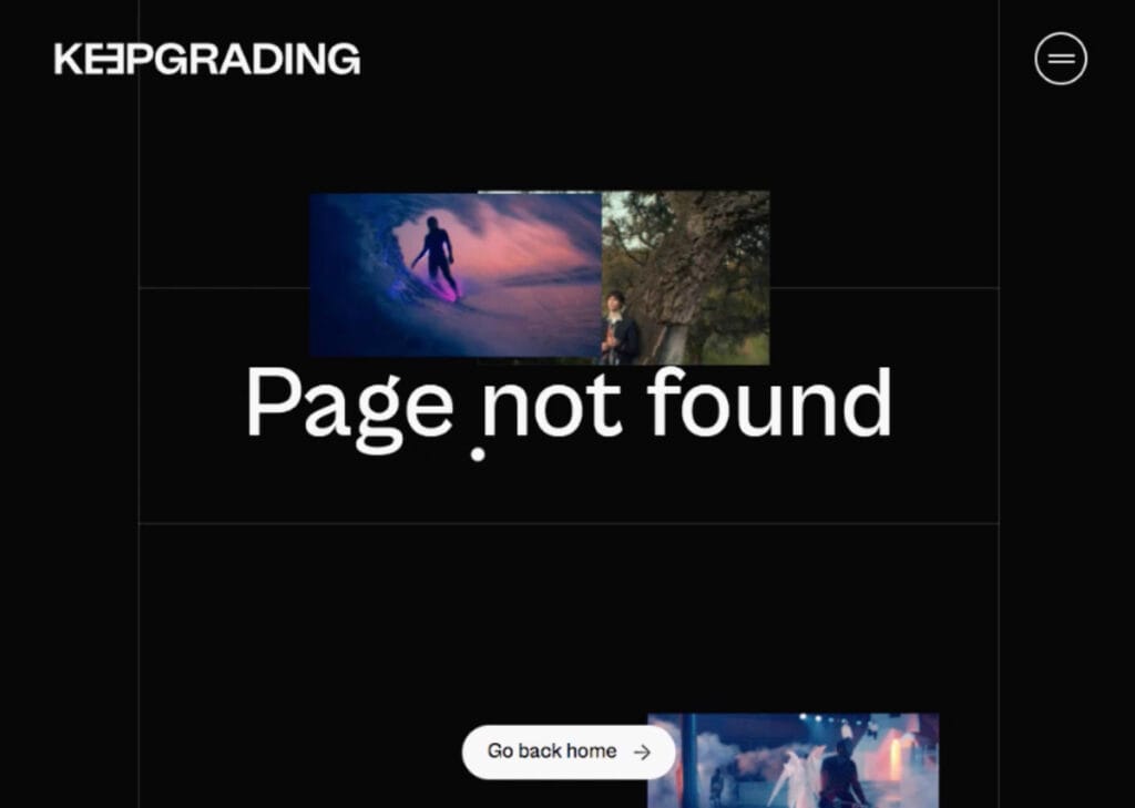
KeepGrading blends simplicity with editorial visuals: large “Page not found” text is paired with cinematic stills that match the brand’s focus on motion and grading. The round, white CTA button stands out clearly on the black background, making recovery immediate and mobile-friendly.
10. Chirpley – 404 error page
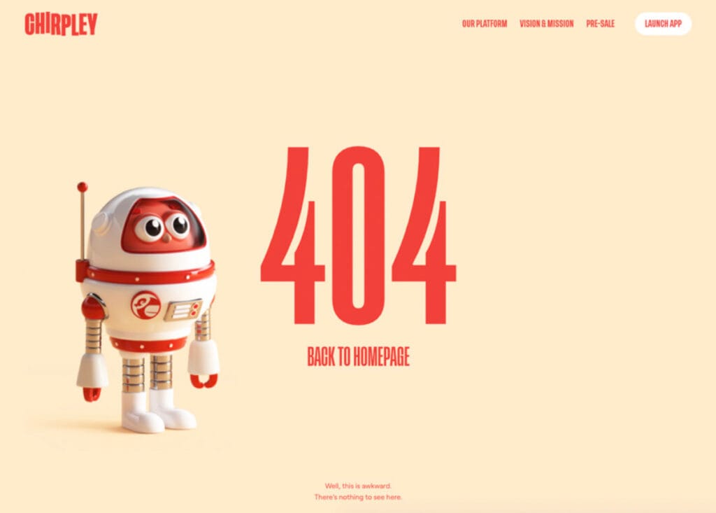
Chirpley’s 404 page delivers charm through a wide-eyed robot mascot, reinforcing brand identity with a playful tone. The oversized “404” and red-accented call-to-action create a clear visual hierarchy, while soft colors and minimal distractions ensure immediate orientation. Friendly, fast, and frictionless, this page turns a wrong turn into a brand encounter.
What Are the Criteria for Good 404 Design?
The criteria for good 404 page design are defined by how effectively the page maintains UX continuity, safeguards semantic consistency, and supports structured error-resolution behavior within a WordPress website. These standards ensure that even when content retrieval fails, the interaction remains meaningful rather than collapsing into abandonment.
- Messaging and Tone shape perception at the moment of navigation failure: clarity, brevity, and brand-consistent language influence emotional response and contextual understanding.
- Primary Recovery Path reflects how easily users can re-engage through contextual redirects, hierarchical navigation clusters, or dynamically generated suggestions based on internal structure.
- Brand Alignment establishes visual and lexical coherence by embedding the 404 experience within the site’s template rendering logic and design system, avoiding generic or misaligned placeholders.
- Mobile Layout ensures responsive integrity across breakpoints, preserving hierarchy, tap targets, and readability within mobile-first environments.
- An Extra Layer of Design introduces purposeful enhancements (animations, interactive modules, or plugin-driven features) that elevate the 404 from a static fallback to an interactive semantic endpoint.
Together, these criteria align with the performance expectations encoded in the WordPress template hierarchy, thereby improving retention, crawl accuracy, and the internal link graph’s semantics. They are not surface-level design preferences but operational components rooted in WordPress design best practices, transforming the 404 into a functional recovery node within the site’s broader semantic architecture.
Messaging and Tone
Messaging and tone on a 404 page guide users through the error state by providing precise, concise wording that explains what occurred and what they can do next. The message should explicitly identify the error (e.g., “404 error” or “page not found”) and avoid phrasing that obscures the event or introduces ambiguity. Tone of voice must remain consistent with the site’s brand language while preserving the clarity required for an error notification.
In WordPress, this messaging is added through the 404.php template, theme strings, or plugin-generated notices. Multilingual configurations can apply localized text while keeping the core message stable across languages. Effective UX writing ensures that users understand the situation and can act on the available recovery options, reducing confusion and supporting a predictable fallback experience.
Primary Recovery Path
The primary recovery path is the main navigation option presented on a 404 page to help users return to valid content. Typical elements include a search field, a homepage link, links to key categories, or suggestions generated from recent or popular posts. Its purpose is to redirect the user to a functional part of the site without requiring them to restart their session.
Inside WordPress, this recovery path can be built with theme logic, internal linking, or WP_Query calls that surface relevant posts or taxonomies. Plugin-based recommendation modules can extend this behavior. A clear primary recovery path reduces unnecessary exits, maintains navigation flow, and ensures that visitors can re-enter the site after reaching a missing URL.
Brand Alignment
Brand alignment ensures that the 404 page uses the same visual and verbal patterns as the rest of the WordPress site. Consistent typography, colors, spacing, and copy tone help the error template remain recognizable and avoid appearing disconnected from the main design system. UI components such as buttons, headers, or footers should match global theme styles to maintain layout continuity.
WordPress themes support this alignment through template inheritance, shared design tokens, and common header/footer elements. Including branded elements (such as the site logo linked to the homepage or buttons styled according to the theme) keeps the 404 page integrated into the site’s interface and preserves user trust.
Mobile Layout
The mobile layout determines how the 404 page renders and behaves on small screens. A responsive design must preserve the page’s hierarchy, provide readable error messaging, and ensure that recovery links or buttons remain accessible as touch targets. Proper scaling prevents layout shifts that could obscure the recovery path or make interaction difficult.
In WordPress, mobile behavior depends on theme responsiveness, CSS media queries, and plugin compatibility with responsive templates. A well-implemented mobile 404 layout keeps the message visible, maintains navigation options, and ensures that users can return to valid content from any device.
Extra Layer of Design
An extra layer of design consists of visual or interactive elements added to the 404 page to improve usability beyond basic error messaging. These enhancements may include contextual illustrations, featured posts, product modules, or links to popular sections. Their purpose is to enhance the page’s utility and direct users to relevant content.
In WordPress, these additions can be implemented through custom template sections, block-based layouts, widget areas, shortcodes, or plugin modules that display related items. Any extra elements should remain lightweight, accessible, and responsive to avoid performance issues. When used appropriately, they improve user orientation and support navigation recovery.
Contact
Don't like forms?
Shoot us an email at [email protected]