Top 10 Examples of Website Color Schemes for WordPress

Table of Contents
In WordPress design, a website color scheme establishes the visual system that defines how primary, secondary, and accent colors structure interface hierarchy across templates and block patterns. A color scheme represents the palette WordPress themes use to unify modular styling, responsive layouts, and block-level components within a consistent visual framework.
The selected palette must meet readability, accessibility contrast, and brand coherence requirements defined in Global Styles and theme.json. Each color relationship is applied to layout elements, block templates, and design tokens to maintain consistent presentation and predictable user interaction patterns.
What Is a Color Scheme in Web Design?
A color scheme is a set of colors that determines how visual elements are styled across the interface, defining the primary, supporting, and interactive hues used for text, surfaces, buttons, and navigational components.
WordPress themes register these colors through systems such as the Customizer, theme.json, and Full Site Editing (FSE), allowing the palette to drive consistent styling behavior across templates, block patterns, and reusable components. The scheme organizes contrast levels in the front end in WordPress, directs visual emphasis, and maintains alignment between layout presentation and brand guidelines.
By assigning each color a specific functional role within global styles and design tokens, a WordPress color scheme ensures uniformity across page structures. It supports accessibility requirements for legibility and contrast.
What Are the Core Components of a Color Scheme?
In WordPress design, the core components of a color scheme represent the specific color assignments that structure how themes style blocks, templates, and global interface elements. These assignments determine the color values applied to text, backgrounds, buttons, and interactive components, ensuring consistent visual behavior across the entire site.
- Primary color sets the main visual emphasis for elements such as headings, primary buttons, and prominent interface highlights.
- Secondary color complements the primary hue and is used for secondary buttons, section dividers, and supporting interface elements.
- Accent color highlights interactive indicators, including icons, badges, notifications, and compact call-to-action elements.
- Background color defines the foundational surface for containers, sections, and block areas.
- Text color provides the necessary contrast for readable headings, paragraphs, and inline content.
- Link or interactive color defines the appearance of links, hover states, active states, and other interaction-driven UI components.
Which Color Scheme Types Are Used in WordPress Design?
Monochromatic Color Scheme
A monochromatic color scheme is built from a base hue, extended through controlled tints, tones, and shades to create a cohesive visual system across WordPress interfaces. WordPress themes register this unified palette in theme.json, Global Styles, and block-level configuration options, assigning tonal variations to backgrounds, headings, buttons, and structural layout elements. Because the entire design draws from a single hue family, the scheme produces a highly consistent visual hierarchy, supports clear contrast management, and reinforces a streamlined presentation, making it well-suited for minimal, content-driven, or brand-focused WordPress sites.
Analogous Color Scheme
An analogous color scheme uses colors adjacent on the color wheel to form a coordinated palette with gentle contrast. In WordPress themes, these neighboring hues are defined through theme.json, Global Styles presets, and block-level color settings, allowing the palette to shape section backgrounds, highlight treatments, hover behavior, and layered visual groupings.
The close relationship between the hues creates smooth transitions across site sections, reinforcing brand continuity and supporting visually rich layouts common in creative, lifestyle, and media-focused WordPress designs.
Split-Complementary Scheme
A split-complementary color scheme builds its palette from one base hue and the two colors positioned next to its direct complement, producing controlled contrast with greater flexibility than a full complementary pair. In WordPress, this three-color configuration is defined in theme.json and Global Styles, where each hue is assigned to elements such as headers, call-to-action components, dividers, and grouped interface sections.
The moderated contrast helps users distinguish layout zones and interactive elements without creating visual strain, making this scheme effective for modular WordPress designs that benefit from coordinated but clearly differentiated color groupings.
Triadic Color Scheme
A triadic color scheme organizes its palette around three hues positioned at equal intervals on the color wheel, creating a balanced but vibrant set of color relationships. In WordPress themes, these hues are configured in theme.json and Global Styles, and then applied to block areas, interface elements, and sectional dividers to ensure consistent contrast across the layout.
This arrangement introduces structured variation, supports flexible branding, and adds visual rhythm to the interface, making it well-suited for dynamic WordPress sites that require clear sectional definition while maintaining overall aesthetic cohesion.
Tetradic (Double Complementary) Scheme
A tetradic color scheme is built from two complementary color pairs, forming a four-hue palette that supports pronounced separation between interface regions. In WordPress, this palette is defined in theme.json and Global Styles, where each hue is assigned to navigation areas, content sections, callout elements, and alert components to create distinct visual zones.
By distributing complementary pairs across different layout segments, the scheme enables complex WordPress sites (such as SaaS platforms, agencies, or publishing environments) to maintain strong visual differentiation while preserving consistency within the broader theme structure.
Neutral Color Scheme
A neutral color scheme relies on grayscale tones and low-saturation hues to create a restrained visual foundation that emphasizes layout clarity and typography. In WordPress, these neutrals are configured through theme.json and Global Styles, where text, background, and border values are set to maintain consistent contrast and a clean visual frame.
This approach prioritizes content visibility and reduces visual noise, making neutral palettes especially effective for minimalist themes, editorial sites, and documentation-focused WordPress designs.
Pastel, Muted, and Low-Saturation Schemes
Pastel, muted, and low-saturation color schemes use softened, desaturated hues to create a gentle visual presence that supports clear layout structure without competing with content.
In WordPress themes, these palettes are defined in theme.json and Global Styles, where tones are assigned to backgrounds, borders, highlighted areas, and light interactive elements. Their reduced chroma produces calm visual transitions and a subtle brand aesthetic, making these schemes well-suited for lifestyle, editorial, and portfolio-oriented WordPress designs that benefit from understated but organized presentation.
Vibrant or High-Contrast Schemes
Vibrant or high-contrast color schemes rely on saturated hues and pronounced value differences to create strong visual emphasis and enhance interface visibility. In WordPress, these impactful colors are defined in theme.json and design tokens, which assign them to CTAs, navigation elements, alert components, and promotional sections.
The high contrast helps users identify key actions, follow the content flow, and engage with priority elements, making this scheme particularly effective for marketing pages, product launches, and other conversion-focused WordPress layouts that require clear visual cues.
What Moods or Emotions Do Color Schemes Create?
Color schemes influence perception by establishing the visual mood and tonal context through their defined roles in the frontend interface rather than through inherent color meaning.
The perceived effect results from how theme.json and global styles specify color application logic for backgrounds, CTAs, headers, alerts, and other structural components, enabling each hue to signal emphasis, support interaction, and shape layout perception in alignment with site objectives.
High-contrast configurations can signal urgency or action through more explicit engagement cues. At the same time, neutral or low-saturation palettes reinforce focus and professionalism by stabilizing interface behavior and maintaining content alignment.
Within this design-driven communication model, the WordPress website defines tone and interface meaning through placement, contrast, and semantic role assignment, demonstrating that perceived emotion is a functional output of structured theme design rather than an intrinsic property of the color itself.
Top 10 Color Schemes for WordPress Design
1. Monochromatic Blue Palette (netnation.com)
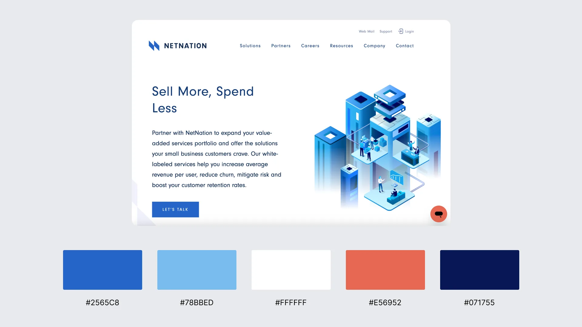
NetNation uses a monochromatic blue palette built from one base hue expanded through tints, tones, and shades to maintain consistent interface styling. Blue variations are applied to backgrounds, section surfaces, buttons, and callouts, creating uniform contrast and a streamlined hierarchy.
2. Soft Analogous Greens & Teals (pachama.com)
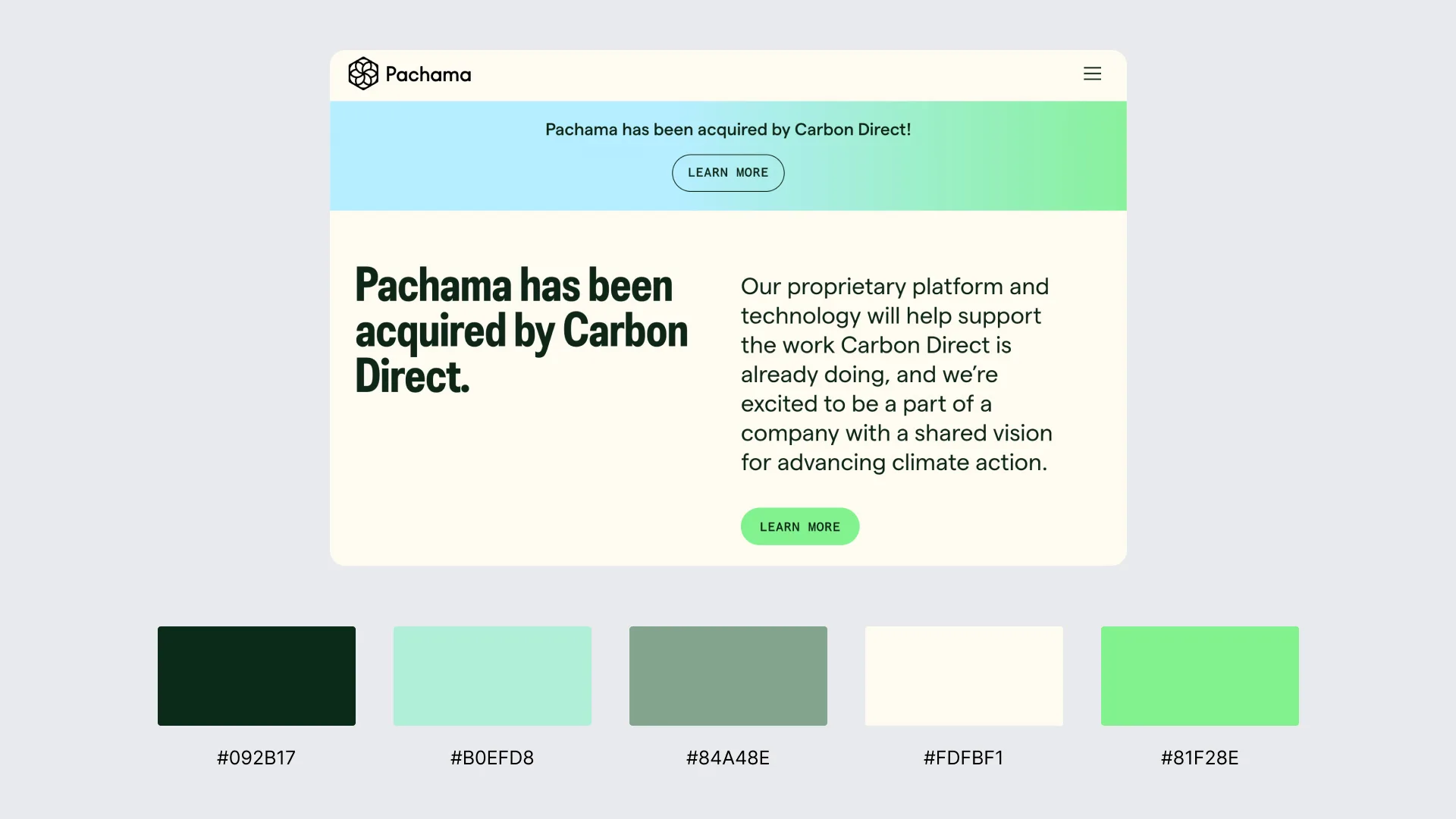
Pachama uses an analogous palette of adjacent green and teal hues, applying these coordinated tones across the interface to create a cohesive visual structure. In a WordPress-style configuration, related hues are mapped to backgrounds, highlights, buttons, and navigation elements to maintain soft contrast and consistent layout behavior.
The harmonious green tones reinforce branding, support smooth section transitions, and maintain a calm, structured frontend presentation, demonstrating how analogous schemes strengthen visual layering and block-based cohesion.
3. High-Contrast Black, White & Accent Red (smashingmagazine.com)
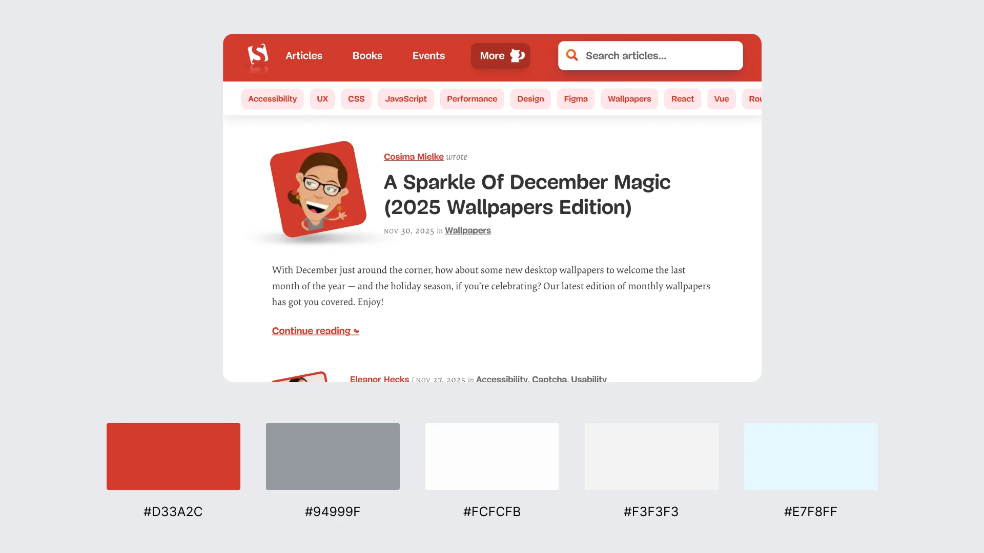
Smashing Magazine uses a high-contrast palette built on black and white, with red applied as a focused accent to guide user attention. The strong tonal separation improves readability and interface clarity, while the accent red highlights links, navigation elements, and key call-to-action areas. In a WordPress-style setup, theme.json and Global Styles assign these colors as semantic roles to enhance CTA visibility, reinforce hierarchy, and maintain a content-driven layout.
4. High-Contrast Black, White & Accent Blue (wired.com)
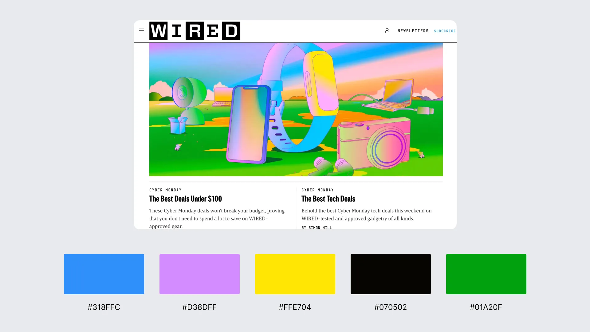
WIRED uses a high-contrast black-and-white foundation with blue applied as a precise accent to emphasize hierarchy and interaction. The strong black/white base ensures maximum readability and clean structural separation, while blue highlights category labels, navigation cues, and key call-to-action elements.
5. Pastel Rose, Blush & Cream Trio (bazzile.ch)
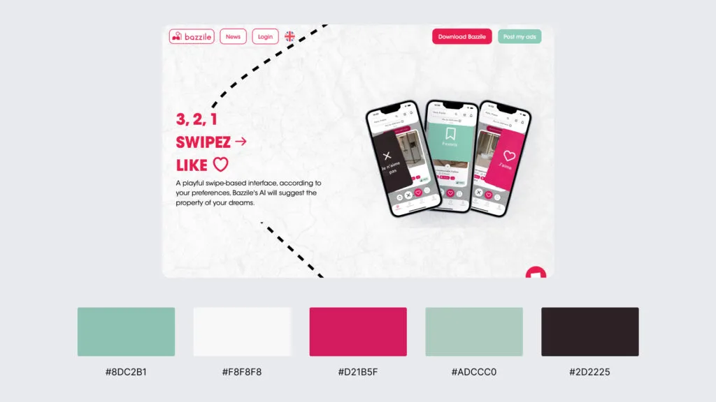
Bazzile uses a pastel palette of rose, blush, and cream tones to create a gentle, low-saturation interface that distinguishes UI elements without strong contrast. These hues form a cohesive global system applied to backgrounds, navigation, text, and interactive components, maintaining visual harmony across the layout. The soft palette supports readability, preserves a refined aesthetic, and demonstrates how pastel schemes can deliver a modern, calm, and content-focused presentation.
6. Complementary Indigo & Amber (VA.gov)
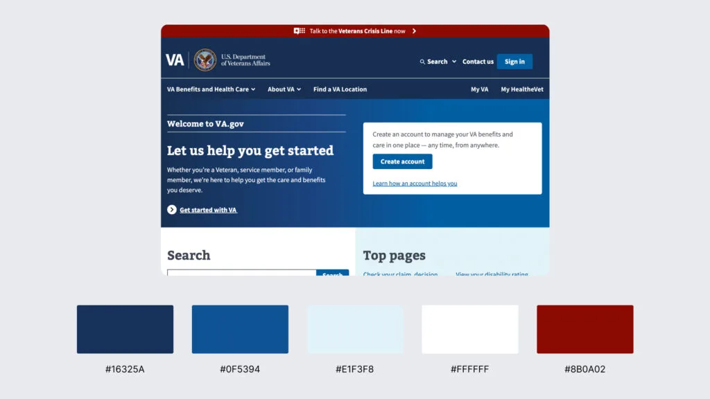
VA.gov uses a complementary palette built from deep indigo paired with warm amber accents to create strong contrast and clear interaction cues. Indigo defines the core layout surfaces (headers, navigation areas, and section dividers), while amber is reserved for alerts, calls to action, and directional highlights.
7. Split-Complementary Cyan, Blue-Violet & Orange (stripe.com)
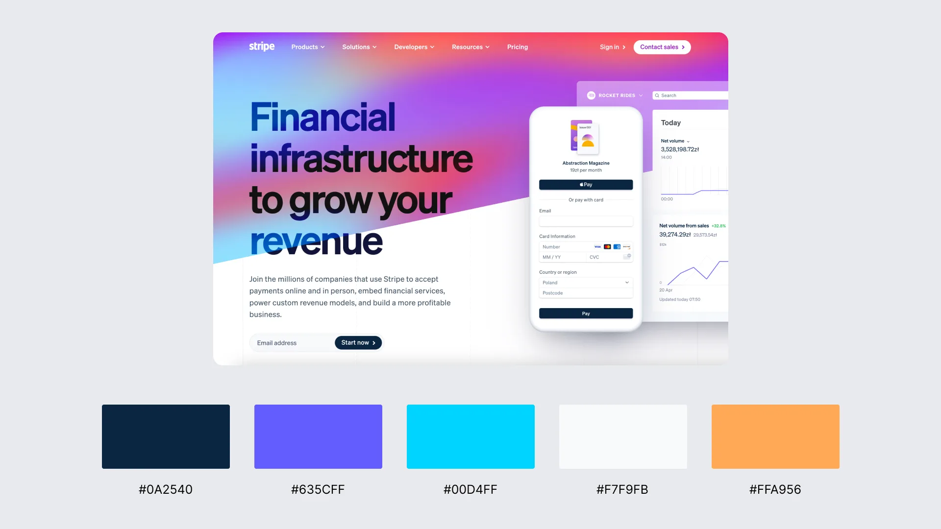
Stripe uses a split-complementary palette centered on cyan and blue-violet, complemented by warm orange accents that highlight interactive and promotional elements. The cool cyan–blue-violet range forms the structural base of the layout and supports modular sectioning across Stripe’s block-styled interface. At the same time, the orange accents provide controlled contrast for calls to action, feature highlights, and navigation cues.
8. Triadic Teal, Coral & Golden Yellow (mailchimp.com)
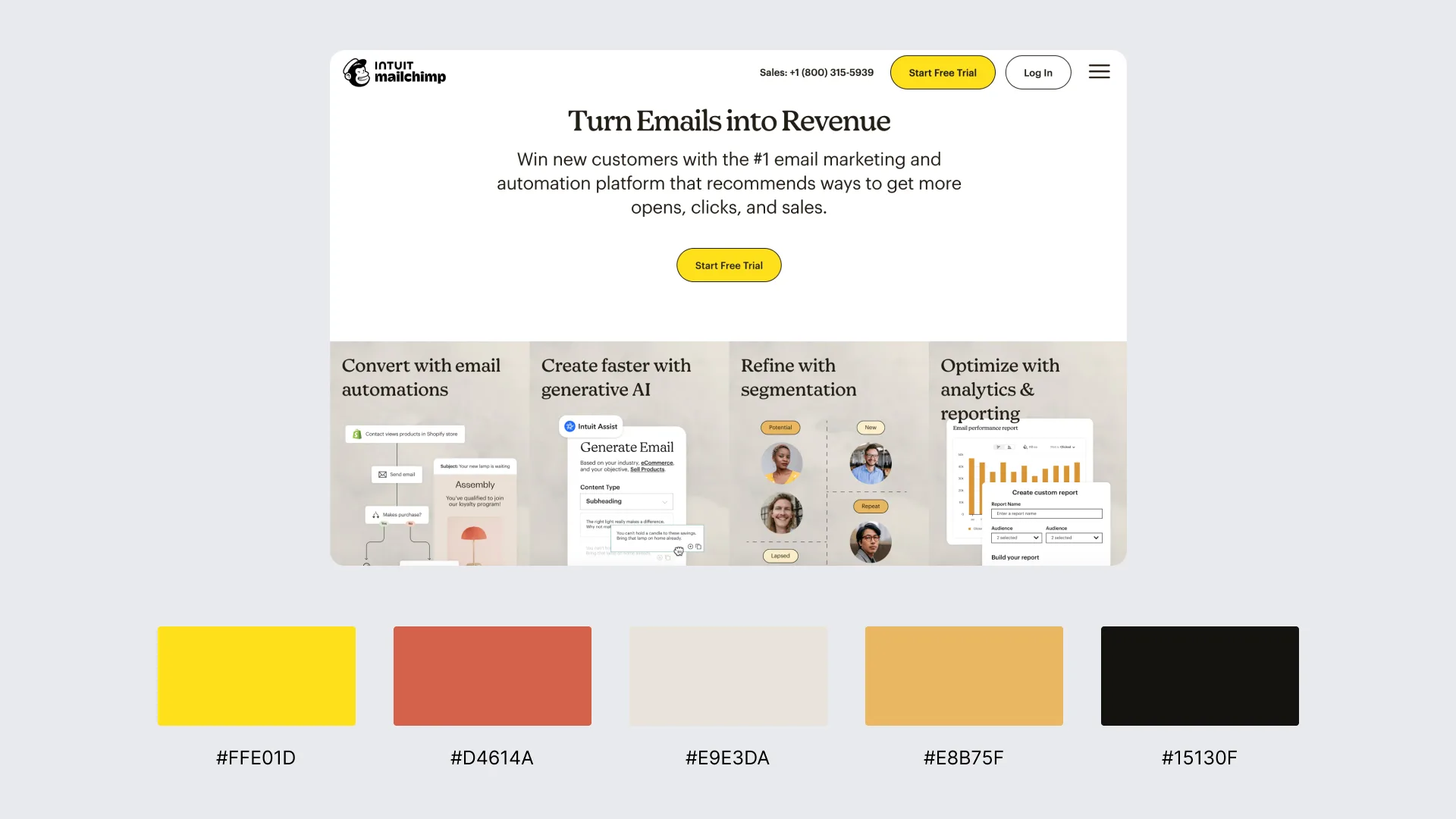
Mailchimp uses a triadic palette of teal, coral, and golden yellow to create dynamic variation across its modular layout. Teal anchors key interface areas such as navigation, backgrounds, and feature blocks, while coral provides warm contrast for highlights, illustrations, and promotional sections. Golden yellow is the third accent color, used in calls to action and emphasis elements to highlight priority interactions.
9. Tetradic Purple, Green, Yellow & Red (slack.com)
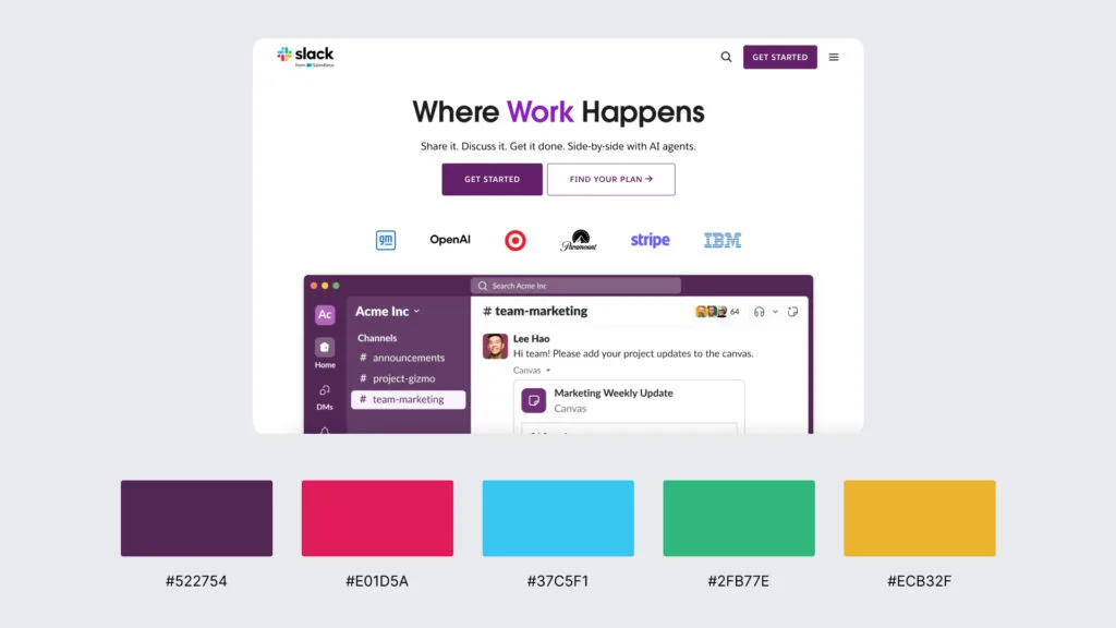
Slack uses a tetradic palette built from purple, green, yellow, and red, the same four-color system showcased in its logo and carried through illustrations, product graphics, and UI accents. Purple frequently serves as the structural base, while green, yellow, and red function as contrast accents applied to navigation cues, category highlights, and interactive elements.
10. Vibrant Magenta, Indigo & Electric Cyan (duolingo.com)
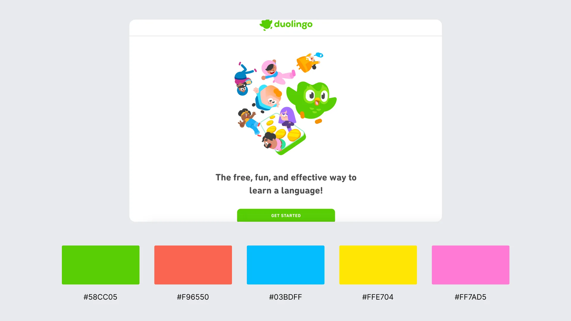
Duolingo uses a vibrant tri-hue palette that combines magenta-leaning pinks, saturated indigo, and bright electric cyan to create high visual energy across its interface. These colors appear in illustrations, progress indicators, section dividers, and interactive elements, producing strong focus and clear foreground separation.


Contact
Don't like forms?
Shoot us an email at [email protected]