WordPress Gutenberg: Complete Guide to the Block Editor

Table of Contents
WordPress Gutenberg is the editing subsystem on which the current version of the WordPress system is built. It offers a block-based interface for content creation, layout, and site building in a unified way. The block editor has integrated all the content components, including text, images, videos, embeds, and buttons, into one interface where the blocks can interact with one another.
Themes extend the block-based interface for site building, while plugins extend the functionality of the block editor with blocks not included in the default version of WordPress. Custom blocks help extend the capabilities of the block editor in React and WordPress’s block API.
The current WordPress editor system is influenced by the editor’s operational characteristics, the use of blocks for building content, the extension of the editor’s capabilities by themes and plugins, and the relative position of the editor compared to the Classic Editor and page builders.
What Is WordPress Gutenberg?
WordPress Gutenberg is the content editor that WordPress uses by default. It was introduced in WordPress version 5.0 in December 2018, replacing the traditional TinyMCE editor. The editor uses a block structure for content creation and page layout within a single interface. The traditional content creation and page layout have been combined into a single block-based editor.
WordPress Gutenberg uses a block-based approach with blocks consisting of paragraphs, headings, images, columns, buttons, and embedded content, which can be customized and styled separately. This is also applicable in block themes, which use blocks for building entire websites, headers, footers, and navigation.
The development of the WordPress Gutenberg editor occurred in phases that expanded its functionality from content creation to building WordPress sites and beyond. The phases that the editor has gone through and the editor’s handling of blocks explain how it came to be and the phases it has undergone so far.
How the Gutenberg Block Editor Works
The Gutenberg block editor uses a block-based interface where everything is a block. When a new post or a new page is created, a blank canvas appears on the screen. A block inserter can be enabled by pressing the ‘+’ button on the top-left part of the screen or by pressing the ‘/’ key on a blank block. The block inserter shows a list of all available blocks, grouped into categories: text, media, design, widgets, themes, and embeds.
Each block functions as an independent element with 2 layers of controls. A toolbar appears directly above the selected block with quick-access options , alignment, bold, italic, linking for text blocks; cropping, replacement, and sizing for image blocks. The right sidebar provides deeper settings: typography, color, spacing, borders, and an Advanced section with HTML anchor and CSS class fields.
Blocks stack vertically by default and can be reordered through drag-and-drop, arrow buttons on the toolbar, or the List View panel that displays the full block hierarchy. Layout blocks , Columns, Group, Row, Stack , nest other blocks inside them to create complex structures. A Columns block can contain a Paragraph block in one column and an Image block in another, all with their own controls.
The Gutenberg project achieved this level of functionality through several development stages.
Gutenberg Project Phases
The growth of the Gutenberg Project is done through four phases:
Phase 1: Easier Editing; Phase 2: Customization; Phase 3: Collaboration; and Phase 4: Multilingual. Each phase adds more functionality to what the editor can do for the user in WordPress.
Phase 1: Easier Editing was included in the 5.0 WordPress update in December 2018. This phase replaced the TinyMCE editor with the block editor and established it as the primary content creation tool.
Phase 2: Customization was included in the 5.9 WordPress update in January 2022. This phase included Full Site Editing, block themes, the Site Editor, and the theme.json file. This phase expanded block editing from the entire post to the entire site, including templates, headers, footers, and other design options.
Phase 3: Collaboration is the current phase. This phase will provide a real-time collaborative editing tool for the block editor, enabling multiple people to edit the same content simultaneously.
Phase 4: Multilingual will provide native translation tools within the WordPress editor, so that a third-party plugin is no longer necessary for multilingual content.
Each phase is designed to build upon the previous one. The block editor was introduced by Phase 1: Easier Editing, which is the foundation for the template system introduced by Phase 2: Customization. This template system is the foundation for the real-time collaborative tool and the translation tool included in Phases 3 and 4.
This editor has been a work in progress for a long time and is the real difference between the previous editor and the one included in the current version of WordPress.
Gutenberg vs Classic Editor
WordPress’s Gutenberg and the Classic Editor use 2 very different content editing models. One is block-based, where every piece of content is its own entity, and you can style and configure them separately. The other is more traditional, where the entire piece of content is a single HTML document that you edit accordingly.
Content structure varies at its core. The Classic Editor stores all content in a single HTML block, whereas the Gutenberg editor divides content into separate blocks, each with its own HTML, thereby creating a structured environment.
The way you can style your page is another major point where the 2 editors differ. The Classic Editor offers no column layouts, drag-and-drop, or page structuring. You need to use shortcodes and page builder plugins to do anything more than linear layouts. Gutenberg offers columns, group, row, and stack blocks to style your page.
The underlying technology is completely different as well. Gutenberg is built with React and the WordPress REST API, giving you a fully dynamic editing interface where you can see your changes in real time and even interact with individual blocks. The Classic Editor, on the other hand, is built using TinyMCE, a JavaScript library that is not even component-based.
What Are WordPress Gutenberg Blocks?
Gutenberg blocks are the basic units of the WordPress editor, also known as the Block Editor. A block is a section of content that contains one type of information, such as a paragraph, image, heading, button, video, or embed.
Blocks replace the shortcodes, widget areas, and HTML fragments required by the Classic Editor to display content beyond plain text. Instead of adding functions to the editor via code, all functions are now individual blocks with their own interface.
There are more than 90 individual blocks in the core, divided into six categories: text, media, design, widgets, theme, and embeds.
Besides individual blocks, the editor also offers the following:
Patterns: These are groups of blocks ready to be placed on the page, providing the user with ready-to-use templates.
Synced Patterns: These are the old reusable blocks that let the user have the same content on every page where the synced pattern appears. Third-party plugins and custom block development extend this system further. How these blocks are categorized, grouped into patterns, and specialized for specific content needs defines the practical structure of the editor.
Block Types and Categories
Gutenberg Blocks are divided into six types depending on the functions they perform within the editor. These types include text, media, design, widgets, themes, and embeds. This is a method of grouping the blocks based on how they handle different types of content, whether written, visual, structural, dynamic, or external, respectively, thus aiding in the location of a given block without having to go through all the available blocks.
Text blocks handle written content. The paragraph, heading, list, quote, code, preformatted, verse, and table blocks address different writing formats.
Media blocks handle visual and audio material. The image, gallery, audio, video, cover, and file blocks handle different types of visual and audio material, respectively.
Design blocks handle the spatial arrangement of different types of content. The columns, group, row, stack, separator, spacer, and buttons blocks handle different aspects of spatial arrangement, respectively.
Widget blocks handle dynamic data within a given block of content. The latest posts, latest comments, search, archives, categories, RSS, social icons, and tag cloud handle different types of dynamic data, respectively.
Theme blocks only work within the Full Site Editing mode. The navigation, site logo, site title, site tagline, post title, post content, post date, post author, query loop, and template parts handle different aspects of a website’s structure.
Embed blocks handle external data within a given block of content. The YouTube, Twitter/X, Spotify, Vimeo, SoundCloud, TikTok, and other platform-specific blocks handle different types of visual material, respectively.
Block Patterns and Reusable Blocks
Block patterns and reusable blocks are predefined content structures that can be saved and do not require developers to build layouts from scratch in the editor.
A block pattern is a pre-designed set of 2 or more blocks, a heading and text, and a button, a two-column layout with images and descriptions, a pricing table with rows and styles, etc. WordPress has a number of block patterns included by default. Additional block patterns can be found through the WordPress.org directory. Once a block pattern has been added to a block, the individual blocks within the block pattern can be completely customized independently.
Reusable blocks, renamed to Synced Patterns in WordPress 6.3, function differently. A synced pattern is a saved group of blocks that stays connected across every instance. Editing a synced pattern on one page updates it everywhere it appears on the site. This makes synced patterns suited for content that must remain identical across pages: call-to-action banners, disclaimer notices, and contact information sections.
The distinction shapes content strategy directly. Patterns serve as starting templates that diverge after insertion. Synced patterns enforce site-wide consistency. Both reduce repetitive assembly work, but they serve opposite editing models: independent customization versus centralized control.
Beyond these structural tools, Gutenberg includes specialized blocks for content needs that standard blocks do not cover, starting with direct HTML control.
Custom HTML Block
The Custom HTML Block allows inserting and editing raw HTML directly inside the Gutenberg editor, bypassing the visual block interface for content that requires manual code control.
Standard blocks abstract content into structured settings panels. The Custom HTML Block removes that abstraction entirely, accepting any valid HTML: custom div structures, inline styles, script tags, iframe embeds, SVG images, and structured data markup. A toggle button switches between code view and visual preview without leaving the editor.
This block serves a specific role in content workflows. Layouts or elements that no existing block supports, customized call-to-action structures, third-party widget embeds, schema markup, or HTML that a design requires verbatim go into the Custom HTML Block.
It bridges the visual block workflow with raw code control, operating within the scope of PHP for WordPress development and front-end customization where standard blocks reach their limits.
For content that pairs visual media with text in a structured layout without custom code, a dedicated block handles that pattern natively.
Media and Text Block
The Media and Text Block combines a media element with written content in a single side-by-side layout, creating a structured pairing without requiring Columns or Group blocks.
The block accepts images or videos from the media library, direct uploads, or external URLs and positions them adjacent to a text column that supports paragraphs, headings, lists, and other nested blocks.
Alignment controls place the media on the left or right side. The “Stack on mobile” toggle collapses the two-column arrangement into a single vertical stack on smaller screens, preserving readability across devices.
Width settings adjust the proportional space between the media and text columns. The media fill option crops the image to match the text column height, aligning both sides visually. Background color, padding, and block-level CSS class fields provide additional styling control.
This block addresses one of the most common content patterns , explanatory image paired with descriptive text , in a way that keeps the media-text relationship explicit within the block hierarchy. The structure renders consistently on the front end and remains manageable in the editor, unlike manually configured column layouts that require more blocks and nesting for the same result.
The practical workflow of adding, arranging, customizing, and managing blocks inside the editor ties these individual block capabilities together.
How to Use the WordPress Gutenberg Editor
Adding and Arranging Blocks
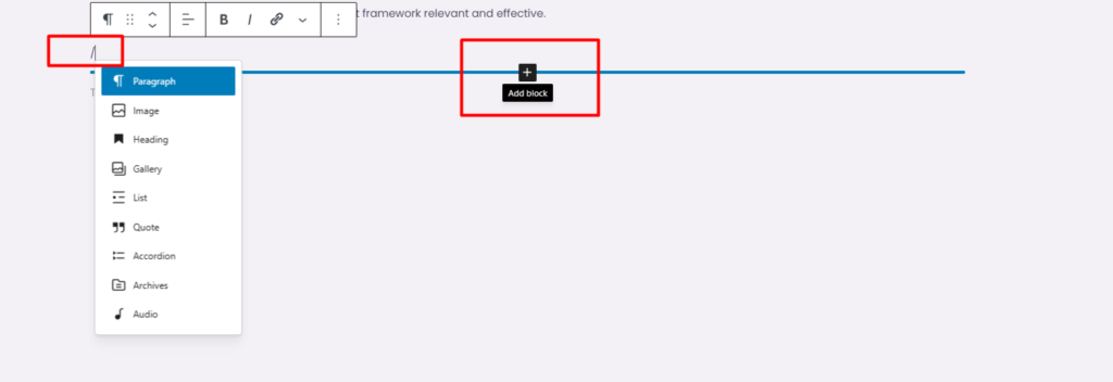
The Gutenberg editor provides 3 methods for adding blocks to a post or page. The block inserter, the blue “+” icon in the top-left corner or between existing blocks, opens a categorized panel of all available blocks. Typing “/” in an empty block triggers an inline search: entering “/image” surfaces the Image block immediately. Pressing “Enter” at the end of any text block creates a new empty Paragraph block below it.
Blocks are stacked vertically and can be reordered through 3 mechanisms. Each block’s toolbar includes a six-dot drag handle for drag-and-drop repositioning and arrow icons for moving a block one position up or down.
The List View panel , accessible from the top toolbar , displays every block on the page in a hierarchical outline, where blocks can be dragged to new positions across the full document structure.
Layout blocks group content into composite structures. A Group block wraps multiple blocks into a single movable unit. A Columns block splits content horizontally. A product feature section, for example, might start with a Heading block, followed by a Paragraph block for the description, an
Image block for the product screenshot, and a Buttons block for the call-to-action , all placed in sequence, then wrapped in a Group block for collective styling and repositioning.
After blocks are placed and arranged, the next step is adjusting their visual appearance and behavior.
Customizing Blocks
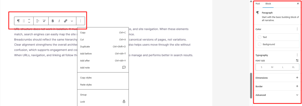
The 2 main areas of the Gutenberg editor for customizing blocks are the block toolbar and the block settings sidebar. The block toolbar, located directly above the block, contains context-dependent quick actions. When a paragraph block is selected, the toolbar contains text alignment, bold, italic, strikethrough, inline code, and hyperlink tools.
On the other hand, it contains block-level tools such as align, crop, file, and link tools when an image block is selected. The tools available on the toolbar depend on the block type being edited.
The Block tab of the right-hand sidebar contains more features and is divided into sections. The right-hand sidebar of a paragraph block contains Typography, Color, Dimensions, and Border tools. Structural blocks, such as columns, contain more features, such as layout. These features include the number of columns, column widths, and column alignment at desktop, tablet, and mobile screen sizes.
The Advanced section of every block’s sidebar contains 2 universal fields at the bottom. The first is the HTML Anchor, which creates a jump link. The second one is the Additional CSS Class, which connects the block to a stylesheet using a custom class name.
For instance, an image block can be aligned to the center of the page using the block toolbar. The block can then be given a border radius and alt text using the block settings sidebar. The block can thus be customized without coding. The Gutenberg editor interface is also used to customize media files, images, videos, audio, and documents. The editor contains file-type controls.
Working with Media
The Gutenberg editor manages media through dedicated blocks: Image, Gallery, Video, Audio, Cover, and File, each with controls specific to its content type.
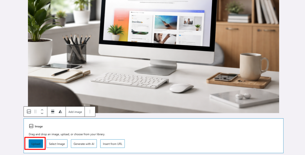
These 3 methods add media to any media block. Upload allows dragging a file directly into the block or selecting it from the device. Media Library opens the WordPress media manager with all previously uploaded files. Insert from URL accepts a direct external link to an image, video, or audio file. All the methods are available across every media-related block.
The Image block displays a single image with an optional caption, toolbar controls for alignment and cropping, and sidebar settings for dimensions, border styling, and alt text. The Gallery block arranges multiple images in a grid with configurable column count, caption display, and link behavior.
The Video block plays uploaded files or embedded links with controls for autoplay, looping, and poster image. The Cover block layers text and other blocks over a background image or video, creating depth within the content layout.
These blocks combine for complex visual sections. A product showcase might use a Cover block with a full-width background image, an Image block sized to feature the product, and Paragraph blocks positioned over the cover to describe key features, all producing a layered layout entirely within the editor.
For controlling how much of a post appears in blog listings and feed previews, a specific block handles that boundary.
Read More Block
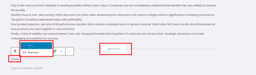
The Read More Block splits a post’s content into 2 sections: a preview for archives and RSS feeds, and the content, which is displayed after the block is opened. The content above the block will be displayed, while the content below the block will be hidden until the post is clicked.
The Classic Editor achieved this split with the <!–more→ ( or use /more or /readmore tag) HTML tag inserted manually into the text field. Gutenberg replaces that with a visible, draggable block labeled “Read more” that is located between content blocks in the editor canvas.
Placement determines how posts appear across the site. Placing the Read More Block after the intro paragraph and a key image normalizes previews on archive pages and blog feeds. This gives enough content to get a hint of the topic without giving away the entire article. Articles without this block will have default settings, usually showing either the entire content or the first 55 words without any formatting.
Some themes allow customization of the text for the Read More link, usually found at the bottom of the excerpt. This only customizes the text, not the content. The placement of the Read More Block affects how blog and archive pages display content, which is related to how themes contribute to a website’s overall display and design.
WordPress Gutenberg Themes
Classic themes use PHP template files, which include header.php, footer.php, single.php, and archive.php, among others. Design changes usually involve editing these files or adjusting limited options in the Customizer.
Block themes use HTML-based templates built with blocks, along with a theme.json file that includes design settings such as colors, fonts, spacing, borders, and widths.
The ability to access the Site Editor under Appearance > Editor enables you to edit all templates visually, starting with a post or page to archives, search, 404, and index templates using the same editor for post content. Template Parts handle the header area that includes the logo, navigation menu, and top bar, as well as the footer area that includes the footer content.
Global Styles, which are also in the Site Editor, let you change design tokens, which are colors, fonts, font size, spacing, borders, and widths, site-wide, without changing the theme.json file, which creates a two-tier system: a theme.json file sets the baseline, and Global Styles let site owners change these with a visual interface.
Block themes that support Site Editor are Twenty Twenty-Three, Twenty Twenty-Four, and starter themes like flavor. Other themes are hybrid, which support the block editor for post content but not the Site Editor.
Whether block or classic, this choice gives you a lot of control over the design with the WordPress editor, depending on whether block or classic themes are used.
If block editor and block themes are not sufficient for your needs, then page builders are another option, with different trade-offs.
Gutenberg vs Page Builders
WordPress Gutenberg and page builders both enable visual layout building, but they operate through fundamentally different architectures with distinct trade-offs in design flexibility, performance, and portability.
The first difference is integration. Gutenberg is part of WordPress core , installed by default, storing content as standard block markup in the database. Page builders like Elementor, Divi, Beaver Builder, Oxygen, and Bricks are third-party plugins with their own rendering engines, storage formats, and editing interfaces layered on top of WordPress.
Design capability currently favors page builders. They offer larger template libraries, advanced animation systems, built-in form builders, popup editors, and more granular control over responsive layouts at specific breakpoints. Gutenberg provides solid support for spacing, typography, color, and alignment, but features like animations, conditional display logic, and advanced form handling require additional block plugins or custom CSS.
Performance, however, favors Gutenberg. The block editor produces relatively clean HTML with minimal wrapper elements and no inline style dependencies. Page builders generate additional wrapper divs, inline styles, and front-end JavaScript to power their design features. As page complexity increases, this additional code impacts load times, Largest Contentful Paint, and Total Blocking Time metrics.
Portability creates the sharpest distinction. Gutenberg content degrades gracefully, which, disabling the block editor, leaves standard HTML that renders normally. Deactivating a page builder breaks layouts, leaving orphaned shortcodes or proprietary markup that requires rebuilding. Migrating away from a page builder means reconstructing every page it built.
Gutenberg prioritizes stability, performance, and core WordPress integration. Page builders prioritize design range and template variety. Gutenberg’s feature set continues to expand with each WordPress release, progressively narrowing the design gap while maintaining its performance and portability advantages.
For users who want early access to upcoming Gutenberg features before they ship in WordPress core, the Gutenberg plugin provides that testing ground.
WordPress Gutenberg Plugin
The WordPress Gutenberg plugin is a standalone plugin available in the WordPress plugin directory on WordPress.org. The plugin provides access to new features still under development for the new block editor. The plugin is not the actual block editor; rather, the editor has been included in WordPress’s core since version 5.0.
The plugin follows a bi-weekly release pattern that provides users with experimental blocks, new editor interface elements, and API changes before they are included in WordPress’s core. The plugin provides a stable version of the new features that are then included in the next version of WordPress’s core. For example, the new full-site editing feature was included in the Gutenberg plugin before it was included in WordPress version 5.9.
The risk of installing the Gutenberg plugin on a live site is high because it is still experimental and may introduce breaking changes between releases. The plugin is recommended for developers, theme builders, and plugin builders who need access to the new editor features.
Plugins that provide additional blocks for the Gutenberg plugin for use in a live site have a different purpose altogether.
Best WordPress Gutenberg Plugins
3 Gutenberg WordPress plugins have consistently increased the capacity of the WordPress block editor in production environments: Spectra, Kadence Blocks, and Stackable. Spectra, developed by Brainstorm Force (the creators of the popular theme Flavor), offers users over 30 blocks with additional form tools, countdown timers, star rating systems, price lists, testimonial sliders, and call-to-action templates.
It includes a pattern library and template import system designed to reduce dependency on additional plugins by consolidating common website features into block elements.
Kadence Blocks provides advanced layout control through its Row Layout, Advanced Gallery, Info Box, Tabs, and Accordion blocks. The Row/Layout block offers precise column sizing, padding, and background configuration with independent settings for desktop, tablet, and mobile screen sizes. Its strength is responsive design precision at every breakpoint.
Stackable focuses on design consistency with UI-kit-styled blocks: containers, feature grids, team member sections, blog post grids, notification bars, and image boxes. Each block includes hover state styling, gradient background support, and advanced typography controls.
Stackable’s design library provides professionally styled block templates that maintain visual coherence across an entire site.
These plugins extend the block editor’s production capabilities without replacing it; they add blocks and patterns that integrate into the same editing interface. For functionality that no existing block or plugin provides, custom block development offers full control.
WordPress Gutenberg Block Development
WordPress Gutenberg block development includes creating custom blocks for the block editor beyond the native capabilities and those offered by third-party plugins. This field can be considered a specific part of custom WordPress development , where JavaScript (specifically React for the editor interface), PHP (for server-side block registration and rendering), and a block.json file for block properties and dependencies are utilized.
@wordpress/create-block is a tool for generating a block plugin with the necessary directory structure and configuration. Custom blocks require 2 primary functions: one for the edit function, where the block’s interface is defined for the block editor interface, and a save function for determining the HTML content to be saved to the database.
When the block requires dynamic content from the database, user information, or other conditions, a render.php callback for server-side block rendering is used instead of a save function.
Block registration is done through PHP using the register_block_type method, which reads the block.json file and links the block’s scripts, styles, and rendering functions to WordPress. The Block Supports API can be used by the block editor to inherit native block editor features, including color pickers, typography options, space settings, border options, and alignment options, which can be declared in block.json instead of creating custom interfaces for the block editor.
Official documentation and related resources for creating custom blocks and customizing the block editor interface can be found in the WordPress source code.
Block Editor Documentation and Resources
Block editor documentation and resources are official WordPress documentation covering the use, customization, and development of the WordPress Block Editor and the Gutenberg editor. The Block Editor Handbook is a primary reference located on the WordPress developer site at developer.wordpress.org. It includes development basics, Block API, component documentation, step-by-step guides such as “How to Create a Block,” data layer for the editor, extensibility hooks, and SlotFill for user interface customization.
The WordPress Gutenberg GitHub repository is the main source for the Block Editor, the Gutenberg plugin, and all block components included in WordPress. The issue tracker is a list of all bug reports and feature requests for the Block Editor. The pull requests section shows the development activity for the Block Editor. The /docs directory in the WordPress Gutenberg repository is a copy of the supplementary documentation also available on the WordPress developer website.
The WordPress Developer Blog is a source for articles on new feature announcements for the Block Editor, breaking changes for migrating from the Block Editor, and explanations of decisions that may not be included elsewhere. Regarding theme development, the Block Theme section of the WordPress Theme Handbook provides information on theme.json configuration, template structure, template parts, and Global Styles. The WordPress.org Pattern Directory provides a browsable pattern library with source code for users to review.
Contact
Don't like forms?
Shoot us an email at [email protected]