Heat Map Complete Guide

Table of Contents
A heat map is an analytics tool that records how visitors interact with page layouts, content blocks, and interface elements. It visualizes click locations, scroll depth, cursor movement, hovers, and touch interactions, so you can see which sections attract attention and where engagement drops.
Different heat map types (click, scroll, move, hover, touch, rage-click, and dead-click) provide focused views of these signals. This segmentation makes it easier to locate ignored areas, ineffective UI components, broken navigation paths, or stalled conversion steps.
In WordPress, you typically add heat maps through plugins or tracking scripts. The collected behavior data is then used to adjust layout, content, and calls to action, resolve usability issues, and address content visibility gaps.
What is a Heat Map?
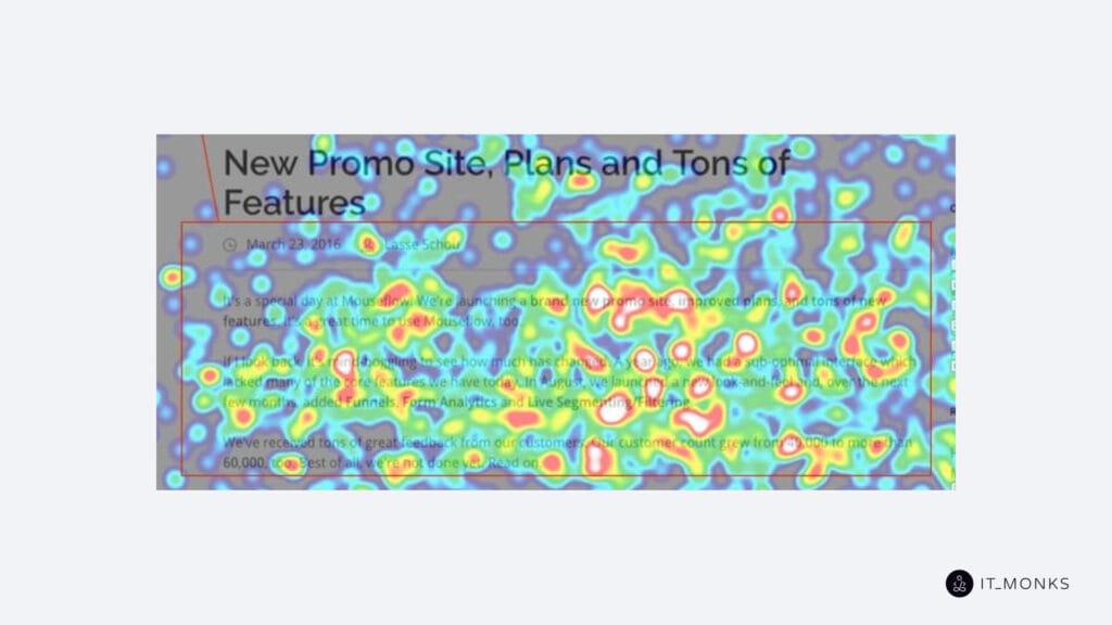
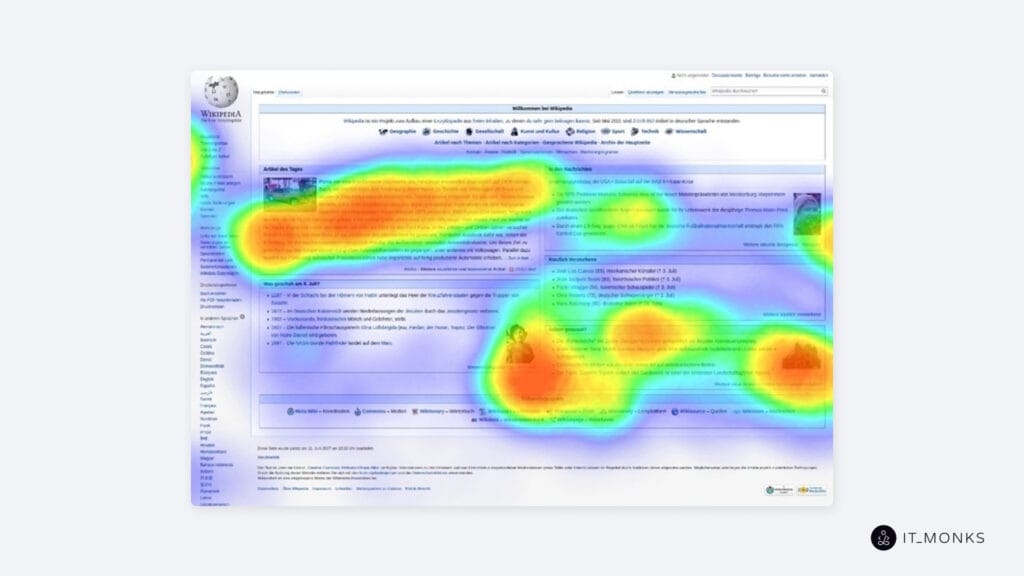
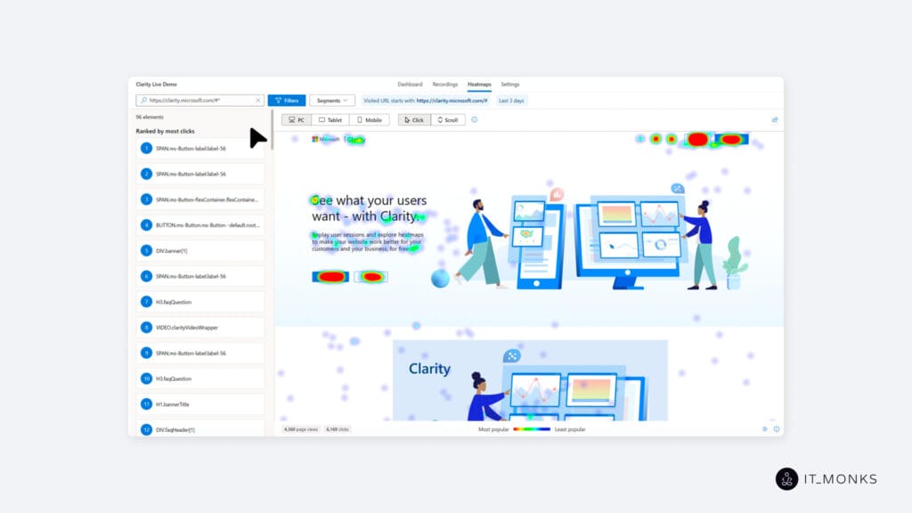
A heat map is a color-coded visual overlay that displays user interaction data directly on the webpage. It maps clicks, scroll depth, hover activity, and cursor movement to graded color intensities so each behavior appears as a visible interaction zone.
By assigning color density to each hotspot, the heat map converts quantitative engagement metrics into clear visual gradients. This allows you to see which elements attract attention, which areas users ignore, and how visitors naturally move through the interface.
These visual patterns help WordPress designers and developers evaluate layout performance, assess UI responsiveness, and adjust content placement to support smoother navigation and conversion flow. Because each interaction type produces its own pattern, multiple heat map formats exist to capture different aspects of user engagement across the site.
What Are Web Heat Maps Used For?
A heat map on a website is used to visualize and analyze how visitors interact with different elements across a page, turning user behavior data into a clear picture of where engagement concentrates or fades. It highlights click distribution, scroll abandonment patterns, hesitation points, and attention zones that show which sections, buttons, or navigation items attract interaction and which areas remain overlooked. These signals reveal content visibility strength and indicate how effectively the page structure supports typical user pathways.
As site owners interpret these visual patterns, heat maps help detect usability inconsistencies across theme or page-builder layouts. They show whether headlines, forms, or call-to-action elements sit in high-engagement regions or fall outside natural attention flow. The findings impact front-end development decisions by revealing navigation behavior, attention drop-off points, and UI components that may require repositioning or clearer emphasis. Heat maps also support decisions about navigation clarity by exposing missed menus, misdirected clicks, and interaction gaps across mobile and desktop views.
What are the Types of Heat Map?
Click Heat Map
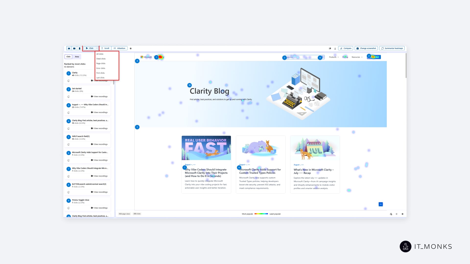
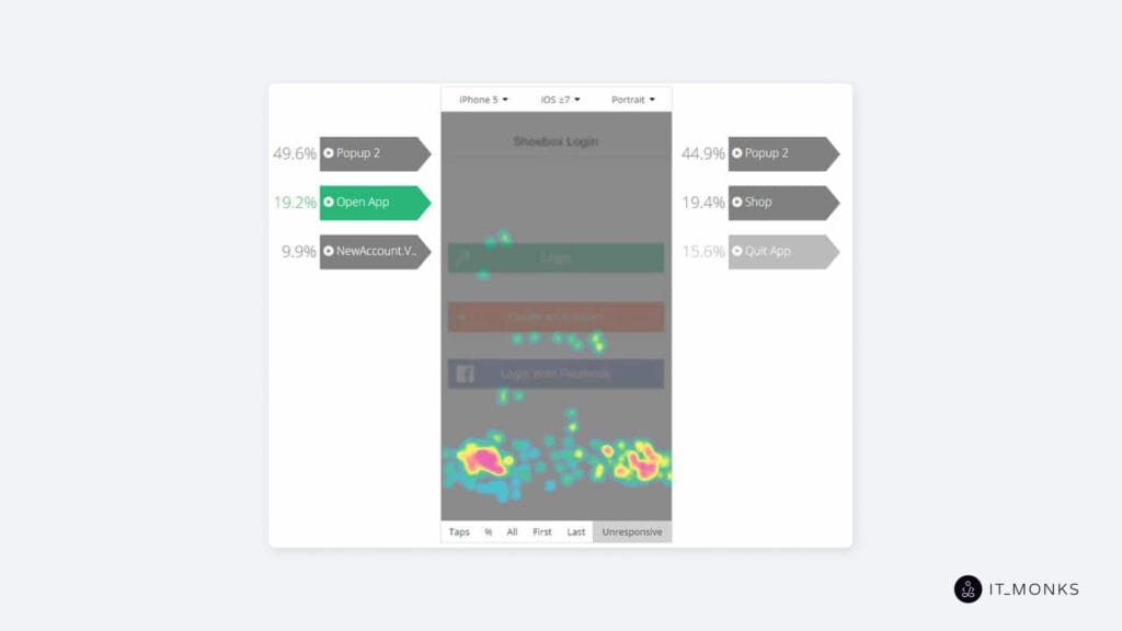
A click heat map on a WordPress website is a visual overlay that shows where users click on page elements. It tracks clicks across buttons, links, images, and navigation menus, highlighting areas that receive the most interaction and those that receive little to none.
Hotter colors indicate higher click activity, while cooler colors reflect lower engagement. This helps WordPress site owners identify effective call-to-action placements, detect overlooked interface elements, and adjust layouts so key actions appear where users naturally interact.
Scroll Heat Map

A scroll heat map records how far visitors scroll down a WordPress page, revealing which sections users actually view. It displays scroll depth as a vertical gradient, with warmer bands showing high-visibility regions and cooler tones marking points where users drop off.
For WordPress websites, scroll heat maps indicate whether important messages, forms, or CTAs appear in visible zones or fall below common viewing depth. This supports adjustments to content hierarchy, page length, and section placement.
Move Heat Map
A move heat map tracks mouse movement across a WordPress website, mapping cursor paths, pauses, and revisits. It visualizes where users look or focus their attention even without clicking.
These movement patterns help site owners understand whether headlines, key images, or interactive blocks attract focus. The results guide refinements to visual hierarchy and layout structure.
Hover Heat Map
A hover heat map monitors where users pause their cursor, highlighting elements that attract attention without generating clicks. It logs hover activity over links, buttons, images, and text blocks, revealing early user interest or hesitation.
For WordPress websites, hover maps help determine whether interface elements are clear and compelling, or whether users hover because of uncertain labels or unclear affordances.
Touch Heat Map
A touch heat map tracks tap and gesture interactions on touchscreen devices such as smartphones and tablets. It records taps, repeated taps, pinch-to-zoom gestures, and other touch inputs on the mobile version of a WordPress site.
These insights help developers validate responsive design by showing whether tap targets are adequate, menus are easy to reach, and key actions are usable on smaller screens.
Rage-Click Heat Map
A rage-click heat map identifies clusters of rapid, repeated clicks in the same spot. This pattern signals user frustration with unresponsive elements, misleading visuals, or slow interface components on a WordPress website.
Site owners can use rage-click findings to locate malfunctioning buttons, broken popups, or misbehaving toggles and remove behaviors that cause friction or abandonment.
Dead-Click Heat Map
A dead-click heat map tracks clicks that produce no visible response. These often occur on elements that appear interactive, such as decorative icons, styled text, or misaligned click zones created by specific themes or page builders.
For WordPress site owners, dead-click maps highlight non-functional or misleading elements, enabling teams to correct interaction zones, eliminate false affordances, and direct users toward actionable areas.
How To Analyze a Heat Map?
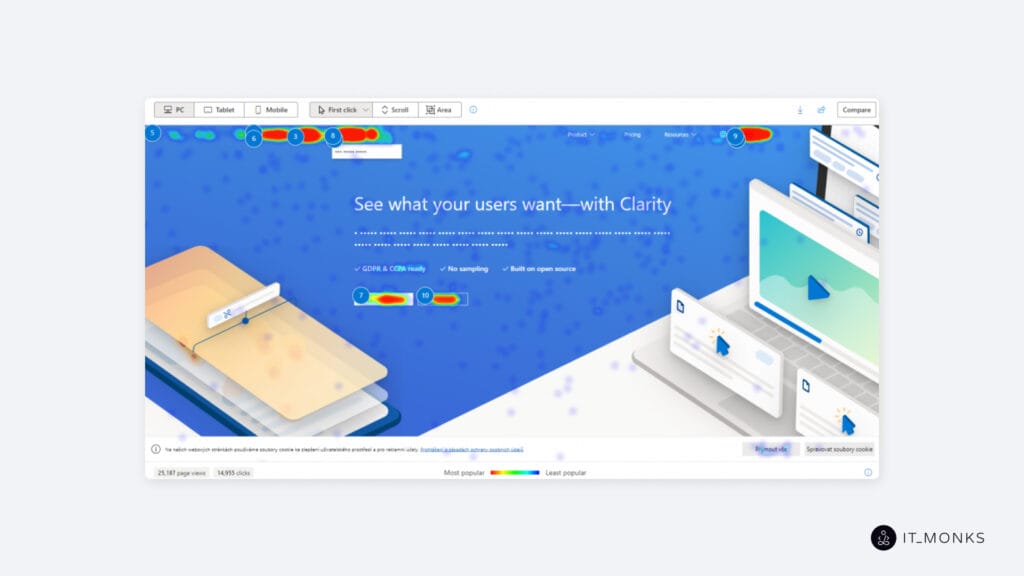
Analyzing a heat map involves interpreting the color-coded interaction patterns that show how visitors engage with specific areas of a page. Warmer areas indicate high interaction density, while cooler zones mark elements or sections that receive limited attention or remain outside common viewing depth.
By reading these visual distributions, WordPress site owners can determine which components attract attention, which are overlooked, and where users encounter hesitation or friction during navigation. This interpretation supports decisions about layout structure, content placement, navigation clarity, and conversion path alignment.
Heat Map Visualization Analysis
A heat map on a WordPress website visualizes user interaction density through a color-intensity gradient layered over a page snapshot. Warmer colors such as red, orange, and yellow indicate high-activity zones, while cooler colors such as green and blue indicate areas with minimal engagement.
This gradient makes interaction strength easy to interpret: higher opacity highlights repeated activity, and lower opacity marks sections with limited attention. Because the color spectrum is mapped directly onto the real layout, WordPress site owners can evaluate interaction patterns in the exact context of element placement and page structure.
User Attention Analysis
User attention analysis interprets heat map data to show which elements naturally draw user focus. Clusters of clicks, frequent hover patterns, and consistently viewed scroll regions reveal where visitors concentrate their attention on a WordPress page.
These patterns indicate which headlines, buttons, or content blocks attract interest and which essential elements remain unnoticed. For WordPress site owners, this analysis clarifies whether key components are positioned effectively in the visual hierarchy or whether critical content is bypassed due to weak prominence or suboptimal placement.
Interaction Friction Checking
Interaction friction checking identifies areas where users struggle to interact effectively. Heat map signals, such as repeated clicks on non-responsive elements, prolonged hovering without action, or inconsistent cursor movement around decision points reveal where friction exists.
On WordPress websites, such issues often arise from misaligned buttons, overlapping elements, theme-related UI inconsistencies, or unresponsive mobile menus. Detecting these friction points helps site owners resolve interface issues that disrupt smooth user navigation.
Engagement Drop-Off Analysis
Engagement drop-off analysis shows where user interaction fades as visitors move through a page. In scroll heat maps, drop-off appears as cooler zones near the bottom; in click maps, as inactive sections beyond core content; and in movement maps, as a lack of cursor activity after certain blocks.
These signals reveal where attention diminishes, and interaction stops. For WordPress site owners, this analysis indicates how long users stay engaged and which parts of long-form posts, product pages, or landing layouts fail to sustain interest.
Behavioral Bottlenecks Analysis
Behavioral bottleneck analysis uses heat maps to identify points where user flow slows or is disrupted. Bottlenecks appear as repeated hovering at decision points, unresolved clicks on progression elements, or navigation loops where users retrace their steps.
These patterns expose where forward movement breaks down, often in conversion-critical areas such as forms, checkout flows, or primary menus. For WordPress site owners, identifying these bottlenecks helps refine UI elements and layout structures so visitors can move through the intended journey without hesitation or unnecessary repetition.
How to Create a Heat Map?
Creating a heat map on a WordPress website involves setting clear tracking goals, choosing the right tool, configuring data collection, and reviewing the resulting interaction patterns. The steps below outline the process from setup to initial analysis.
- Define the behavior you want to measure, such as clicks, scroll depth, cursor movement, or mobile interactions. Align these goals with page types where user behavior affects performance, including homepages, landing pages, product listings, and long-form blog posts.
- Select a heat map tool that integrates cleanly with your WordPress theme or builder and supports the interaction types you plan to analyze. Add the tracking script to your site or enable the plugin integration to begin data collection on the selected pages.
- Specify the URLs or templates to monitor, prioritizing sections tied to navigation flow, content engagement, or conversion activity. Activate the heat map and allow it to gather real user interaction data over a meaningful traffic period.
- Review the heat map results once enough data has accumulated. Open the interface to view the color-coded activity overlay on your page snapshot and prepare for deeper behavioral analysis in the next evaluation steps.
What Problems Heat Maps Can Reveal in WordPress Websites?
On a WordPress website, a heat map reveals interaction and usability issues that traditional analytics often overlook. Because the data appears directly on the page layout, heat maps make visibility gaps and interaction failures easy to spot without relying solely on numeric metrics.
They identify unclicked or misaligned call-to-action elements caused by theme inconsistencies, misplaced blocks, or layout shifts introduced by page builders. Heat maps also reveal dead zones in the content flow, highlighting which sections users ignore because of weak layout logic or poorly structured blocks.
Navigation issues become visible through patterns that signal confusion, such as limited interaction with menu items, unresponsive mobile toggles, or unclear hierarchy within navigation paths. Form abandonment appears as cold zones and abrupt drop-off patterns, often caused by tight spacing, poor field ordering, or cluttered mobile layouts.
Heat maps also highlight frustration signals, including rage clicks on non-responsive elements linked to misconfigured plugins or malfunctioning widgets. Scroll heat maps reveal engagement drop-offs created by excessive padding, modal interruptions, or stacked content blocks that push important material too far down the page.These findings feed directly into WordPress development for marketers, helping teams refine structure, adjust UX patterns, and improve clarity. By exposing these issues visually, heat maps support update prioritization, structural testing, and iterative improvements based on real user behavior.

Contact
Don't like forms?
Shoot us an email at [email protected]