Visual Aesthetics of a WordPress Website Design

Table of Contents
A WordPress website’s visual aesthetics define how its design communicates identity, usability, and coherence through structure and style. As the foundational layer of front-end composition, aesthetics guide perception, influence interaction, and support brand interpretation beyond surface-level appeal.
Within the WordPress ecosystem, where modular flexibility integrates with standardized theme and block frameworks, visual design functions as both a creative system and an operational interface strategy. Layout composition establishes structural rhythm, typographic hierarchy directs attention and legibility, and color systems support clarity, contrast, and accessibility.
These elements operate as an interconnected design language rather than independent components, with responsive behavior ensuring that visual decisions adapt consistently across devices. The effectiveness of a WordPress website depends not only on appearance but also on how well its aesthetic logic aligns with user expectations, content structure, and interface clarity.
Layout Composition and Grid System Logic
Layout composition in a WordPress website is the methodical structuring of content and design elements to create order and visual balance across the page. At the center of this approach is the grid system, a structural framework of columns and rows that distributes space consistently and organizes content into clear, readable patterns. This system shapes how a visitor’s eye moves across the interface, guiding attention while ensuring that each section of the design feels connected and intentional.
Structured alignment and modular layout are not arbitrary choices; they are built into the logic of WordPress themes and block editors, which depend on grid principles to support responsive behavior and maintain coherence across screen sizes. Within the main components of WordPress design, layout serves as a critical foundation, acting as the invisible blueprint that supports typography, spacing, and interactive elements.
Underlying Grid System Implementation
The underlying grid system in a WordPress website defines the invisible framework that gives structure and alignment to every element on the page. It divides the layout into columns, rows, and spacing rules that determine how content fits together both visually and spatially. This grid architecture acts as the backbone of the interface, segmenting space into predictable modules so text, images, and blocks align intentionally rather than floating without structure.
WordPress themes and block editors operate on these principles by default, using container structures and layout frameworks that enforce consistent alignment across the site. Gutters regulate spacing between elements, margins create necessary breathing room, and column logic maintains visual balance, long before advanced layout tools like Flexbox or CSS Grid refine the details.
Applying Flexbox and CSS Grid
Flexbox and CSS Grid are the layout engines that translate the underlying grid system of a WordPress website into a functional, adaptable structure. While the grid establishes the overall spatial framework, Flexbox manages one-dimensional alignment by distributing items along a single axis. This makes it suited for menus, button groups, and linear content sections where spacing and alignment must adjust as elements change in size.
CSS Grid introduces full two-dimensional control, allowing designers to define rows, columns, and track relationships with precise spacing and alignment rules. These engines are integrated into modern WordPress themes and block editors, enabling layout zones to stretch, reorder, or re-stack based on content requirements. Flexbox supports directional flow, while CSS Grid organizes entire sections into reusable track systems ideal for stable template structures.
Working on top of the grid foundation, both systems convert a static layout into a dynamic, responsive interface. Their combined behavior governs alignment, modular organization, and content flow, core functions that prepare the layout for the responsive breakpoint logic that follows.
Establishing Base Responsive Breakpoints
Responsive breakpoints define the viewport thresholds at which a WordPress website’s layout must adapt to maintain readability, usability, and spatial balance. These control points operate as structural triggers, recalibrating alignment, spacing, and content flow when the screen width crosses specific ranges.
Breakpoints work in tandem with Flexbox and CSS Grid by determining when elements should wrap, realign, or redistribute across the available space. In WordPress, base breakpoints are commonly embedded into themes and block-based editors, defining default patterns for mobile, tablet, and desktop layouts. These global thresholds form the foundation for more detailed component-level adjustments that refine behavior on a per-block basis.
By anchoring layout changes to responsive thresholds, breakpoints ensure that the grid system behaves predictably across devices. They transform the layout from a fixed design into an adaptive system that responds intelligently to user context and screen constraints.
Visual Flow and Spatial Focus
Visual flow describes the directional path a user’s eyes follow as they scan a WordPress website layout. This path is shaped by spacing, alignment, grouping, and structural hierarchy, all of which guide users from one element to the next in a predictable sequence. Horizontal and vertical stacking, consistent spacing intervals, and balanced structural patterns establish an ordered visual rhythm, while spatial focus emerges at points where these patterns converge, typically around headings, media blocks, or grouped content clusters.
Within the WordPress interface, tools such as block spacing controls, alignment settings, and layout templates support this flow by structuring how elements are positioned and prioritized. By shaping how attention moves and where it stabilizes, visual flow and spatial focus transform the layout into a guided reading sequence that improves clarity and supports intuitive content processing.
Negative Space Use (White Space)
Negative space, or white space, is the intentional allocation of empty areas around and between elements to support structure, clarity, and user focus in a WordPress website. These spatial intervals function as design mechanisms that frame content, provide breathing room, and reduce cognitive load. Effective white space separates blocks, defines sections, and prevents visual congestion, allowing each element to be interpreted without competing distractions.
In WordPress, padding, margins, and block spacer tools enable granular control over these spacing relationships. Whether defining the gap between a heading and its body text or the buffer between primary and secondary content regions, negative space organizes the interface and supports comfortable scanning, reading, and navigation.
Visual Weight Distribution and Focal Points
Visual weight refers to the perceived prominence of an element based on its size, contrast, position, and density, and it establishes focal points within a WordPress website. Larger or high-contrast elements draw attention first, functioning as primary anchors within the layout. This hierarchy is intentionally constructed through strong headlines, featured images, prominent sections, and other emphasis cues that carry greater perceptual gravity.
As users move through a page, these focal points structure the reading sequence and clarify which content is most important. WordPress design tools (such as block-level hierarchy, featured-media components, and designated layout zones) allow designers to control where emphasis is placed and how it flows across the page. When visual weight is distributed intentionally, it strengthens usability, reinforces hierarchy, and ensures that critical content receives the appropriate level of attention.
Typographic Hierarchy and Readability
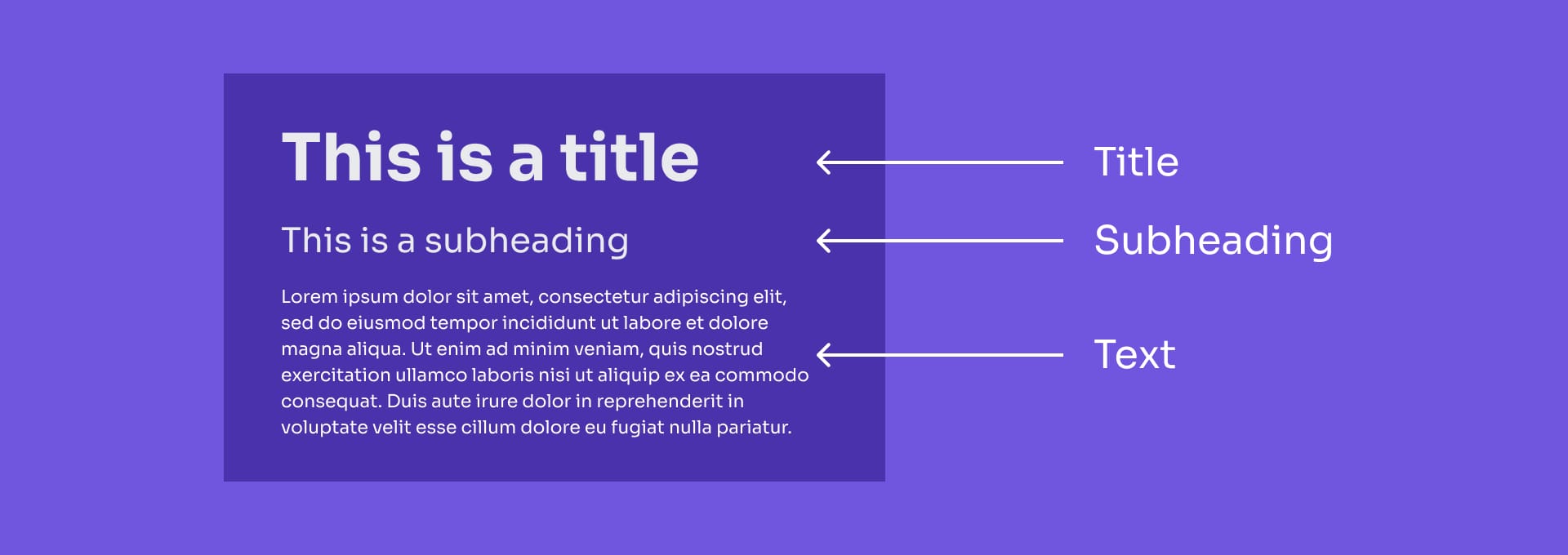
Typography on a WordPress website functions as a structural system that determines how content is read, understood, and prioritized. A clear typographic hierarchy, from headings to body text to supporting meta information, creates an internal order that guides users through information in a logical and accessible sequence. This hierarchy organizes content through coordinated type scale, spacing, and alignment, establishing a reading rhythm that supports legibility and reduces cognitive effort.
Readability operates as a foundational requirement for comprehension, and each typographic decision directly influences how users interpret and process content. In WordPress, these principles are applied through theme typography settings, block editor controls, and global style systems that define consistent text behavior across templates and components.
Font Selection and Performance Integration
Font selection on a WordPress website influences both textual clarity and load performance. A typeface affects readability, brand expression, and typographic hierarchy while also introducing a measurable performance footprint through file size, rendering behavior, and load priority. Selecting fonts requires balancing tone, legibility, and structural utility across serif, sans-serif, and variable options so that each choice supports the established hierarchy.
Performance considerations are integral to this process. Formats such as WOFF2 and modern variable fonts provide efficient compression and faster rendering, while fallback definitions and loading strategies help stabilize layout and reduce visual shifts during page load. WordPress manages these typography decisions through theme.json configurations, global style tokens, and block-level settings that coordinate aesthetic consistency with technical efficiency. In this model, fonts function as structured design decisions that influence how the website communicates and performs simultaneously.
Font Pairing Strategy for Lexical Flow
Font pairing is the structured coordination of multiple typefaces to support clarity, hierarchy, and reading rhythm across a WordPress website. Effective pairings balance contrast and harmony by differentiating type families, weights, or scales to mark distinct content roles (for example, pairing a high-clarity sans-serif heading with a legible serif body font).
These relationships create a controlled visual cadence that directs attention, reinforces the hierarchy, and enables smooth lexical flow. WordPress themes and block editors apply these strategies through global styles and defined font presets, ensuring headings, paragraphs, and supplementary elements remain aligned both visually and semantically. When implemented correctly, font pairing becomes an underlying mechanism of readability, shaping meaning through consistent and intentional contrast.
Local Hosting vs. CDN Integration for Speed
Font delivery, through local hosting or CDN integration, directly affects how quickly and consistently a WordPress website renders text. Local hosting provides full control over versions, caching behavior, and privacy, making it suitable for sites that require tight performance management and brand stability. CDN delivery offers global edge caching and reduced latency for geographically distributed users, often improving initial load speed through optimized delivery networks.
Each method influences caching patterns, rendering stability, and the likelihood of visual disruptions such as FOUT (Flash of Unstyled Text) or FOIT (Flash of Invisible Text). WordPress accommodates both delivery approaches through theme.json configuration and global typography controls, enabling designers and developers to select the strategy that best aligns with performance goals and user experience requirements. The chosen delivery path plays a critical role in determining how stable and responsive the site feels at the moment it loads.
Micro-Typographic Refinement for User Flow
Micro-typography refers to the fine-grained adjustments in spacing and alignment that support smooth reading flow on a WordPress website. Elements such as line height, letter spacing, word spacing, and text alignment work together to influence how easily a reader’s eye moves across and down the page. When these variables are calibrated carefully, they reduce visual friction, stabilize text rhythm, and lower the cognitive effort required to process written content.
These refinements strengthen readability by maintaining consistent pacing, supporting lexical flow, and minimizing unnecessary eye movement during longer reading sessions. Within WordPress, micro-typographic tuning is handled through block-level controls, theme.json typography settings, and global style variables, giving designers precise control over text behavior. Micro-typography therefore functions as a structural component of the reading experience, shaping how users engage with content through responsive, well-regulated text presentation.
Responsive Type Scaling (Viewport Units)
Responsive type scaling adjusts font sizes fluidly based on viewport dimensions to maintain consistent readability across devices. Using viewport-relative units allows text to scale proportionally with the browser window, preserving hierarchy, balance, and legibility from mobile to desktop environments. This fluid method reduces dependence on rigid breakpoint definitions and enables smoother transitions as layout structures shift.
WordPress supports responsive type scaling through theme.json configurations, Global Styles, and block-level font controls, making it possible to implement text systems that automatically adapt to the user’s device context. By ensuring that type size remains aligned with the visual hierarchy at any screen width, responsive scaling maintains clarity, stability, and cohesive typographic structure.
Optimizing Line Height and Letter Spacing
Line height and letter spacing are micro-typographic variables that directly impact readability and user comfort. Line height sets the vertical distance between lines, determining how easily the eye progresses from one line to the next. Excessively tight or loose spacing disrupts rhythm and reduces legibility. Letter spacing governs the horizontal spacing between characters, supporting clarity at varying text sizes and preventing visual crowding.
Together, these adjustments create a balanced reading cadence and maintain consistent user flow across content blocks and screen widths. WordPress enables precise control over these parameters through theme.json settings and block editor typography tools. When configured appropriately, line height and letter spacing reduce visual strain and strengthen overall legibility, resulting in a more stable and accessible reading experience.
Color System Structure and Technical Implementation
A color system in a WordPress website functions as a structured palette in which each color fulfills a defined semantic and functional role to ensure visual consistency, brand coherence, and accessibility. Colors are assigned to role-based categories (such as primary, secondary, utility, and supportive tones) that organize hierarchy and guide user attention across the interface. These semantic assignments influence how the UI communicates importance, establishes contrast, and preserves clarity across varying design contexts.
A robust color system also integrates brand hues while maintaining accessibility thresholds that support inclusive visibility and readable contrast. In WordPress, this structure is implemented through theme.json configuration, global style variables, and block-level color controls, which provide centralized governance and scalable consistency across patterns, blocks, and templates. Through this integration of aesthetic intent with technical enforcement, the color system stabilizes interface behavior and ensures predictable, rule-driven color usage throughout the site.
Defining Thematic Color Roles
Thematic color roles organize a WordPress website’s palette into a semantic system in which each color fulfills a defined function within the interface. Instead of operating as arbitrary styling, color becomes a structural tool for signaling hierarchy, guiding interaction, and maintaining consistency across templates and blocks. Roles such as primary, secondary, accent, and utility serve as anchors within the palette, clarifying navigation, emphasis zones, and state-based behaviors.
This role-based structure improves predictability by helping users interpret what each color signifies throughout the interface. In WordPress, these roles are implemented through theme.json, global styles, and CSS variables, enabling designers to enforce a coherent system where color behavior aligns with brand expression, usability requirements, and content architecture. By separating the role from the specific hue, the visual system can evolve without disrupting its interpretive framework.
Primary and Secondary Brand Hues
Primary and secondary brand hues define the tonal identity of a WordPress website and establish a clear visual hierarchy. The primary hue operates as the dominant anchor, appearing in key interface elements such as primary actions, high-level headers, and major navigational highlights. The secondary hue expands this structure by providing supportive contrast that reinforces brand tone without competing for prominence.
Together, these hues shape emphasis zones, stabilize brand voice across layouts, and maintain coherence in different content contexts. WordPress supports this hierarchy through theme.json definitions, global color tokens, and block-level palette controls, ensuring consistent application across components and templates. This structured mapping allows the brand identity to be expressed visually in a controlled and repeatable manner.
Utility Colors for Alerts and Actions
Utility colors represent the functional signaling layer of a WordPress website’s color system, providing immediate cues for alerts, confirmations, and interactive states. Unlike brand hues, utility colors communicate system status and user expectations. Alert colors identify issues requiring attention, success hues indicate positive outcomes, and action-state colors define hover, focus, and active interactions.
These functional tones create predictable feedback logic that supports efficient navigation and interaction across the interface. WordPress enables consistent implementation through theme.json palettes and global color variables, ensuring that utility roles remain clear and interpretable across all components. By maintaining a dedicated utility layer, the interface preserves clarity and reinforces behavior through reliable, high-contrast signaling.
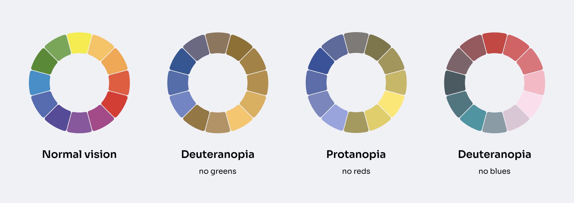
Accessibility and Constraint Compliance
Accessibility within a WordPress website’s color system refers to the constraint rules that ensure all color pairings remain legible, perceivable, and inclusive across user groups. These constraints restrict the use of color combinations that fail to meet clarity thresholds, preventing low-contrast or ambiguous visuals from undermining readability. Accessibility compliance operates as a governance layer that regulates both brand and utility roles, ensuring that all colors communicate effectively while meeting WCAG visibility requirements.
This enforcement does not dilute design intent; it aligns aesthetic choices with equitable use by linking each palette decision to contrast-safe, readable outcomes. WordPress integrates these safeguards directly into theme.json configuration and global style systems, making accessible palettes structurally enforced rather than manually policed. Accessibility functions as the constraint logic that stabilizes color behavior across the interface and ensures that all palette choices remain legitimate under inclusive design standards.
Contrast Ratio Testing (WCAG Compliance)
Contrast ratio testing evaluates the accessibility of all foreground and background color pairings within a WordPress website. Serving as a quality-control step, this process verifies that text, icons, and interface regions maintain the minimum WCAG-defined contrast ratios required for readable and inclusive presentation. Contrast validation prevents non-compliant pairings from entering the visual system, protecting usability and ensuring consistency across components.
In WordPress, contrast ratio enforcement is built into theme workflows through theme.json restrictions, global style warnings, and visual editor safeguards. These integrated mechanisms ensure that palette decisions made at the system level are verified in practice and that the accessibility logic defined in earlier stages is upheld across real-world usage.
Utilizing CSS Variables for Global Theme Management
CSS variables act as the global control mechanism for maintaining color consistency and accessibility compliance throughout a WordPress website. As centralized tokens, these variables store validated, contrast-safe hues and propagate them across templates, blocks, and interface elements. Any update to a variable triggers automatic system-wide adjustments, preserving legibility, brand coherence, and adherence to accessibility rules.
This variable-driven governance model prevents unsafe or inconsistent colors from entering the design and enables scalable iteration without jeopardizing compliance. WordPress operationalizes this approach through theme.json token mapping and Global Styles, allowing theme builders to define palette rules and enforce color integrity at the system level. CSS variables therefore function as more than a convenience. They provide the structural link between expressive design decisions and ongoing accessibility compliance across the interface.
Asset Optimization for Visual Fidelity

Asset optimization in a WordPress website is the process of refining images, vectors, and visual components so they maintain high visual quality while loading efficiently across devices and network conditions. Optimization is not about using the highest-resolution assets; it is about selecting appropriate formats, applying controlled compression, and relying on scalable graphics that preserve clarity at any size.
Unoptimized assets introduce blur, pixelation, or slow rendering, undermining both visual presentation and site performance. File format establishes the baseline for rendering quality, compression reduces weight without sacrificing essential detail, and vector graphics maintain sharpness for interface elements that require resolution independence. Together, these decisions create a performance-aligned asset pipeline that delivers visual fidelity without imposing unnecessary load.
WordPress supports this process through a media system that integrates responsive image handling, theme-level compatibility, and scalable icon workflows, ensuring that optimization is treated as a structural requirement rather than an optional enhancement. Visual fidelity remains stable only when it is intentionally engineered into the asset pipeline from the start.
Format Strategy for Performance – Aesthetic Balance
A format strategy defines how a WordPress website balances visual fidelity with rendering efficiency by selecting image formats that preserve clarity while minimizing load cost. Format behavior shapes how an asset renders (its edge sharpness, gradient handling, scaling stability, and compression tolerance), directly influencing aesthetic precision and performance.
Because WordPress generates responsive variants from the source file, the initial format choice governs how well assets adapt across device sizes and pixel densities. A strong format strategy determines how effectively images retain detail, avoid artifacting, and load without unnecessary weight, aligning each asset’s rendering profile with the site’s broader design and performance goals.
By basing asset decisions on format properties rather than guesswork, the website establishes a reliable foundation that subsequent compression steps and vector-scaling techniques can refine.
Image Format Selection (WebP, SVG, PNG)
Image format selection determines how a WordPress website delivers clarity and performance by matching each asset to the format best suited to its structure. WebP provides efficient raster delivery through lightweight compression that retains photographic detail. PNG maintains lossless quality and stable transparency, preserving sharp edges and UI elements that require precision. SVGs are resolution-independent vector graphics, ensuring icons, logos, and geometric illustrations scale cleanly without pixelation.
Each format introduces specific rendering behaviors related to clarity, transparency handling, and bandwidth usage. WordPress’s responsive image system builds on these choices by generating device-appropriate variants from the source file. Selecting the correct format prevents artifacting, maintains edge stability, and ensures each asset aligns with the interface’s visual and performance requirements.
Lossy and Lossless Compression Techniques
Lossy and lossless compression techniques define how a WordPress website reduces asset weight while controlling the level of detail preserved in the final render. Lossy compression removes redundant visual data to create smaller files, offering efficient delivery for photos or gradient-heavy imagery while introducing a managed risk of artifacting. Lossless compression reorganizes image data without removing information, preserving full clarity for UI elements, illustrations, and transparency-dependent graphics.
Each method affects rendering behavior, gradient smoothness, and edge precision. Because WordPress generates multiple responsive sizes from the compressed source, the chosen compression mode directly influences all downstream variants. Applying the appropriate technique to each asset stabilizes performance, maintains visual integrity, and ensures consistency across layouts and devices.
Integrating Iconography and Vector Scalability
Iconography and vector scalability define how a WordPress website maintains crisp, communicative UI elements through resolution-independent vector assets. Icons provide functional cues that support navigation and clarify actions, and vector formats ensure these symbols remain sharp across high-density displays and scaled interface contexts.
Scalable vector glyphs preserve shape fidelity without introducing pixelation or excessive file size, offering a clean alternative to raster icons that degrade at different sizes. Within WordPress, these vector assets integrate into block icons, theme-level components, and global UI systems to ensure consistent clarity throughout the site.
By relying on vector-based iconography, the website achieves efficient rendering, stable visual communication, and a polished interface that aligns with the broader asset-optimization strategy.
Contact
Don't like forms?
Shoot us an email at [email protected]