How to Create High-Converting WordPress CTA Buttons
Table of Contents
Call-to-action buttons are the indispensable element of every website. No matter what micro-niche your site belongs to, whether it’s a startup project or a well-established company’s site, buttons can be found everywhere. Although they fill up relatively little real estate, the power of calls-to-action is indisputable. Taking into account their value, adding WordPress CTA buttons to your site is a big deal.
A well-designed and properly placed WordPress CTA button encourages users to take a specific action on your site. CTAs attract users to read the full text, check out more details about your offers, buy from you, or take other action. However, designing call-to-action buttons that will work on their website is not as easy as it seems. There are many points you need to consider to create WordPress CTA buttons that convert. It includes the design, shape, color, placement, and copy you put on the button.
This blog post will focus on the basics of creating high-converting CTA buttons for your WordPress site and consider the most popular ways to add CTAs code-free.
Key Factors of Designing High-Converting WordPress CTA Buttons
Designing effective WordPress CTA buttons won’t be an issue unless you know the fundamental practices that make your buttons appeal to your clients and make them convert. Let’s discuss three fundamentals of creating appealing and engaging CTAs.
Make it look like a button
It seems to be clear and logical, but it’s the major principle that many of us neglect. It’s up to you to decide how the CTAs will be displayed on your site. Your loyal customers will get used to your CTAs and won’t have any issues taking the next steps towards their goals. However, do not forget that new clients will also reach your sites. To keep them on your site, you should take care of providing them with a seamless and intuitive UX. Making WordPress CTA buttons recognizable is one of the keys to success.
In the screenshot below, you can find a bold and catching CTA featuring an easy-to-comprehend copy located in the easy-to-reach area on the site.

It should clearly transmit the message
While working on the design of the CTA button, it’s vital to keep in mind that the action associated with it is clear and comprehensive. Whether your button features the text or contains a symbol, ensure that it vividly transmits the message that a user should take.
Create consistent design for all buttons performing the same action
While adding CTA buttons to your website, ensure that buttons asking users to take similar actions look consistent. While designing WordPress CTA buttons, develop a system in which designs of different buttons would have different purposes. Thus, people will subconsciously realize what actions they should take at first glance at the buttons on your site.
Design Tips on How to Make CTA Buttons Stand Out
Unlike other buttons added to your web page, CTA buttons should have a somewhat different design. The main goal of WordPress CTAs is to encourage users to take specific actions on your site. These are not purely UI elements that are used for decorative purposes. Call-to-action buttons should be created with the following design principles in mind:
- Design CTAs in colors in high contrast to the background and stand out from the rest of your site’s UI elements.
- Ass a sense of urgency to the text written on the CTA button. It’s especially important for limited-time marketing promos and special deals.
The CTA Placement Matters
Not only does the design of CTA buttons plays an important role. It’s also the location where the CTA is placed. Marketers recommend placing CTAs “above the fold” on the landing page or at the top of the page, meaning they should be visible to the users without making them scroll. Putting a CTA at the center of the web page is a win-win strategy. However, there are several other suggestions for the CTA placements that work. It includes locating CTAs:
- At the top of a web page;
- At the end of blog posts;
- In the sidebar;
- In a welcome pop-up message;
- In the middle of a long blog post;
- In email marketing content.
While looking for the best CTA placement on your site, mind the UX flow and pick the location that won’t be disruptive to users but happens to be a logical continuation of the text shared on your web page.
With that said, let’s see how you can add CTA buttons to your WordPress pages or blog posts.
Adding a CTA Button in Gutenberg
The introduction of the Gutenberg editor made it so much easier for us to create stunning posts featuring the needed visual and functional patterns. When adding WordPress CTA buttons to your blog posts or pages, the editor lets you add the fully customized CTAs while simply working in the visual mode.
To add a CTA button, open your page or blog post in the editor and find the place where you’d like the button to be located. Tap on the “+” icon and write “button” in the search field.
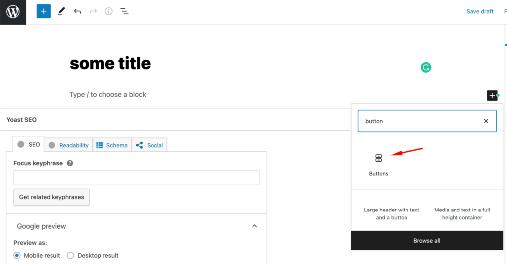
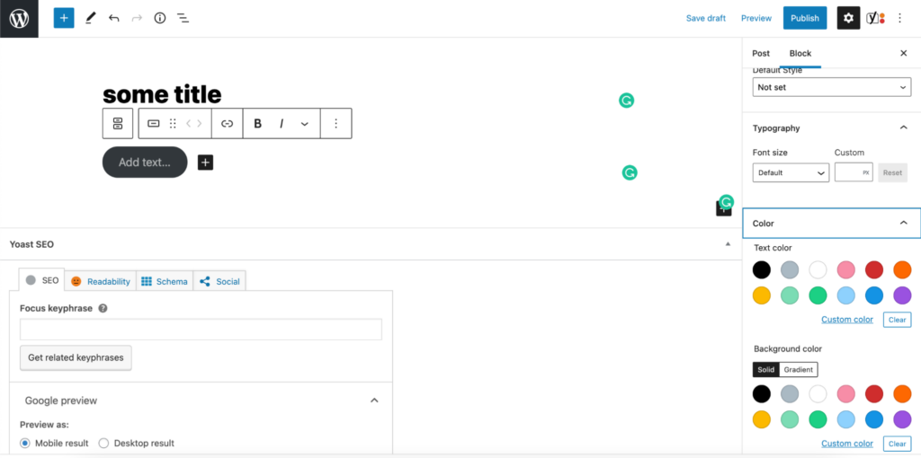
After clicking on “buttons,” the respective element will be added to your working area. The settings menu will show up in the right sidebar. Write the text on your button, add the link to the page where your clients will be redirected when they click on your button, and apply addition customization like adjusting the color of the button and the text, borders, style, etc.
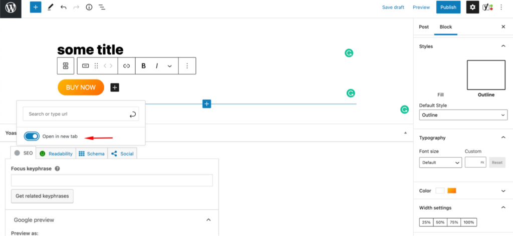
While linking the button to another page, ensure that you mark the “open in new tab” position. It will keep users on your current page or blog post after transferring them to a different destination point.
Adding CTAs Using The Classic Editor
Although Gutenberg editor is already available to all WordPress websites using the latest version of the CMS, some website owners still prefer using the Classic WordPress Editor.
To add a CTA button with its help, install the Forget About Shortcode Buttons plugin to manage buttons code-free.
Once the plugin is installed and activated on your site, you will be able to add custom buttons to your site’s content. Watch the short video tutorial below to see how to add catching WordPress CTA buttons to your site using the Classic Editor.
Plugins to Create WordPress CTA Buttons
Traditionally, you can always pick the right WordPress plugin to achieve the desired results on your site. The same works with WordPress CTAs. Many free and premium extensions let you boost conversions on your website with CTA buttons. Let’s take a look at some of the most popular solutions.
Call To Action for AMP
Price: $29.99
The plugin makes your website faster for mobile devices. To start adding CTA buttons to your website, you need to install the free AMP for WP plugin and get the premium AMP CTA extension. Once installed and activated, the extension adds two additional options to your site’s dashboard – the possibility to add CTAs to the pages and posts on your WordPress site.
The extension lets you create CTA boxes, CTA bars, and contact bars with CTA buttons.
You may feel free to adjust the placement of CTA elements on your web page – above, below, in the middle of your content, or in a fixed position in the footer of your site. The customization bar lets you adjust the look and feel of WordPress CTA buttons the way it matches your brand’s style and appeals to your audience.
Bloom
Price: comes with the Divi subscription, which costs $70/year or $249 for lifetime access
Bloom is an email opt-in plugin from ElegantThemes. With its help, you can create email opt-ins anywhere on your site and manage the look and feel of CTAs to appeal to your audience and match your branded style. What’s more, the plugin lets you display different CTA buttons based on the actions users take on your web page.
Bloom features an impressive collection of 100+ ready-made templates for your pop-ups, fly-ins, and widget area CTAs. The extension lets you add customized CTAs using a custom-made shortcode.
Easy Social Share Buttons
Price: $22
If you are looking for a plugin that will help you add catching and fully customized social share buttons to your site, the Easy Social Share Buttons from Codecanyon should be the best choice for you. It works with more than 50 social networking sites, so you should have no worries about adding the needed functionality to your web page no matter what country you are located and what audience you target. The plugin includes social share buttons, like/heart buttons, email buttons, click-to-tweet, and bookmark. It also lets you integrate your site with the Instagram feed widget to display more visual content that you post on the social media platform.
Hello Bar
Price: free, paid version starts at $29/mo
The plugin lets you add full-page popups, notification bars, and slide-in CTAs on your website. To get started, you need to create an account at hellobar.com and start building your CTA when you sign in. Once done, simply copy the code and paste it anywhere on your site.
The tool is free to use on the Starter plan. It offers a basic set of design features, up to 5,000 views per month, the possibility to create up to 10 popups, and take advantage of basic integration. If you need more, you may upgrade to any of their premium plans starting at $29/mo.
MailOptin
Price: lite version is available, premium version starts at $79/year
If you want to focus your marketing efforts on driving more leads through email channels, the MailOptin should be a great fit for you. With its help, you can add fully customized email opt-in CTAs to your website, add dif, and add different slide-ins, notification bars, lightbox popups, and inline CTAs. These elements are fully customizable and can be adjusted to match the theme used on your site.
Monarch
Price: comes with Divi, which is $89 per year or a one-time payment of $249
Monarch is one more handy extension that lets you add catching social sharing buttons to your site. It lets you select from 20 different social media networks that you can display on your site. It features integration with Facebook, Google+, Twitter, Pinterest, Reddit, etc. All social sharing buttons are fully responsive, thus making it easy for your clients to share their preferred content with social media followers using handheld and desktop devices.
Opt-In Content Locker
Price: $17
The plugin integrates with the most popular mailing services, like MailChimp, Campaign Monitor, iContact, GetResponse, etc. It’s a very handy solution for those businesses that want to display targeted messages and deliver a fully personalized online experience to their audience. Thus, it lets you restrict access to only those users that are subscribed to your email list. The plugin remembers your subscribers and makes the content available to them every time they reach your site.
OptinMonster
Price: starts at $14 for a single site license.
It’s one of the leading and most popular popup builder plugins for WordPress. It lets you update your website with various popup forms, including lightboxes, content gating, and mobile popups for smartphone users. You can experiment with different forms and shapes until you find the perfect solution that appeals to your audience. It’s easy to come up with the perfect formula for your site using the A/B testing tool. To track the performance of forms on your site, OptinMonster comes with built-in analytics.
Thrive Leads
Price: $19/mo
Thrive Leads from Thrive Themes is a popular lead generation plugin that helps you create a strong email list. It comes with a convenient drag-and-drop interface that lets you create sleek and stylish email subscription forms with fully personalized CTA button.s You may feel free to work with any pre-designed templates or develop your own custom solutions. The plugin also lets you choose from many CTA types, including slide-ins, lightbox CTAs, and notification bars.
The plugin makes it easier for you to deliver a fully personalized ussr experience on your website. It lets you display targeted CTAs on the per-page or per-user basis. The A/B testing functionality lets you check what works best on your site, while the built-in reporting feature reveals the results of your campaigns.
Ultimate Blocks
Price: free
If you enjoy Gutenberg as much as we do, the following free WordPress plugin will come in handy for you. With its help, you can add 20 new blocks to the Gutenberg editor, including a CTA block, social sharing buttons, a styled blockfor notifications, a click-to-tweet block, etc. These are mobile-friendly Gutenberg blocks that you can easily edit in the visual mode. The traditional color, size, and font settings are included.
WP Subscribe
Price: free, pro version starts at $29/year
The mission of the WP Subscribe plugin is to let you easily integrate your website with email subscription forms. It provides you with inline subscription form widgets linked to MailChimp, AWeber, or Feedburner. You can also create custom-made email subscription forms with CSS.
The free version of the plugin includes a standard set of features. With the premium version, you get access to a wider choice of popup forms integrations, a popup CTA widget enhanced with various triggers, and the possibility to apply all the needed changes to the CTAs in the visual mode.
WordPress Calls to Action
Price: free
WordPress Calls To Action is the last but not the least useful plugin that lets you create conversion-oriented WordPress CTA buttons. It’s a totally free extension that provides you with various ready-made templates that you can modify in the visual editor. Besides using pre-designed templates, you can also create custom templates from scratch using HTML and CSS. You can save your custom-made templates to the library for further reference. The plugin also lets you improve the performance of CTAs on your site using A/B testing tools.
Bottom Line
CTA buttons are the indispensable elements of every website. In WordPress, you can create fully customized CTA buttons and email subscription forms using the built-in functionality of your WordPress theme or while installing WordPress plugins on your site. Both the Classic Editor and Gutenberg let you enhance your blog posts and WordPress pages by catching CTA buttons to keep your audience engaged and let the conversions rise.
Contact
Don't like forms?
Shoot us an email at [email protected]

