Web Design for WordPress Website: Key Components

Table of Contents
Web design for a WordPress website is a platform-specific practice embedded in the theme and template architecture that governs how visual rules, layout logic, and content-presentation patterns apply to posts, pages, taxonomies, and metadata.
It functions within WordPress’s semantic architecture, where design decisions are constrained by theme structure, template hierarchy, and the content model.
WordPress web design works through the platform’s design system, such as design tokens, responsive grids, and component-based UI schemas that themes define and govern. Typography, color, spacing, and interaction patterns are inherited from the stylesheet hierarchy, block rules, and template files, ensuring consistent behavior across templates and breakpoints.
Web design operates within the site editor, block editor, theme.json, and pattern libraries. It forms the final visual hierarchy of grids, breakpoints, semantic templates, and content regions that express the site’s information architecture.
The design layer organizes dynamic entities, supports component inheritance, enables predictable navigation, and aligns with WordPress’s rendering model, which defines and constrains layouts through templates, loops, and block structures.
Design system
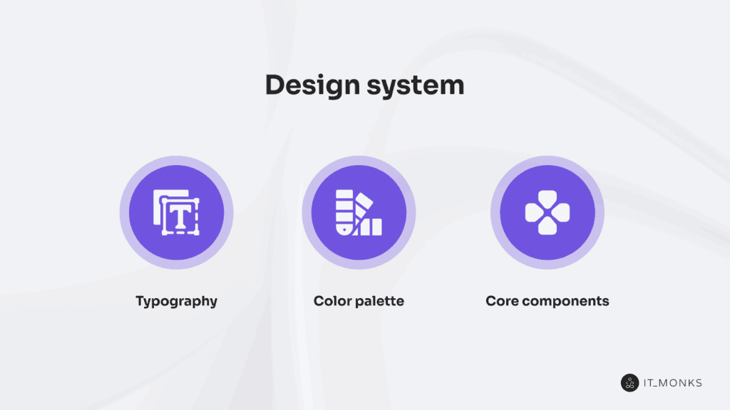
Design system is the tokenized style rules, component behavior, and layout structure for a WordPress website within its theme architecture. It governs how color tokens, typography scales, spacing units, and state rules are mapped through theme.json and block.json.
This ensures blocks, components, and templates follow a unified front-end ruleset, which is a foundation often used in professional WordPress web design services to deliver scalable, consistent interfaces.
Design system structures the interface through a clear hierarchy: tokens provide single-source values, styles apply those values, components implement them, and templates inherit them during rendering.
This hierarchy operates within WordPress constraints, such as PHP templates, block editor rendering, and theme.json/block.json configurations, ensuring consistent propagation of design tokens across patterns and template parts.
Design system controls component appearance and behavior by standardizing buttons, form fields, navigation elements, and alerts on the same typography, color, and spacing variables.
It also constrains layout through shared grid rules, breakpoint definitions, and margin/padding variables aligned with block-level style inheritance. This central governance improves UX predictability and ensures designers and developers rely on the same semantic ruleset.
Typography
Typography, as a functional layer within a WordPress theme’s design system, is driven by tokenized values that flow from global style settings defined in theme.json. It exposes attributes such as fontFamily, fontSize, lineHeight, letterSpacing, fontWeight, and textTransform, which are configured via settings.typography (presets and capabilities) and applied through styles.typography at global, element, and block levels..
Font-related attributes can reference presets (tokens) defined in settings.typography.fontSizes and settings.typography.fontFamilies (for example, theme-specific tokens like heading-lg, body-md, or label-sm). Blocks and components consume these tokens through the theme’s inheritance chain, from global styles down to individual block styles..
Typography establishes the type hierarchy by assigning token sets to heading levels, body text, captions, and labels. Heading tokens use larger sizes and stronger weights; body tokens prioritize legibility and spacing; caption and label tokens use compact values.
In a well-configured theme, these values meet accessibility requirements for minimum font size, line height, and readable contrast.
In a WordPress theme, typography is implemented to support responsive behavior through fluid or stepped type scales. By encoding sizes and line heights as tokens and aligning them with the theme’s CSS breakpoints, designers and developers can maintain a consistent baseline grid and vertical rhythm across viewports.
Centralized typography tokens then ensure that these changes propagate consistently across templates, template parts, patterns, and reusable components.
Typography tokens and styles are applied to blocks and elements used in WordPress content structures: pages, posts, widget areas, and custom components.
So that text styling remains consistent wherever those blocks appear. Through settings.typography, developers can control which typography options are exposed in the editor and reduce ad-hoc overrides.
Within the block system, typography governs text styles for buttons, forms, navigation, and other UI elements, aligning text properties with layout spacing to maintain structural clarity and readability across the interface.
Color palette
The WordPress color palette is a set of tokenized color values governed by the WordPress design system. Stored in theme.json under settings.color.palette as {name, slug, color}, these tokens form the global palette used by blocks and components for foreground, background, border, and surface rendering.
Component-level inheritance ensures consistent semantic color mapping across all interface elements.
The palette organizes colors into functional groups, primary, secondary, accent, background, surface, border, and feedback, and uses semantic naming, such as primary-500 or surface-light, to maintain scalable tone ranges across light and dark modes.
The palette enforces WCAG 2.1 AA/AAA contrast ratios and provides state tokens for hover, active, focus, and disabled, standardizing interaction behavior.
Aligned with typography and core components, the color palette supplies shared, accessible color variables that maintain uniform visual logic throughout the WordPress design system.
Core components
Core components structure the user interface using the WordPress design system’s semantic rules. They act as the execution layer, inheriting typography, color, spacing, and interaction states from theme.json and block.json tokens. Each component applies these mappings through semantic styling, ensuring predictable, reusable UI behavior across templates and blocks.
WordPress core components encapsulate consistent visual rules and interaction patterns. Buttons, inputs, navigation items, cards, and alerts render identical token-defined styling whether used in custom blocks, block patterns, reusable blocks, or block template and pattern layouts.
Each component functions as an accessibility-ready unit, supporting ARIA roles, keyboard navigation, focus visibility, and responsive rules derived from the design system. This integration enforces consistent meaning and behavior for all interactive elements.
Page Template Layout System
The page template layout system defines the container logic of WordPress theme architecture. It establishes reusable structural patterns (single-column, sidebar, grid) and governs how components, content zones, and design tokens are distributed through block templates, template parts, and theme.json layout settings.
Page templates, such as index.html, page.html, and single.html, provide macro structure. Their template parts inherit Theme.json layout settings, including contentSize, wideSize, blockGap, and spacing, which form the content container and regulate inner-block alignment, spacing constraints, and full-width or wide behavior.
Block-level align, layout, and spacing attributes resolve against these rules to maintain consistent grid alignment and section hierarchy.
The layout system operates as a semantic framework that applies design tokens, spacing logic, and alignment boundaries across all structural zones. It also governs the grid system, which defines column and row structure, and breakpoints, which control breakpoint-based container reflow across viewports.
Grid
The WordPress grid system is a spatial logic used by the page template layout system to align and distribute components. It governs column structure, modular spacing, and alignment behavior through values inherited from theme.json.
The grid exposes attributes such as column count, spacing scale, alignment rules, and uses Alignment Tokens such as contentSize, wideSize, and spacing presets to determine .alignwide, .alignfull, or default container placement. This makes the grid a token-driven layout structure.
In WordPress, grids are implemented through group blocks or custom containers using layout.type:grid or layout.inherit:true. Block patterns can define fixed or adaptive column systems to preserve semantic container alignment across templates.
CSS Grid or Flexbox, applied via theme.json or block attributes, controls stacking, alignment, and flow, while spacing tokens regulate gaps and padding to maintain consistent distribution.
Grid logic adapts to breakpoints via responsive theme.json settings or block-level controls, adjusting column counts, stacking order, and spacing across devices.
Breakpoints
Breakpoints govern when structural changes occur in WordPress layouts based on viewport width. As semantic thresholds in the page template layout system, they trigger viewport-based layout reflow, controlling when grids collapse, components stack, and spacing or typography tokens override their defaults.
WordPress does not expose native breakpoint tokens in theme.json, but themes implement them through CSS media queries, responsive block classes, and utility layers that modify spacing, font size, alignment, and visibility.
Breakpoints dictate grid collapse behavior, container width adjustments, and navigation shifts into compact modes. Components inherit these responsive overrides to maintain alignment and hierarchy across viewport conditions.
Working with the Grid, breakpoints define when spatial logic changes, enabling token value overrides and predictable responsive adaptation across all display contexts.
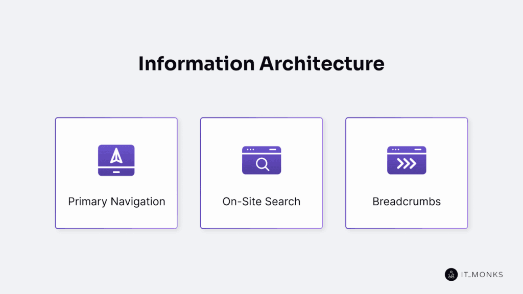
Information Architecture
Information architecture defines the access model and content hierarchy of a WordPress website.
It organizes where content types reside, how taxonomy-based relationships connect them, and how navigation paths are mapped through templates, menus, and URL logic. As a semantic layer, it governs entity placement, hierarchical depth, taxonomy segmentation, and the metadata relationships WordPress uses for route resolution.
Information architecture arranges pages, posts, and custom post types into a coherent navigation system, linking them through categories, tags, and parent-child structures. These relationships surface through menu registration, permalink logic, and the template hierarchy.
It also determines how content is accessed through primary navigation, on-site search, and breadcrumb trails, all of which rely on shared metadata and taxonomy-based paths.
Primary Navigation
Primary navigation exposes the semantic hierarchy of a WordPress website. It structures top-level content access according to the information architecture by mapping pages, posts, and taxonomy archives into a hierarchical menu.
Each menu item links to a specific content entity, with parent and nested items reflecting page and taxonomy depth. This creates the main IA axis, even when multiple menus exist.
In WordPress themes, primary navigation is registered with register_nav_menus() and rendered through wp_nav_menu(), or created with the navigation block. The navigation block is placed in the header template part, and in FSE themes, its data is stored as a menu post type.
Primary navigation aligns with template linkage and URL routing: templates expose the nodes, and the menu defines the access path. Dynamic items, such as category or term archives, extend the structure consistently with the IA and stay synchronized with the breadcrumb hierarchy.
On-Site Search
On-site search is a query-based access layer in the WordPress information architecture. It resolves the s query var, traverses the content index, and retrieves entities from public post types. The system executes the WordPress query, matches tokens in indexed fields, and returns a result set governed by IA visibility rules.
Search indexes only public content; private or excluded types remain outside retrieval. Through pre_get_posts, search filters enable CPT inclusion, metadata matching, and taxonomical search for extended semantic filtering.
The WordPress query executes the search loop, applies query vars, filters by taxonomy or metadata, and structures the result set according to IA access logic.
The search template (search.php) or the fallback theme template renders the query output via the archive result template, exposing or omitting entities based on the template hierarchy.
As an IA retrieval component, on-site search provides a non-linear query path parallel to primary navigation and breadcrumbs, with extensible relevance logic and filtering controlled through hooks and algorithms.
Breadcrumbs
Breadcrumbs are structural context indicators that expose the hierarchical location of the current page within the WordPress information architecture. They reflect page hierarchy through parent–child page relationships, expose taxonomy lineage through category depth, and trace template inheritance within WordPress’s template hierarchy.
When permalink segments match real IA depth, they are also mapped into the breadcrumb path.
As IA readouts, breadcrumbs present structural context rather than navigation shortcuts. Plugins such as Yoast or Breadcrumb NavXT, or custom theme functions, generate the breadcrumb trail by resolving the queried object, its ancestors, associated terms, and the active template.
Typically inserted in header areas or before the loop, breadcrumbs reference the relationships that define where a page, post, or term fits in the site’s architecture and complement primary navigation and on-site search by making that placement explicit.
Content model
Content model defines the entity types, attributes, and relationships that structure content on a WordPress website. It classifies all post types, including pages, posts, and custom post types, and assigns each one an attribute schema, including title, content, author, date, taxonomy terms, media fields, and metadata. CPTs are added via register_post_type(), which registers their schema and taxonomy links with the system.
The model governs relational context: pages support parent-child hierarchy, posts use categories and tags, and CPTs may expose custom taxonomies. These relationships feed directly into the site’s information architecture, enabling navigation logic, breadcrumbs, archive organization, and search inclusion.
Content model also maps each content entity to its template file via the template hierarchy (page.php, single.php, single-{post_type}.php, taxonomy archives). Template resolution follows entity type and attribute exposure. The same schema defines how content is retrieved through queries (get_post, taxonomy queries, WP_Query) and how permalinks are generated via post-type rewrite rules.
Pages
Pages are hierarchical content entities in the WordPress content model that define fixed, non-chronological site structures. As static content entities (hierarchical: true), they support parent–child relationships that shape permalink depth, navigation placement, and breadcrumb traces.
Pages are excluded from date archives and timeline queries unless taxonomies are manually enabled. They are resolved via WP_Query or get_page_by_path(), where the query object exposes the page’s ID, path, hierarchy, and template. Rendering defaults to page.php, with optional templates such as page-{slug}.php and front-page.php for specific layout mapping.
Within the information architecture, a page functions as a navigation-linked entity whose hierarchical position determines menu inclusion and breadcrumb output.
Unlike posts, pages form fixed-position structural nodes governed by hierarchy and template resolution rather than chronological or taxonomy-based grouping.
Posts
Posts are non-hierarchical content entities in the WordPress content model, used for time-stamped publishing and taxonomy-driven organization.
Registered as the default post post type, they expose core attributes, such as title, content, post_date, excerpt, featured image, categories, and tags, and participate in taxonomy-linked grouping through category and tag terms. This structure contrasts with scenarios in which developers create custom post type objects for more specialized content.
This makes each post an archive-included unit, retrievable via date, taxonomy, and author archives, as well as RSS feeds.
Posts populate the WordPress loop, which retrieves them in post_date order or by taxonomy filters. The query context resolves template-based post rendering in single.php, archive.php, index.php, and taxonomy-specific templates such as category.php and tag.php.
Because they are indexed in the search index and included in feeds, posts function as query-resolved content entities surfaced through date, taxonomy, author, and search queries.
Unlike pages, posts do not support parent-child hierarchy; they integrate into the site through taxonomy terms and temporal metadata.
This positions them as dynamic, time-bound units within the WordPress publishing framework, structured for archive inclusion, loop-based retrieval, and taxonomy resolution rather than hierarchical placement.
Theme Architecture
Theme architecture governs how WordPress maps and renders content entities through template hierarchy, block structures, and theme.json design tokens.
It defines the template mapping logic that resolves which template file or block template loads for each query and how layout rules and design tokens are inherited across templates and parts, all operating within the theme’s underlying file and directory structure.
Classic themes use PHP template files (index.php, single.php, page.php, archive.php, and post-type/taxonomy variants). These files expose entity attributes, including title, content, taxonomy terms, and featured image through the loop, functioning as EAV exposure units.
Block themes use HTML templates in templates/ and template parts in parts/. Blocks expose attributes directly (post title, featured image, query loop). Block patterns provide reusable layout structures. Block containers rather than PHP conditions handle layout inheritance.
theme.json defines typography, color, spacing, content width, and block defaults. It applies these tokens across templates and parts, ensuring consistent rendering. In classic themes, functions.php registers menus, sidebars, and block supports that the theme architecture incorporates into layout governance.
Template parts inherit layout rules from the resolving template and apply theme.json tokens when rendering blocks. This keeps attribute exposure and structure aligned with the content model and information architecture.
Accessibility Design Practices
Accessibility design practices are the structural constraints that ensure a WordPress theme complies with WCAG 2.1 and remains perceivable, operable, and understandable to assistive technologies. These practices govern how semantic HTML elements, ARIA attributes, and design tokens are applied across theme, template, and block layers.
Templates expose landmark regions using <header>, <nav>, <main>, <aside>, and <footer> so assistive technologies can interpret hierarchy. ARIA attributes refine semantic content where native markup is insufficient. Tab order logic enforces aligned keyboard traversal across header, navigation, main content, and footer.
Design tokens, such as color, typography, and spacing, are constrained by accessibility thresholds. theme.json defines WCAG-compliant defaults, including contrast-safe color tokens and readable typography scales.
Navigation systems, forms, and interactive components must integrate keyboard navigation through predictable tabbing, focus states, and label association. Core and custom blocks must maintain ARIA compliance and correct heading structure.
Color Contrast
Color contrast is a WCAG accessibility constraint that defines the minimum visual and luminance difference between a foreground and a background element. WCAG 2.1 requires a 4.5:1 contrast ratio for normal text and 3:1 for large text, calculated from relative luminance values and applied to all text, icons, and UI components.
In WordPress, color contrast is enforced through design tokens in theme.json, where accessible color palettes are configured and non-compliant foreground–background element pairs are restricted. theme.json ensures that primary, secondary, and interactive state tokens (hover, focus, selected, disabled) maintain required contrast.
Color contrast governs legibility for headings, body text, links, buttons, form inputs, overlays, and focus indicators. Automated audits validate that every pairing meets WCAG thresholds and that interaction states remain compliant.
Keyboard Navigation
Keyboard navigation is an accessibility feature that defines how users navigate a WordPress website using only the keyboard. It governs tab order, manages the focus path, and constrains interaction to a predictable sequence that exposes every focusable element through semantic HTML in the WordPress theme template.
Tab order aligns with a landmark-based structure, exposing a sequential path across <header>, <nav>, <main>, and <footer>. Focusable elements use native roles (<a>, <button>, <input>) and tabindex to control tab index flow, while ARIA attributes, such as aria-expanded, aria-controls, and aria-hidden, support ARIA-compliant interaction without breaking focus logic.
Skip links target landmark regions with destinations like #main-content, and theme.json focus-ring/style tokens expose consistent focus visibility. Interactive components, including menus and modals, must restore focus correctly to preserve semantic traversal.
Website Performance
Website performance is a system-level efficiency of a WordPress website, governed by how themes structure output, load resources, and expose content to the browser. It results from template output efficiency, semantic content loading, resource prioritization, and network-aware loading strategies.
Theme architecture directly constrains performance: template hierarchy, block rendering, and layout depth define the DOM size and the rendering path. Excess markup and unoptimized CSS/JS delay first paint and interaction.
Key performance metrics, LCP, FCP, CLS, TTI, and TTFB, measure when content is delivered, painted, stabilized, and activated. These metrics depend on file size, image format, script execution cost, CSS specificity, and render-blocking resources.
Media assets account for most load time; responsive formats, reduced file sizes, and lazy loading determine when images enter the pipeline. Script/style resources require controlled loading: defer non-critical scripts, use async when possible, minimize CSS payloads, and deliver only context-relevant assets.
theme.json defines theme-level performance constraints, including lazy-loading defaults, preload hints, layout rules, and style-generation limits.
Tools such as Lighthouse, WebPageTest, and Chrome DevTools measure these behaviors and surface bottlenecks.
Media Optimization
Media optimization governs how visual assets are structured, rendered, and delivered across WordPress templates to maintain performance, semantic layout integrity, and responsive behavior.
A media asset is a load-governed entity: its exposure depends on the template path, viewport, and browser capabilities. WordPress generates multiple image file sizes and selects them through srcset and sizes to deliver responsive images. Non-critical assets use the loading attribute (loading=”lazy”) to defer rendering of off-screen content.
Format type choices follow performance logic: .webp and .avif for efficient delivery, .svg for interface graphics, and .jpeg/.png only when required. Video assets use modern codecs and fixed dimensions to prevent shifts.
Theme architecture configures media through theme.json, setting token-based responsive width limits, aspect ratios, and layout rules that define how a block template exposes media. These constraints prevent CLS and maintain predictable spacing.
Server-side delivery, such as CDN-delivered media, compression, and HTTP/2 multiplexing, optimizes transfer costs and capability-based fallback handling.
Media directly affects performance metrics: oversized images raise LCP, missing dimensions cause CLS, and improper lazy-load boundaries delay rendering.
Media assets must therefore operate under a defined delivery logic aligned with WordPress’s responsive pipeline, theme tokens, and server transport rules.
Script/style Loading
Script and style loading controls how a WordPress theme registers, sequences, and executes JavaScript and CSS. wp_enqueue_script() and wp_enqueue_style() define each asset’s handle, source, JavaScript dependency list, version, and placement (head or footer), establishing dependency-resolved loading.
Header scripts block parsing unless a defer attribute or async attribute is applied; footer scripts enable non-blocking execution. Script assets that rely on libraries such as jQuery must declare dependencies to maintain the correct execution sequence.
Style sheets load globally or per template/block. Critical CSS is inlined for immediate first paint; non-critical CSS is deferred to reduce LCP. CSS load order must remain stable to prevent CLS; scoped styles reduce layout reflow.
theme.json constrains global and block-level style output by defining base tokens and reducing redundant style sheet generation.
During rendering, WordPress injects critical CSS immediately and loads external style sheets and script assets based on the enqueue arguments. Deferred or async logic removes non-essential assets from the critical path, improving TTI and reducing blocking.
Performance metrics reflect this sequencing: render-blocking JS increases TTI, oversized or unused CSS slows LCP, and unsynchronized CSS/JS causes CLS. Combining or minifying assets reduces request overhead while preserving dependency order.
Tools such as Lighthouse and PageSpeed Insights identify blocking resources and highlight where deferred JavaScript loading or Critical CSS inlining is required.
Contact
Don't like forms?
Shoot us an email at [email protected]