Explore our specialized services, tailored solutions, and industry expertise to elevate your digital presence. From custom WordPress development to seamless integrations, we build high-performing websites that deliver impact.
Most people watched Google I/O 2026 and came away thinking, sure, more AI in Search, another year of the same story. But if you look past the demos, something more specific happened. Search is quietly moving away from just reading your text and toward something closer to how a person looks at a page: what’s placed where, what stands out, what’s grouped with what.
There’s a Google patent that backs this up in surprising detail, and once you understand it, a lot of the “why is this page ranking and not that one” mystery starts to make a bit more sense.
This matters most if you’re the one making decisions about how a website looks and behaves, not just what it says. SEO specialists will care because it adds a whole new layer to think about beyond keywords and backlinks. Web developers and designers will care because layout choices they might treat as purely cosmetic now carry ranking weight. And marketing teams building content or product pages should care because how something is arranged on the page may soon matter almost as much as what it says. If you work anywhere near a company website, this is worth ten minutes of your time.
Search is Starting to Rebuild Pages, not Just Link to Them
The big theme coming out of I/O was Search leaning further into dynamic, agentic behavior. Instead of simply sending someone to your website, Google’s systems are getting better at going out, pulling information from multiple sites, and putting it back together themselves, as a direct answer, a comparison table, a small interactive tool, or a results page that looks nothing like the classic ten blue links.
Picture someone searching “which of these three CRMs has a decent free plan.” A few years ago they’d click into three separate articles and compare manually. Now Google might just build the table for them, pulling a fact from your site, a fact from a competitor’s, stitching it together on the spot. Your content still matters, maybe more than ever, but your page isn’t automatically the final stop anymore. The AI is acting more like a researcher, reading and reorganizing rather than just pointing.
For that kind of reorganizing to work, the system needs a real understanding of a page’s structure. Not just “here’s 800 words about CRMs” but which part is the headline, which part is filler, which part is the actual answer someone’s looking for. That’s where the patent comes in.
How the Machine Reads Your Page
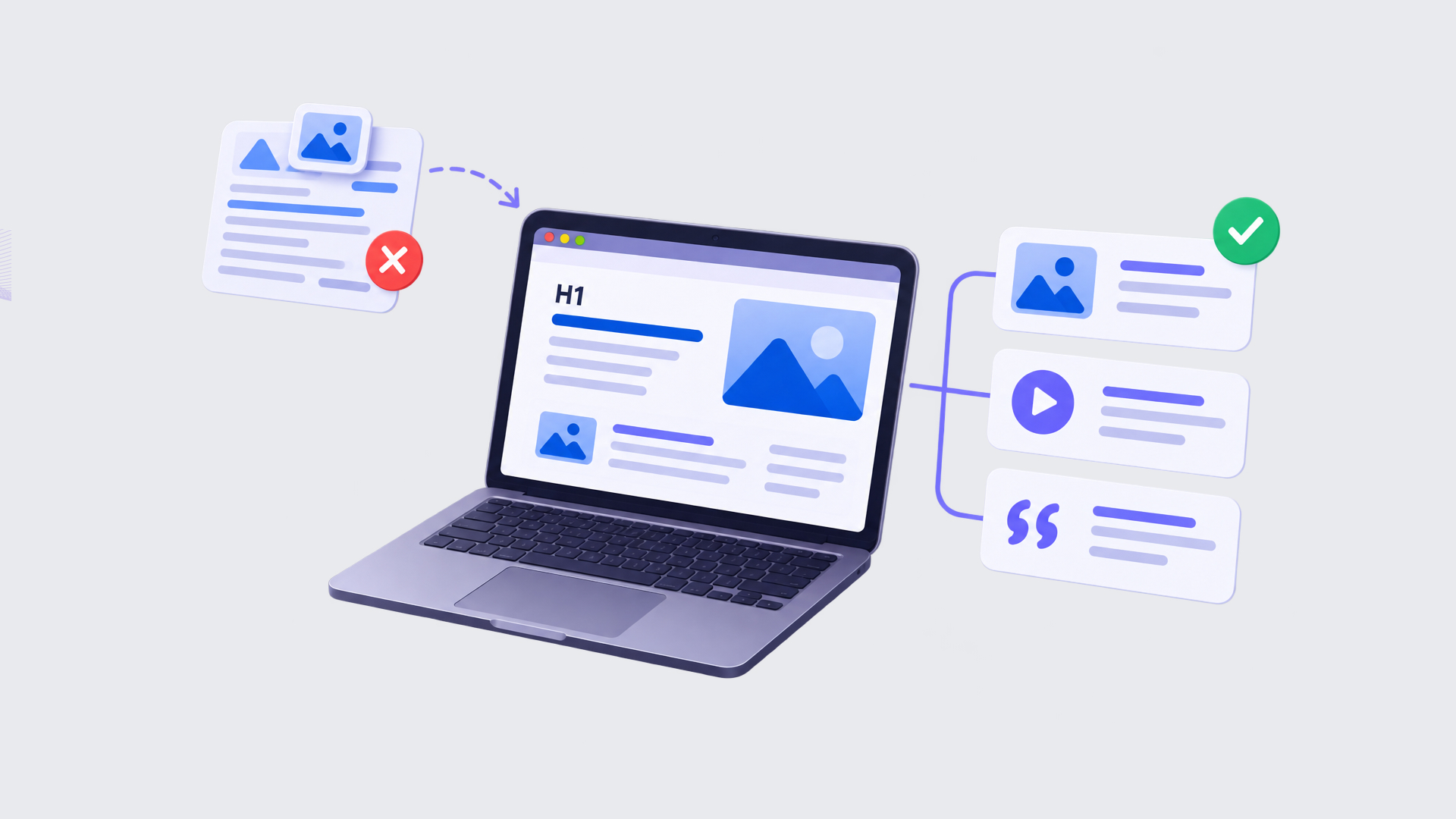
Google holds a patent, granted in 2025, describing a document understanding system that goes well beyond text extraction. The patent is called “Layout-aware multimodal pretraining for multimodal document understanding” (US12393768B2), and the core idea is this: a model breaks a page down into blocks, things like a heading, a paragraph, an image, a table, and then studies how those blocks relate to each other.
What it’s actually paying attention to includes:
The order the blocks appear in, along with their rough position on the page.
Which blocks sit close to each other, since proximity often signals that two pieces of content belong together, like a photo and its caption.
Font size, boldness, italics, underlining.
Color.
And how images line up with the text around them.
All of that gets folded into one internal summary the model builds for itself, something researchers call a document-level representation. That summary is what actually gets used later on: to classify the page, to summarize it, to decide how relevant it is to a search, or to match it against other similar content elsewhere on the web.
Here’s the part that’s easy to miss. The model is trained specifically to notice when something is out of place, like blocks appearing in a strange order, or an image that doesn’t seem to belong with the paragraph next to it.
So it’s not just parsing your layout. It’s quietly judging whether the layout makes sense. A page that reads as visually chaotic to a human is very likely producing a messier, less confident signal on the machine side, too.
Why This Affects Your Rankings
Put the I/O direction next to the patent, and the conclusion is hard to avoid: layout has become a search signal in its own right, not just a nice-to-have for design.
A page where the AI can cleanly separate a header, a focused answer paragraph, and an image that’s obviously connected to the surrounding text, that page is easy to summarize.
A page where the hero image, the header, and three unrelated blocks of text all blur together is likely to get skipped when the system is deciding what to pull into an answer.
There’s a practical angle, too. Evaluating a page’s structure is relatively cheap for Google, and those early signals help determine both the quality of the page and the topical domain it belongs to. If the structure and content signals are weak or unclear, the page may receive a lower initial score or be classified into the wrong topical set. That matters because Google can reserve its more computationally expensive evaluation systems for a much smaller pool of promising pages. A page that fails those earlier checks may never make it into the final candidate set competing for visibility in search results.
So What Should You Change
This isn’t a reason to throw out everything you know about UX or conversion design. Think of it as an extra layer on top.
Sites now need to work for three different audiences at once:
real people who need things to be usable,
search engines that still care about authority and relevance,
AI systems that need clean, parseable structure to do their job well.
A few things worth prioritizing:
Use actual semantic hierarchy instead of visual shortcuts. A heading should be a real heading tag, not a paragraph that’s just styled bigger. The model leans heavily on things like HTML structure to figure out where one block ends and another begins, and if your markup doesn’t match your content, you’re making its job harder for no reason.
Keep each section self-contained. A card, an FAQ answer, a product blurb, whatever it is, should mostly make sense on its own. When a machine is lifting a block out to build a comparison or an answer, a paragraph that only works in the context of three other paragraphs isn’t going to hold up well.
Place images near the content they’re actually illustrating, and don’t skip the alt text or caption. The model specifically checks whether an image fits its surrounding text, so a hero image dropped in with no real connection to what’s around it is a weak spot now, not just a stylistic choice.
Don’t hide your key point under layers of decoration. If the number or the answer someone actually needs is buried in styling that visually deprioritizes it, the system may not weigh it the way you’d want. Font size and boldness read as importance cues, so use them for what’s genuinely important.
Pay attention to the order things appear in. The patent’s model is specifically trained to notice when two blocks have been swapped out of their original position, and to predict whether the sequence it’s looking at is the correct one. A page where content jumps around illogically isn’t just harder for a person to follow, it’s the exact kind of thing this part of the model is built to flag.
Make the page layout reflect the user’s primary intent. On a product page, elements such as images, price, availability, key specifications, reviews, and the purchase action should be prominent and appear early rather than being buried under secondary content. On a service page, the same applies to the service description, proof, pricing, contact details, forms, and CTAs.
Google patents describe systems that distinguish primary content from peripheral areas like sidebars and footers, and use position, spatial relationships, font, style, and other layout signals to understand relative importance.
There’s another layer worth knowing about behind that image point specifically. Part of the system relies on a convolutional neural network, the kind of model built to look at an image and understand what’s actually in it, not just where it sits on the page or what alt text is attached to it. So it’s not only checking proximity, it’s evaluating the image itself the way a person would look at a photo and register what it shows.
That feeds into something the patent calls multimodal representation, which is really just a fancy way of saying the model evaluates text and media together as one combined signal instead of two separate ones. And the training goes a step further than most people expect. The model learns, from huge amounts of data, to predict what kind of block, with what mix of text and media, would actually answer a given user question. That’s not just “what should the text say.” It’s whether the answer needs text alone, or text paired with an image, whether that image should be a single photo or a carousel, and roughly what that image needs to show to be useful. The system isn’t reading your page one line at a time. It’s reasoning in whole layouts.
What Shift Google I/O Brings
For a long time, optimizing for search basically meant writing for a crawler that counted keywords and tallied up backlinks. That world hasn’t disappeared, but it’s being layered with something new: an AI reader that treats the whole page, its structure, its spacing, its images, as data worth analyzing.
That’s a real shift in how sites need to be built. SEO specialists, content writers, and developers can’t really work in separate lanes anymore. How a developer marks up a section and how a designer lays it out both influence whether an AI system can understand the page well enough to actually trust and use it.
Google I/O didn’t frame this as one flashy new feature. It came through more as a direction, Search becoming more dynamic, more willing to take content from across the web and reassemble it into its own answers. The patent shows some of the mechanics behind how that reassembly happens. Taken together, they point to the same thing: building for people and building for machines are starting to overlap, and layout is now very much part of that conversation.




 ChatGPT
  Claude
  Grok
Grok  Gemini