Explore our specialized services, tailored solutions, and industry expertise to elevate your digital presence. From custom WordPress development to seamless integrations, we build high-performing websites that deliver impact.
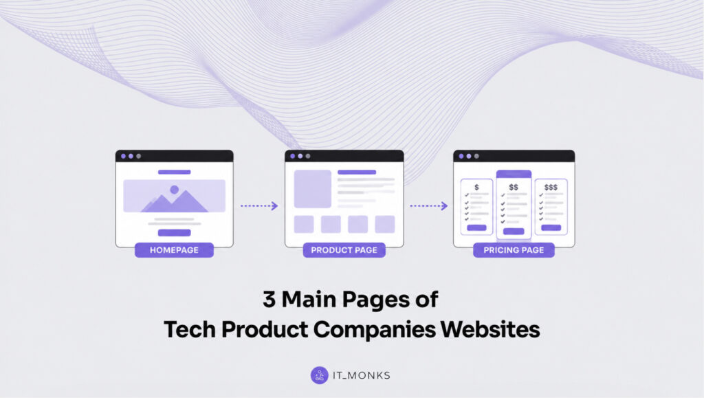
Designing a website for a product company is a completely different challenge from designing one for a service business. Understanding the SaaS Website essential pages is often the difference between a website that simply looks polished and one that consistently turns visitors into customers.
A service company’s website usually exists to build trust in the team behind the business. A SaaS website has a different job. It needs to explain what the product does, who it’s for, why it’s better than the alternatives, and convince someone to take the next step, often in just a few minutes.
That’s why most successful SaaS websites aren’t organized around the company. They’re organized around customer problems, use cases, industries, and the people who actually buy the product.
You might have dozens of pages across your website, but not all of them carry the same weight. The SaaS Website essential pages are the ones that shape nearly every purchasing decision. If these three pages aren’t doing their job, improving the rest of the site usually won’t move the needle very much.
1. Homepage
People often think the homepage deserves the biggest investment because it attracts the most visitors.
That isn’t really why it matters.
The homepage is where almost everyone goes before deciding whether your company feels credible enough to keep exploring. Someone might discover your product through Google, AI search, a LinkedIn post, a review website, or a comparison article. Even then, many will still open your homepage before booking a demo or starting a trial.
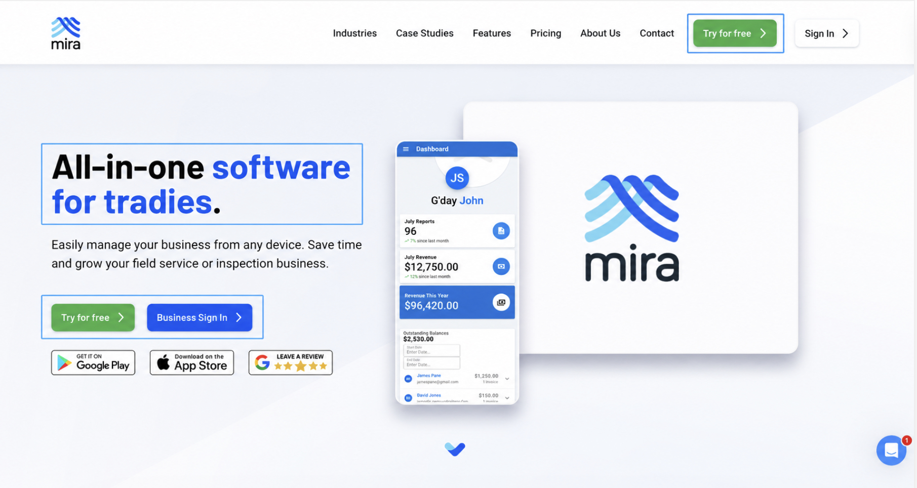
Your homepage has one job above everything else: answer three questions almost immediately.
What is this?
Who is it for?
Why should I care?
If visitors need to decode a clever slogan before they understand your product, you’ve already lost valuable attention. Headlines should describe outcomes, not try to impress people with creativity. “Project management software for marketing teams” tells visitors far more than “Transforming the future of collaboration.”
Every homepage also needs one obvious next step. Whether that’s booking a demo, creating an account, or starting a free trial, make that action impossible to miss. It’s perfectly reasonable to include a secondary option like “Watch demo,” but it should clearly play a supporting role rather than competing with your primary CTA.
Another mistake is treating the homepage like a place to explain absolutely everything.
It isn’t.
Think of it as the traffic controller for the rest of your website. Every section introduces one important idea before directing visitors toward a deeper page where they can continue learning. The homepage shouldn’t carry the responsibility of answering every possible question.
Trust should appear early as well. Display recognizable customer logos, meaningful statistics, measurable outcomes, or a specific success story close to the top of the page. One result like “Reduced onboarding time by 45% for a global software company” builds far more confidence than a long strip of anonymous logos.
Finally, remember how people actually browse websites. They scan much more than they read. Someone should understand your product simply by reading your headlines while scrolling. If the page only makes sense after reading every paragraph, it’s probably doing too much.
2. Product Page
For many SaaS companies, this is where the real selling happens.
Visitors who reach a product page usually aren’t browsing casually. They clicked an ad, searched for a specific solution, followed a recommendation, or compared several competing products. They’re already interested. Your job is to confirm they’re in the right place.
The first thing they see should match exactly what brought them there. If your Google ad promised CRM software for startups, your product page should reinforce that promise immediately. When the message changes between the ad and the landing page, people become uncertain, and uncertainty often leads to an immediate exit.
A strong product page follows a simple progression.
Start with the customer’s problem. Show that you understand what isn’t working today. Explain how your product solves that problem, then support every important claim with proof.
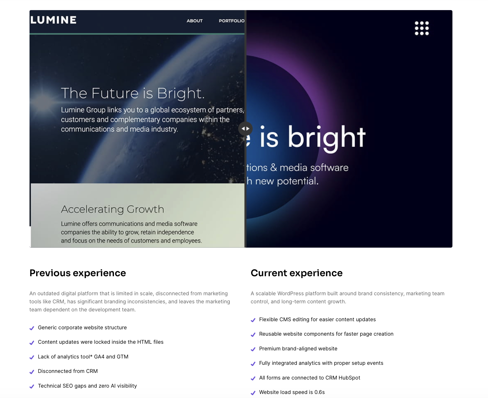
On our website, you can see the problem/solution approach applied to the portfolio showcase, where you can use an interactive switch between the old and current website versions, as well as compare the list of problems that a client had and how we solved them.
Don’t hide testimonials, screenshots, or customer results near the bottom of the page. Place evidence right beside the statements it’s supporting. Visitors shouldn’t have to search for reasons to believe you.
Showing the product is almost always stronger than describing it.
Real interface screenshots, short product videos, interactive demos, before-and-after examples, or genuine customer workflows help people picture themselves using the product. Generic words like intuitive, powerful, or innovative don’t create that confidence anymore.
It’s also worth remembering that buyers rarely compare products one at a time. They usually have several browser tabs open at once. Your page needs to explain why your solution deserves their attention without making them work for the answer.
State your biggest differentiators clearly.
Maybe implementation takes days instead of months. Maybe onboarding is handled by your team. Maybe your platform replaces three separate tools. Whatever makes your product genuinely different should be impossible to miss.
Companies often spend months polishing secondary pages while overlooking the SaaS Website essential pages that actually move buyers through the decision process. Improving your homepage, product page, and pricing page usually produces a much bigger impact than redesigning less important sections.
Before visitors leave, remove as many objections as possible. Integration questions, migration concerns, contract terms, implementation timelines, security certifications, and support expectations can all be answered directly on the page. Every unanswered question creates another reason to postpone a decision.
3. Pricing Page
The pricing page isn’t where customers discover you.
It’s where many decide whether they’re ready to move forward.
That means clarity is far more valuable than creativity.
Visitors should immediately understand what each plan costs, what they receive, and which option fits their situation best. Three pricing tiers often work well because they simplify comparison without overwhelming people.
Instead of organizing plans around long feature checklists, explain who each option is designed for. “Best for growing teams of 10 to 50 people” helps someone identify themselves much faster than comparing dozens of technical capabilities.
Be transparent about costs.
If setup fees exist, mention them. If usage limits apply, explain them. If additional seats increase pricing, say so clearly. Surprises discovered later create much more friction than honest explanations shown upfront.
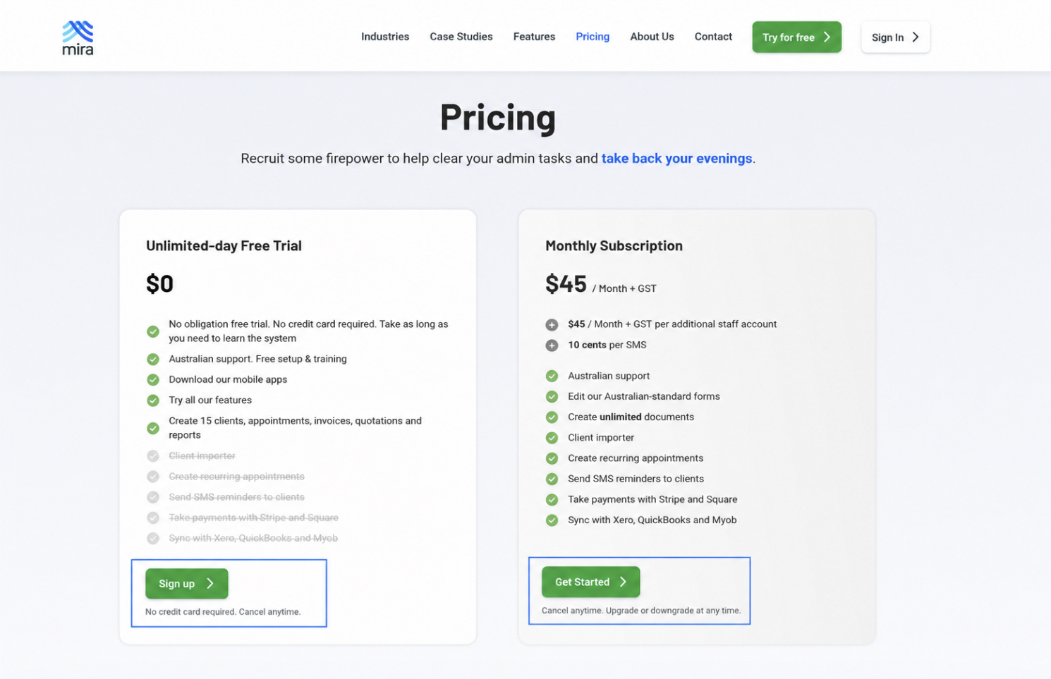
Risk reduction belongs next to your main CTA, not hidden somewhere else on the page. Whether you offer a free trial, require no credit card, provide a money-back guarantee, or allow cancellation at any time, these reassurances help people feel comfortable making a decision.
Not every SaaS business publishes fixed prices, and that’s completely understandable.
Enterprise products often require custom quotes.
Still, replacing every number with “Contact Sales” usually creates unnecessary uncertainty. Explain how pricing is calculated, what affects the final quote, and include a starting price whenever possible. Even an estimated range gives buyers something concrete to work with.
Finish the page with a practical FAQ covering billing, contracts, implementation, support, security, and anything else your sales team answers repeatedly. The fewer questions someone needs to email about, the smoother the buying experience becomes.
Final Thoughts
Homepage, product page, and pricing page each have a different job to do, but together they shape almost every buying decision.
The homepage builds trust and points people in the right direction. The product page convinces them that your solution fits their problem. The pricing page removes the remaining uncertainty before they commit.
Companies often spend months polishing features while these three pages quietly lose potential customers every day. Getting them right doesn’t require flashy design or clever copy. It requires clarity, proof, and an understanding of what visitors are actually trying to decide at each step of the journey.
Here’s a quick checklist worth pinning somewhere your team will actually see it:
Homepage passes the five-second test
One primary CTA, repeated consistently down the page
Proof sits above or just below the fold
Product page headline matches the ad or search intent that brought the visitor there
Problem, solution, and proof sit together, not split across the page
Real product UI or a demo is shown, not stock visuals
Pricing page is scannable, with tiers framed by who they’re for
No hidden costs, and risk-reducing copy sits right next to the CTA
FAQ covers billing and contract questions
If you’re staring at your own homepage, product page, or pricing page right now and not sure where it falls short, that’s usually a sign it’s worth a second set of eyes. Sometimes the fix is a headline rewrite. Sometimes it’s a full restructure. Either way, getting these three pages right tends to move the needle more than anything else on the site.




 ChatGPT
  Claude
  Grok
Grok  Gemini