- Expertise
Expertise That Drives Results
Explore our specialized services, tailored solutions, and industry expertise to elevate your digital presence. From custom WordPress development to seamless integrations, we build high-performing websites that deliver impact.
Solutions- Booking System Integrations
- Headless & REST API WordPress
- Hubspot Integration
- Enterprise WordPress
- Website Migration
- Internal Collaboration Platforms
- External Communications Hubs
- Work
- About
- Proof
- Contact
Learn more


8 Signs Your WordPress Site Needs a Redesign

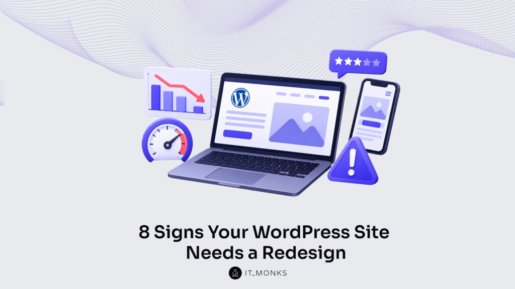
Most WordPress redesign signs don’t show up as one obvious problem. They show up as a slow buildup of small annoyances: conversions sliding for a quarter or two, a developer who sighs before every plugin update, a site you avoid pulling up on your phone when someone’s watching.
If any of that sounds familiar, you’re probably already sitting on two or three of the eight signs below. On their own, none of them is a five-alarm fire. Together, they usually mean a redesign has quietly moved from “someday” to “now.”
1. Poor Website Page Speed and Optimization
Slow load times cost real money, not just patience. Google has weighted page speed into rankings for years, and honestly, users have gotten even less forgiving than the algorithm. Four or five seconds to load a homepage sounds small until you realize a good chunk of your traffic is already gone by then.
Usually, it’s not one dramatic problem. It’s a bloated theme, unoptimized images nobody ever compressed, a graveyard of plugins someone installed in 2021 and forgot about, hosting that made sense years ago but hasn’t scaled. Untangling that kind of accumulated mess is often slower than just rebuilding cleanly, which is a big part of why performance issues push people toward a redesign instead of another round of small fixes.
You don’t have to guess whether this is happening to you. A few quick checks will tell you plainly enough:
- Run your homepage through Google PageSpeed Insights or GTmetrix. Both are free, and both hand you an actual load time along with a breakdown of what’s slowing things down, usually images, unused JavaScript, or scripts blocking the page from rendering.
- Check Core Web Vitals in Google Search Console, under the Experience tab. If pages are sitting in the red or yellow for Largest Contentful Paint or Interaction to Next Paint, Google is already telling you speed is working against your rankings.
- Time it yourself on your phone, on regular mobile data rather than office wifi. Count the seconds until the page actually feels usable. If you get impatient waiting, assume most visitors already left.
- Look at how many plugins are active versus how many anyone on the team could actually explain the purpose of. When that gap is wide, a few of them are probably slowing things down for no real benefit.
- Ask your host, or check the hosting dashboard, for average server response time (TTFB). Google considers under 800ms “good”; if your team wants a tighter internal bar, treat 500ms as your own target rather than the industry benchmark. Anything consistently missing the 800ms mark usually means the hosting plan has been outgrown.
2. Frequent Website Downtime During Updates
If updating a plugin makes your stomach drop a little, pay attention to that feeling. It’s data. Frequent downtime during routine updates almost always points to a fragile foundation underneath, outdated code, plugins quietly fighting each other, a theme that was never meant to carry this much weight.
A site that can’t survive a plugin update without breaking is more than an inconvenience. Teams start avoiding updates out of fear, and that means security patches get delayed longer than they should. On a properly built, modern WordPress site, updating shouldn’t feel like defusing anything.
A quick way to check where you stand: WordPress doesn’t keep a built-in log of past updates in the dashboard, only a list of what’s currently available. To see real history, check Site Health (Tools → Site Health → Info) for plugin and theme version info, or ask your host to pull the server or deployment logs, which usually timestamp each update. If it’s been months since the last one, that gap itself is usually fear, not luck.
Try updating one plugin at a time on a staging site first, if you have one. If you don’t have a staging environment at all, that’s worth noting on its own, since it means every update currently goes live untested.
Ask whoever manages the site how many times something’s broken after an update in the last year. A number above two or three is a pattern, not bad luck.
Check your error logs, or ask your host to pull them, for recurring PHP warnings or fatal errors. Recurring errors after routine updates are usually a sign the codebase is more brittle than it looks on the surface.
3. Hard to Conduct Any Content Updates
Marketing teams should be able to swap a headline or launch a landing page in an afternoon, not file a ticket and wait three days for a developer to have time. When even small changes require outside help, the platform has stopped serving the people using it.
Nine times out of ten this traces back to hard-coded sections instead of flexible, reusable blocks. A rebuild that leans on proper components, custom fields, a real page builder setup, hands that independence back to marketing. Agencies and in-house teams both tend to underestimate how many hours a month get lost to this specific bottleneck until they finally fix it.
Try this test: pick a simple task, changing a headline, swapping a hero image, adding a testimonial, and time how long it actually takes from decision to published. If it’s under ten minutes, you’re probably fine. If it involves a developer or a ticket, that’s the bottleneck showing itself.
Look at how many pages were built with the native WordPress editor versus custom code or hard-coded templates. A high share of custom-coded pages usually means less flexibility for non-technical editors.
Ask your marketing team directly how often they’ve wanted to make a change and gave up because it felt like too much hassle. That answer tends to be more revealing than any analytics report.
4. Outdated Design and Aesthetics View
Design ages faster than people expect. What felt sharp a few years ago can look tired now, and small things give it away: skeuomorphic buttons, cramped spacing, tiny text trying to cram in too much information.
Visitors clock this instinctively, even when they couldn’t explain what’s bothering them. They just sense the brand feels a step behind, and that read happens within seconds of landing on the page. Refreshing the responsive design isn’t about chasing whatever’s trendy this year. It’s making sure the first impression actually matches how seriously the business takes itself.
An easy gut check: pull up your site next to two or three competitors you respect and look at all of them for thirty seconds each, nothing more. If yours feels noticeably older or busier, that’s worth trusting.
Screenshot your homepage and show it to someone outside the company with no context. Ask what they think the business does and how established it feels. Their first reaction usually says more than internal opinions do, since everyone inside the company has stopped seeing the site with fresh eyes.
Check when the theme was last updated by looking at its changelog, either in the theme’s readme file or on its WordPress.org listing page (if it’s a public theme). The dashboard itself only shows whether a new update is available, not a release history. A theme with no updates in two or three years is often a decent proxy for how dated the whole design has gotten.
5. Your Brand Moved on, but the Site Didn’t Get the Memo
Companies rebrand. Logos change, palettes shift, the tone of voice grows up a bit as the company matures. And then, somehow, the website keeps running the old identity for another year or two because nobody wants to be the one to touch it.
That gap between the current brand and an outdated site creates a weird kind of friction, especially for people who met the brand somewhere else first, on social, through an ad, in a conversation. If your logo, colors, or messaging have moved on and the site hasn’t caught up, that mismatch is about as clean a redesign trigger as you’ll find.
Pull up your current brand guidelines next to your live site and compare colors, fonts, and logo versions line by line. Any mismatch is usually a leftover from the last rebrand that never made it to the website.
Check your most recent social posts, ads, or sales decks against your homepage. If the tone of voice or visual style feels like it’s coming from two different companies, that inconsistency is confusing visitors more than you’d think.
Ask sales or customer-facing teams whether they’ve ever had to explain to a prospect why the website looks different from everything else the company puts out. If that’s happened more than once, the mismatch has already cost you something.
6. WCAG or EAA Compliance Failed
This one’s not optional anymore. WCAG compliance, and increasingly EAA standards for anyone doing business in the EU, has shifted from nice-to-have to legal exposure. Missing alt text, broken keyboard navigation, poor color contrast, no real screen reader support, these aren’t small oversights. They shut real users out and open the business up to actual risk.
Bolting accessibility onto an old, tangled codebase after the fact is usually harder and pricier than building it in from day one. If nobody on your team can honestly say the site meets current standards, that’s worth dealing with properly, as part of a rebuild, rather than a rushed patch that half-fixes it.
Run your homepage through a free scanner like WAVE or the Lighthouse accessibility audit in Chrome DevTools. Both flag missing alt text, low color contrast, and structural issues in a couple of minutes.
Try navigating your own site using only the keyboard, tab key to move, enter to select, no mouse at all. If you get stuck or lose track of where focus is on the page, a screen reader user will get stuck too.
Check whether your forms, menus, and buttons have proper labels a screen reader could actually announce. Missing labels are one of the most common and most overlooked compliance gaps on older WordPress builds.
7. Mobile Visitors Get the Short End of the Deal
Mobile traffic share varies a lot by industry, consumer-facing sites often skew heavily mobile, while B2B businesses in fields like manufacturing, SaaS, or fintech frequently still see desktop lead for research and purchase sessions. Rather than assume a split, check your own numbers, it’s often higher than people expect, even on B2B sites. If the site was designed desktop-first with mobile bolted on afterward, it shows. Buttons too small to tap accurately. Text that forces zooming. Forms that are genuinely painful to fill out with a thumb.
Responsive design done right isn’t just a layout that technically shrinks to fit a smaller screen. It’s rethinking the whole experience around how people actually behave on mobile, shorter attention, one-handed scrolling, sometimes a slower connection. A mobile engagement rate that’s noticeably worse than desktop isn’t a coincidence. It’s a symptom.
Open Google Analytics (GA4) and compare mobile engagement rate against desktop (GA4 reports engagement rate rather than the old bounce rate metric; a low engagement rate on mobile is the equivalent red flag). A meaningful gap between the two is usually the clearest signal you’ll find.
Fill out your own contact form or checkout flow on your phone, using one thumb, the way a real visitor would. Note every moment of friction, a button too small, a field that’s awkward to tap, and take that seriously.
Check mobile usability using the Lighthouse mobile audit in Chrome DevTools, or by switching DevTools into device mode and browsing the site as you would on a phone. (Google retired the old Search Console mobile usability report and the standalone Mobile-Friendly Test in December 2023, so this is now the reliable way to catch issues like text too small to read or tap targets placed too close together.)
8. You Hesitate Before Sending the Link
This one won’t show up in Google Analytics, but it might be the truest signal on the list. If there’s a small pause before you send your own website to a prospective client or a new hire, some part of you already knows. That instinct is usually right, and it’s worth trusting.
A website is often the very first impression someone forms of a business, before a call, before a meeting, sometimes before they’ve spoken to a single person on the team. When the site doesn’t reflect the actual quality of the work, it’s quietly working against sales instead of for it.
Next time you’re about to send the link, notice the actual feeling in that moment, pride, indifference, a flicker of hesitation. That reaction is honest in a way most feedback isn’t.
Ask a few colleagues, especially newer ones without much attachment to the current site, how they’d honestly describe it to a stranger. Fresh eyes tend to say the quiet part out loud.
If you can, ask a recent client or new hire what their first impression of the website was, before they knew the company. Whatever they say is probably closer to the truth than anything internal opinion will give you.
So What Now
None of these signs alone guarantees you need a full rebuild. A slow page here, a dated banner there, sometimes a targeted fix genuinely does the trick. But when several of these show up together, sluggish speed, brittle updates, mobile friction, a brand the site has outgrown, that combination usually points to something structural. Patches won’t hold it together for much longer.
A strategic WordPress redesign, handled by a team that understands both marketing and the technical side of the platform, lets you address all of it at once instead of chasing symptoms for another year. If you’re on the fence, it’s worth a conversation with a WordPress agency that will actually audit what’s happening under the hood instead of just repainting the surface. That conversation alone usually makes it obvious whether you need a full redesign or just a few fixes, and either answer beats not knowing.
More Articles by Topic
Imagine a marketing team two days before a campaign launch. The copy is approved, the images are ready, and the…
Learn more 
Take a company that sells custom printed boxes to other businesses. We made it up for this article, but each…
Learn more 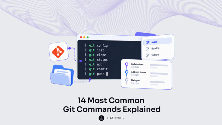
Basic Git commands are the text instructions typed in a terminal, the word git plus a command name, that tell…
Learn more Contact
Feel free to reach out! We are excited to begin our collaboration!
Don't like forms?
Shoot us an email at info@itmonks.com
Don't like forms?
Shoot us an email at info@itmonks.com

CEO, Strategic Advisor
Reviewed on Clutch
 ChatGPT
  Claude
  Grok
Grok  Gemini
 Send a Project Brief
Fill out and send a form. Our Advisor Team will contact you promptly!